Weekly Roundup, 1st August 2017

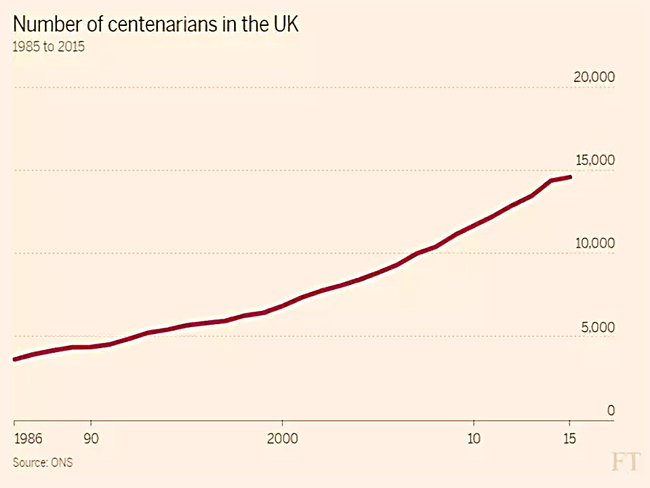
We begin today’s Weekly Roundup in the FT, with a feature looking at whether people can afford to live to 100.
Living to 100

Lindsay Cook looked at whether people living longer would outrun their savings.
- There’s no doubt that more people are living to 100, but it still seems like a strange question to me.
The whole point about financial independence is that you reach the point where you have sufficient assets that you can live on a withdrawal rate that will be sustainable indefinitely.
- Here in the UK under current economic conditions, that’s around 3%.
So you need at least 30 times your living expenses to retire, and preferably 35 times.
- Once you have that amount of money, you should never run out.
The article covered life expectancy, the impact of the pension freedoms and property (equity release), but I can’t say that I learned anything.
- Withdrawal rates and pot sizes weren’t mentioned.
Active vs passive

It was a bad week for the FT, with a second sub-standard article provided by Maike Curry.
- Maike works for Fidelity, and for some reason the newspaper let her write an ad for their actively-managed funds in the guise of a comment article. (( Yes, Fidelity offers passive funds as well, but we all know where most of their income comes from ))
I share her concerns over a market dominated by passive funds (there would be no price-setting mechanism).
- We’re a long way from that situation today, but we’re heading in that direction.
But I can’t agree with her assertion that sideways markets make the case for active management.
- I think what she really means is that if markets are flat, there are no returns from index trackers.
But that doesn’t mean that active funds will outperform.
- They can’t in aggregate, since their costs are higher.
- So you need to be able to identify winners in advance, which is not straightforward.
The Saturday FT really has dropped off in quality over the past few years.
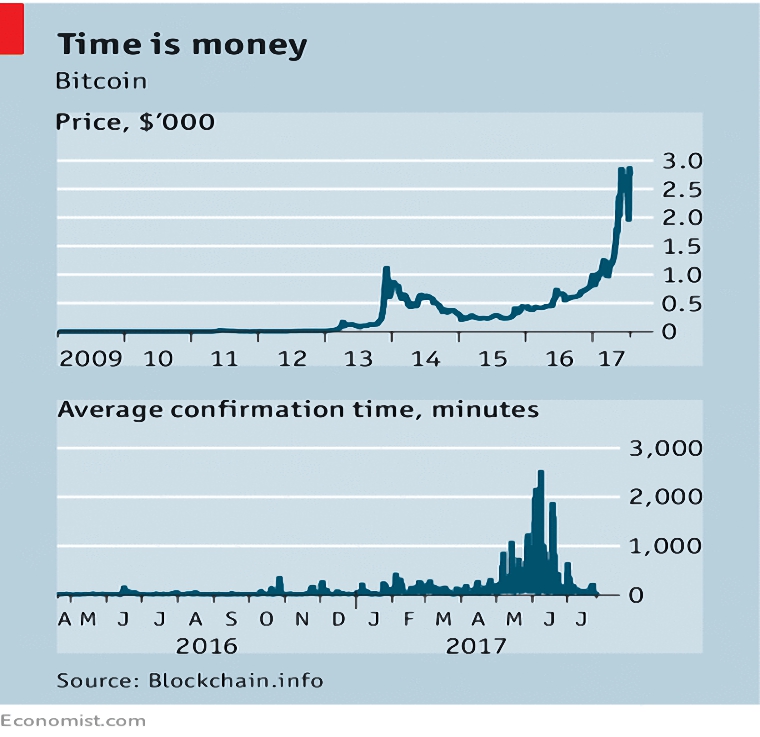
Bitcoin
The Economist looked at the civil war within the Bitcoin community.
- There had been a risk that the currency would “fork” into two, but a compromise has been reached.
The original specification of Bitcoin (by the pseudonymous Satoshi Nakamoto) limited the block size of the blockchain currency to 1Mb. (( He also limited the total number of bitcoins in circulation to 2M ))
- This means that the system can only handle 7 transactions a second, compared to thousands per second for payment systems like Visa.
The newspaper worries that the problems have not really been solved.
- The underlying problem is whether bitcoin should be more like gold or cash.
If bitcoin grows too quickly, the blockchain register could become too big for holders to use their own computers to check for valid transactions.
- Thus a de-centralised system would become centralised, and subject to potential government interference.
The alternative approach is to bundle transactions before confirmation (known as “lightning”) and to pack blocks more densely (using “segregated witness” or SegWit).
- The two approaches are backed respectively by Chinese bitcoin miners and Western developers.
The rise of alternative cryptocurrencies, and Ethereum in particular, has focused the attention of the two sides and led to the compromise solution known as SegWit2x.
- This means that SegWit will be implemented in August, and the block size will double to 2Mb three months later.
But it’s possible that the doubling will only take place after a fork has happened anyway.
The Economist predicts that there will be many competing cryptocurrencies in the future, and that the winners will need to better processes to adapt their rules than Bitcoin has at the moment.
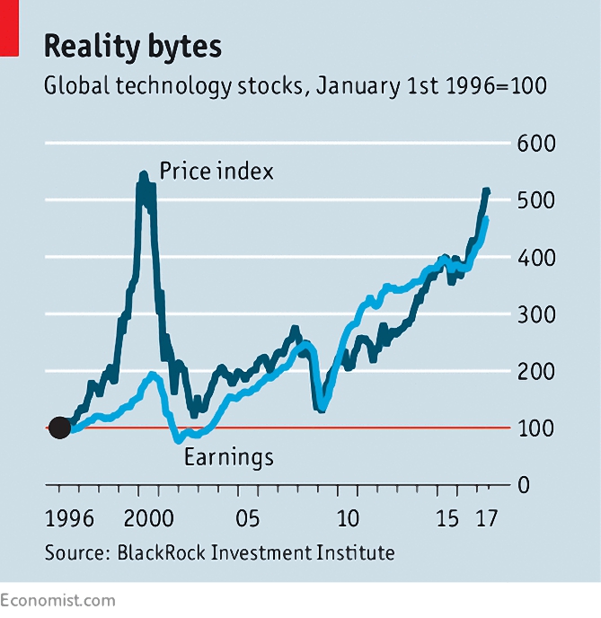
Tech stocks
Buttonwood noted that tech stocks (specifically, the S&P 500 tech sector) are now above their dotcom era highs.
- But the gap between the sector’s price and its earnings is much smaller.
Investors are more discriminating now, focusing on stocks that can exploit network effects and dominate a sector (eg. Google, Facebook, Apple, Amazon, Netflix and Microsoft).
- The sector is much more mature than in 2000, as several of the leading companies probably have their fastest growth behind them.
- And the sector is the object of much more suspicion (eg. about privacy) than last time around.
But the market CAPE is 30, and has only been higher in 1929 and 2000, so worries remain.
Uncompetitive markets
The Economist also looked at market concentration.
- More than three quarters of US industries are more concentrated than they were 20 years ago.
- And fewer firms are entering and leaving the market.

A new report suggests that growing market power is behind a lack of investment over the past 15 years.
- The potential to establish a monopoly (via a drug patent, or network effects) can lead to a lot of investment.
- But once it is established, little further investment is required.
The authors looked at investment relative to Tobin’s Q – the ratio of market value to book value.
- A high Q should mean that a firm wants to invest more, since it is making a good return.
But investment relative to Q has fallen in more concentrated industries.
- And it is industry leaders rather than laggards who invest the least.
Separate research suggests that dominant firms also pay less of their profits as wages.
- They actually pay higher wages than other firms.
- So their growing dominance leads to both higher inequality and a lower labour share of GDP.
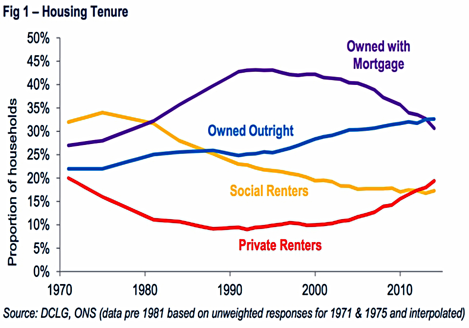
Property
Over on Flip Chart Fairy Tales, Rick looked at the rise and fall of the property-owning democracy.
- The concept (from the Thatcher government in the 1980s) was designed to split the “respectable” working class (( In which I was brought up )) from the very poor an unemployed.
- With more of a stake in society, they would be more likely to vote Tory.
So mortgage regulations were relaxed and council houses were sold off cheap.
But now houses are a lot more expensive.
- Home ownership peaked in 2003, but mortgages peaked in 1996.
- Since then, as older owners have paid off their debts, they have not been replaced by younger borrowers.
As the cost of housing has increased, it has greatly affected disposable incomes and led to greater inequality.


I’m not sure it’s too much of a shock that those owning houses are better off than those who are renting.
- And as houses get more expensive, you might expect the gap to widen.
Low to middle income households (those with jobs paying less than the median income) are being squeezed out of home ownership.
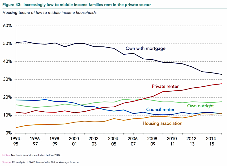
Again this is unsurprising, since those in work now form a higher proportion of those in relative poverty (income below 60% of median).
So now “the middle” own fewer houses, and are more reliant on welfare (in-work benefits like tax credits).
- So they might feel that they have more in common with the poor rather than the rich.
Which means that the era of the property-owning democracy – and its impacts – is over.
- Instead we have what Rick calls “the buy-to-let barons”.
Rick speculates that these changes might lead to “less reverence for property and more demands for its taxation or for laws protecting tenants from landlords”.
- And potentially, to fewer Conservative voters.
I certainly worry that too few people now have a real stake in society, but it’s not clear how to fix this easily or quickly.
- More houses in the right places would be a start.
Twitter pics
It was a bumper week on Twitter, with nine pictures to take a look at.

The first shows that inflation in Venezuela has reached a new high.
- This is what happens if you implement Corbyn-style policies.
It’s a sad situation over in South America, with riots in the streets.
- Strangely, there’s no coverage of this story over on the BBC news website.
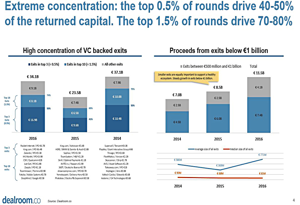
The next shows how concentrated are the returns from venture capital investment.
- The best 1.5% of capital raises return 75% of the money.
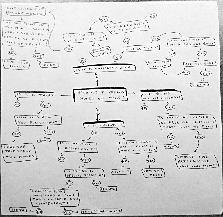
The third is a hand-drawn flowchart used by one guy to curb his spending.
- Apart from on Chipotle, it seems.
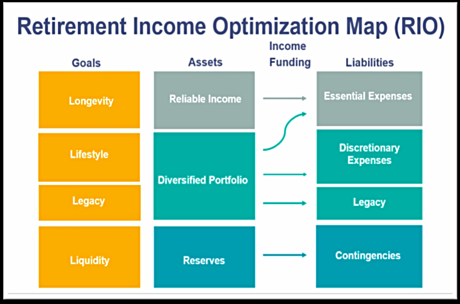
This chart shows you how to arrange your assets in retirement to meet the four key goals (all beginning with L) of longevity risk, lifestyle, legacy and liquidity.

This chart plots the outperformance of super investors against the duration of their outperformance.
- The big red question mark shows that few investors outperform by a lot for a long time.
- This could be because the best outperformers become so rich that they lose the incentive to continue.
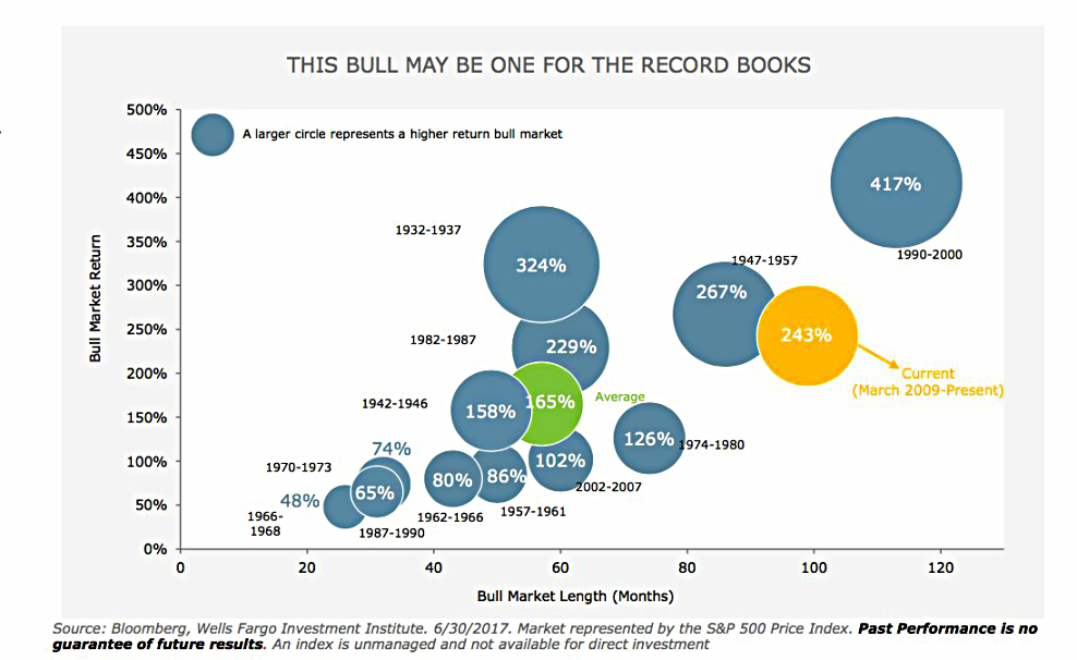
This chart compares the current bull market in US stocks with earlier versions.
- This is currently the second longest and third biggest (in terms of percentage gains) on record.
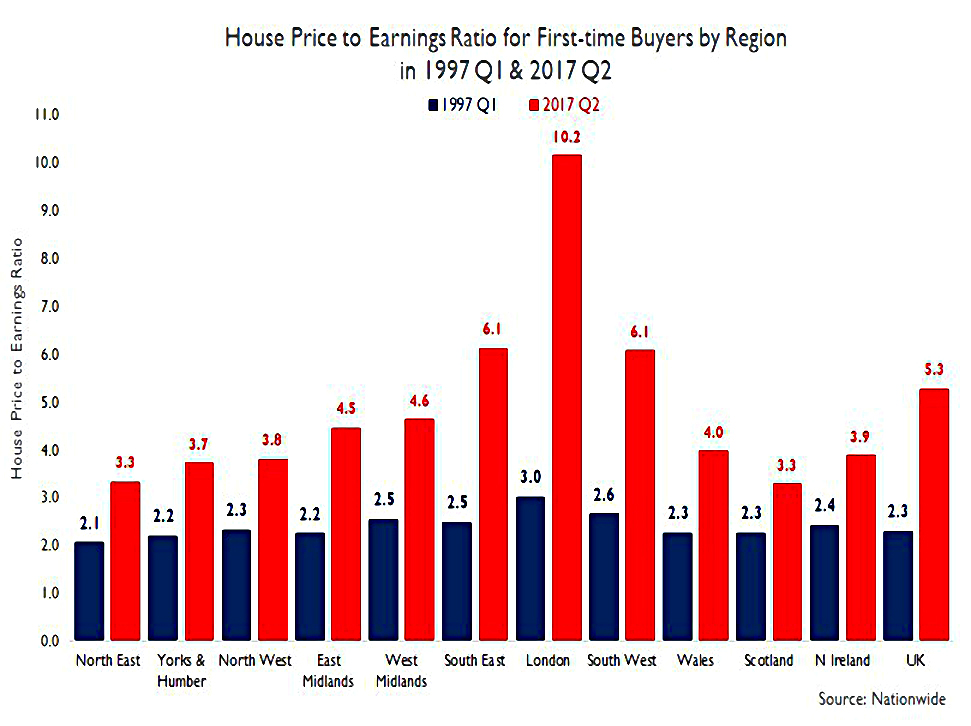
This chart compares house prices to earnings across regions, in 1997 and 2017.
- You can see that the ratios have gone up across the board, but particularly in London and the South.
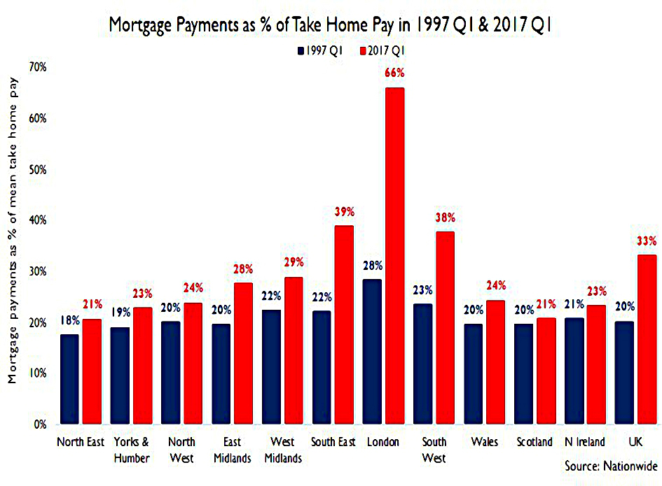
The companion chart shows that because of low interest rates, the cost of servicing mortgages has not risen as much.
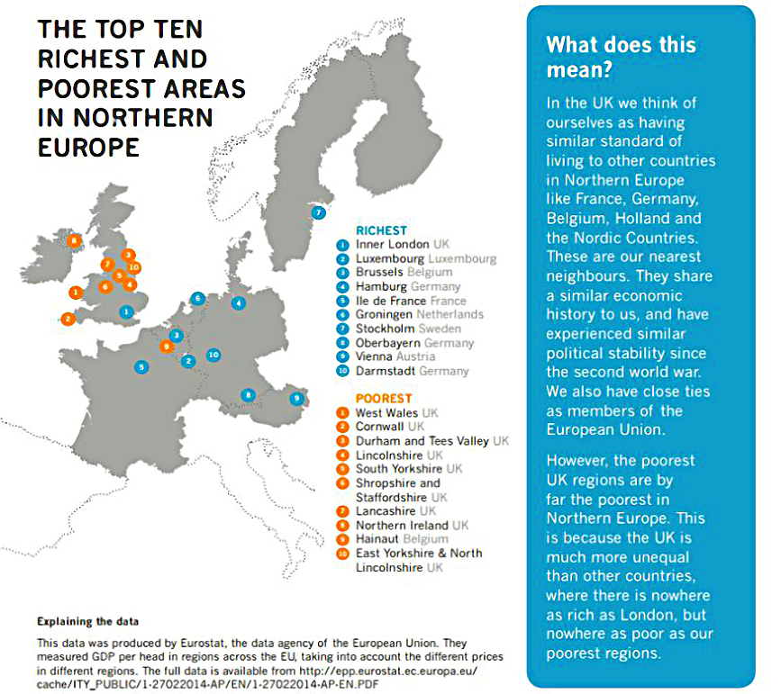
And finally, this map shows that the UK has the richest and nine of the ten poorest regions in northern Europe.
- I think it’s a bit misleading, as things would look very different if Portugal, Spain, Italy and Greece were included (London would still be top, of course).
Until next time.
Mike Rawson
Mike is the owner of 7 Circles, and a private investor living in London. He has been managing his own money for 40 years, with some success.