Weekly Roundup, 26th January 2016

We begin today’s Weekly Roundup in the FT, with the Chart That Tells A Story.
Contents
Gold

Naomi Rovnick took a look at the gold price. The FT is continuing with its recent policy of having a different chart online to the one in the printed edition of the paper.
- I had hoped to show you the relationship between gold and US stocks, but that chart is missing.
Naomi thinks that gold is starting to recover after a downward trend that started in 2011. Sales of gold ETFs have picked up, and the metal is certainly doing better (less badly) than other commodities.
- But the price is only up by 3.1% in January, so there’s nothing to get excited about yet.
From 2009 to 2011, QE in the US was the main driver of the price rise, as it pushed down the value of the dollar.
- Gold is both priced in dollars and acts as the “anti-currency” (as well as a “safe haven” from bond and equity stress), so this has a double effect on the metal.
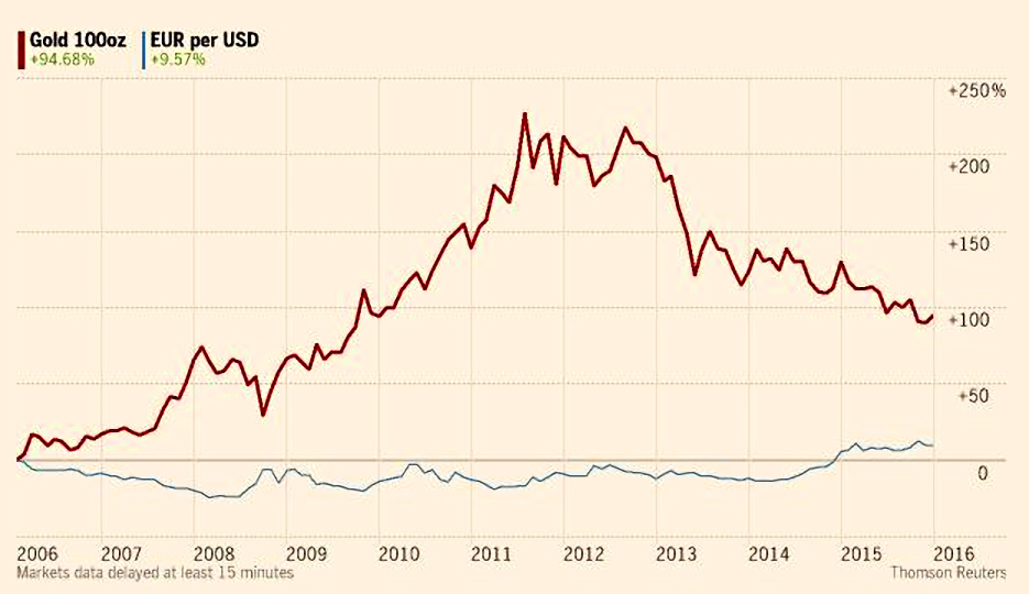
Now that the Fed has raised rates (too soon?) the dollar should rise, and the gold price should fall.
- But the Fed signalled that future rises would be small and gradual, and there is continuing turmoil in the stock and commodity markets.
An alternative to buying a gold ETF would be to opt for gold mining shares. These are a geared play on a rise in the gold price, since a 10% rise in gold can double a miner’s profits over its “”all-in sustainable cost of production”.
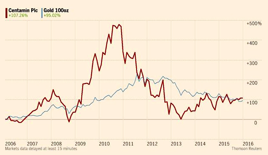
The chart shows the share price of Centamin against the gold price. ((A better choice of vertical scales would have made the point even better ))
- The main snag with buying gold shares is that miners’ costs tend to inflate with the gold price, as they chase growth and market share.
- So investors do well, but not as well as they expected.
Dividends
Over in the Economist, Buttonwood took a look at the prospects for dividends.
It is well-known that re-invested dividends do the heavy lifting within equity returns.
- Even in the US, where payouts are typically lower than the UK, two-thirds of the 6.4% pa real return from shares since 1900 has come from reinvestment.
- Over the last century, annual returns from markets with the highest dividend yields were eight percentage points above those from the lowest yielding markets.
In a lot of the big markets, dividend income – in absolute currency terms, the total money paid out – is concentrated in a few stocks.
- In Australia, Britain, France, Germany and Switzerland, more than 70% of the dividends come from just 20 companies.
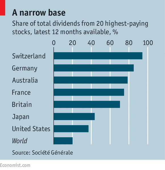
This doesn’t surprise me – the way equity markets are constructed means that they are dominated by a few large companies, with greater capacity to pay out hundreds of millions of pounds.
- Why should the payout structure look any different to the market capitalisation structure?
- Further, when putting together a dividend portfolio, the private investor doesn’t choose Shell because they payout £1 bn a year, it’s because the company yields 5%+.
What is slightly concerning is that the industries which have historically been the best payers are going through rough times.
- Banks were big payers until the 2008 crisis, and now mining and energy companies are cutting their payouts.
- In 2015, 504 American companies cut their dividends, many of them from the energy sector.
Dividends still rose by $3.6 bn in 4Q2015, but the same quarter in 2014 produced a $12 bn increase.
- The key sectors are now pharma and healthcare (Pfizer, Roche and Johnson & Johnson).
This all feeds into how the high dividend yield of equities should be judged.
- The FTSE All-Share yields 4% – compared to 1.7% for 10-year gilts – but is this a bargain?
Shares yielded more than bonds until the 1950s, since they were seen to be riskier.
- Then the “cult of the equity” within pension funds and insurance companies drove prices up and yields down.
- Since 2008, institutional investors are now back with “safe” bonds, and equity yields have gone up again.
The real question is whether the high yields will be delivered, or if the dividend will be cut.
- For many companies, a yield above say 5% indicates that the market expects a cut.
- BHP Billiton is yielding 12% based on the 2015 payout, but that will probably be cut in half this year (still 6%).
So be careful what you buy.
UK pay rises
The Economist also reported that the recent boost to British pay-packets appeared to be over.
- Unemployment is 5.1%, a 10-year low, but after a brief increase in wages during mid-2015, pay has started to flatten out again.
Economists would expect competition for staff under low employment conditions to drive up wages, but it hasn’t happened.
- Annual pay growth is now down to 1.9%, below the pre-2008 rates.
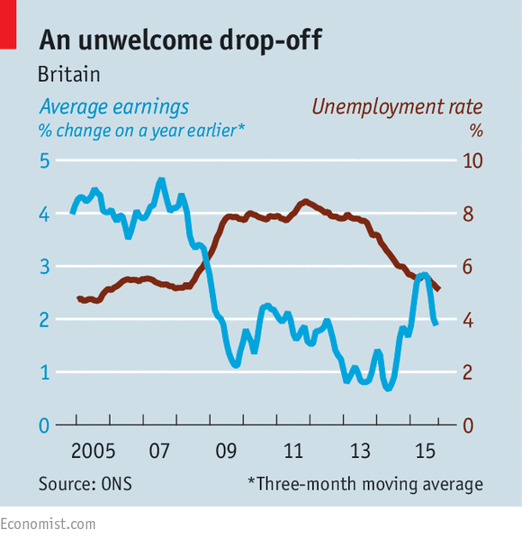
- Part of this is the slump in the oil and gas industry (wages down 12% over the year).
- Part of this is the UK’s lowflation / deflation, which tends to damp down pay rise demands.
- Part of this is the previously strong pound, which drove exporters to cut costs to maintain competitiveness.
But perhaps the labour market isn’t that strong.
- Long-term (> 6 months) unemployment is still 50% higher than in 2007
- Hours worked per week are falling, suggesting weak labour demand
The answer may be in who is getting the work.
- Companies appear to be hiring younger, cheaper people, and training them up.
But as youth unemployment falls, it may become harder to pull off this trick.
- And the new “national living wage” should have an effect from April.
One opposing factor is fear of Brexit, which will depress investment, and hence productivity, and hence wages.
- So pay rises could remain modest, even as the UK economy continues to improve.
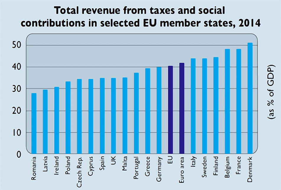
UK tax take

In MoneyWeek, Matthew Lynn looked at the UK tax take in the context of other European countries.
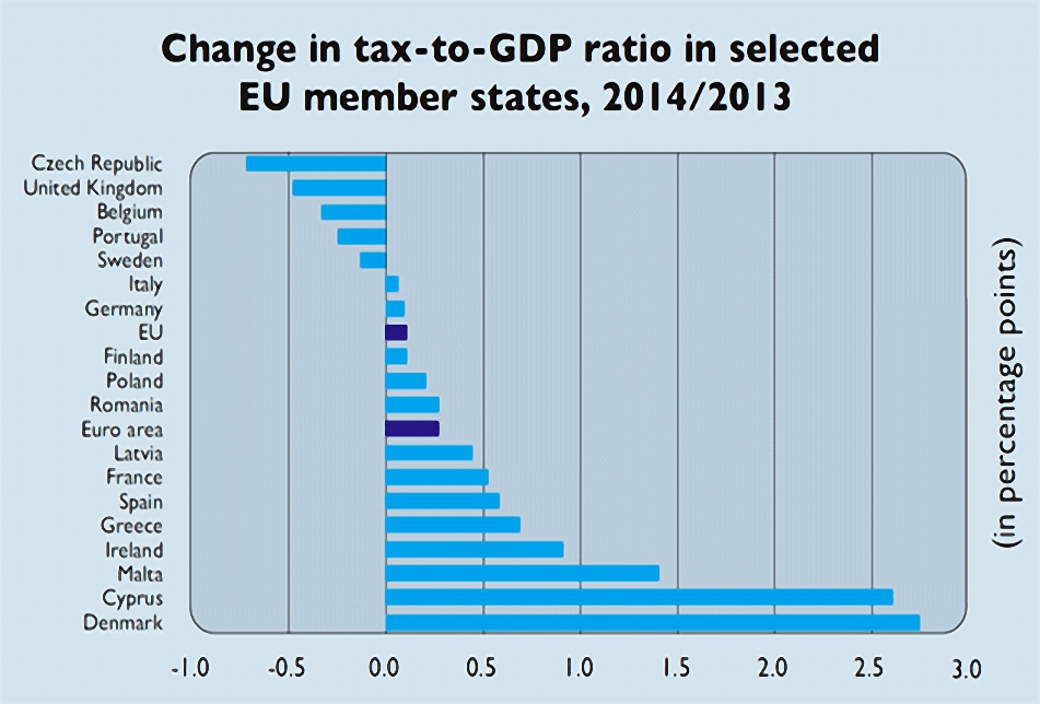
- Along with the Czech Republic, the UK’s tax burden is coming down at the fastest rate.
The 2014 figures show that the EU tax is rising, and now stands at 40%, close to the maximum that developed economies can withstand.
- Denmark has passed 50% for the first time, while Romania is down at 27%.
- Eight countries reduced their tax burden, but 20 increased theirs.
There is a proven link between lower taxes and faster growth.
- In America, the lower-tax states have the highest growth.
- Low-tax city states like Hong Kong and Singapore, have grown the fastest and created the greatest increase in living standards.
- Within the EU, the fastest growing economies are the ones cutting their tax base, while France and Denmark remain depressed.
Sentiment as a contrarian indicator

Also in MoneyWeek, Matthew Partridge looked at whether investor sentiment could be used to predict market rallies – by acting as a contrarian indicator.
One famous contrarian indicator is the magazine cover, which could now perhaps be updated to include the front page of the BBC website and the 10 o’clock news.
- Historical examples include BusinessWeek “Death of Equities” cover from 1979, and the Economist’s prediction of $10 oil.
- Whenever the stock market makes it to the front page or the first story on the news, the move is already over.
A more scientific approach is to poll investors.
- The American Association of Individual Investors’ (AAII), began in 1987 to survey its members (private investors, mostly wealthy ones) every week. There’s good evidence that the survey is a contrarian indicator.
- Right now 46% of investors are bearish, and just 18% bullish, so there could be good times ahead.
- Another survey comes from Bank of America Merrill Lynch (BoAML) – once a month they poll global fund managers.
- The fund managers are not so bearish – only 12% believe that a recession will happen in the next 12 months and most prefer equities to bonds.
- They are holding a lot of cash (for fund managers), though.
- They are also at record under-weights on resources and materials.
A third approach is to look at the put / call ratios – this measures actual money flows rather than sentiment, but it looks at the future.
- This worked well in the dotcom boom.
- Right now puts are ahead of calls for both the US index and shares – another bullish contrarian sign.
So maybe things aren’t quite as bad as they seem.
London House Prices

Back in the FT, Merryn announced that she had caved in and bought a studio flat in London.
- It’s not because she believes in the London market, it’s just that she lives in Edinburgh and spends a lot of time long-distance commuting to London for work.
In fact, she offered six reasons why London property should crash.
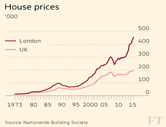
The first is this chart, which shows the cyclical relationship between London prices and the rest of the UK.
- London runs ahead and then the gap closes. Then repeat.
- At the moment the gap is wider than ever (in nominal terms – I’d have liked to see the chart rebased by inflation, or better still earnings, and against a logarithmic scale).
So mean-reverters should sell in London and move to the country.
- Except the property market doesn’t work like that.
Reason number two is the excess supply of largely luxury flats in towers near the river.
- These have been sold off-plan to foreigners for years, but that source of customers is drying up.
Reason three is the improvement to transport around London.
- Crossrail will certainly make a difference at the bottom end of the market, but few people will swap Zone 1 or 2 for Surrey.
Reason four is the government’s signal of increases to stamp duty and enveloped dwellings (houses in companies) tax, plus the extra stamp on second homes. Buy-to-let is also being hit.
Reason five is the collapse in commodities and the China slow-down.
- The billionaires market at the top end will suffer.
Reason six is the pending rise in UK interest rates (which I think could be years away – things may never return to “normal”).
- So Merryn says crash. I don’t agree.
London is an edge case, and it’s dangerous to apply the normal rules to edge cases.
- I’m not saying that the next ten years will be like the last for London, but London housing is a scarcity good.
- You can’t go and live in Maidenhead and catch the Crossrail to work and pretend you have the same life.
- For those of us who live here, and love it here, there is no substitute for London, at any price.
I think that the stamp duty changes have sucked the life out of the £2M+ market, that there will be fewer foreign buyers in the future and that they are building too many small luxury flats near the river.
- But unless the City, media, music, government and law sectors relocate, London will still be the place to be.
- And for rich people from dodgy regimes, an expensive flat in London will always be a nice insurance policy.
Pensions tax relief
Over in MoneyWeek, Merryn’s second column of the week had two criticisms of the UK’s recent pensions revolution.
- First, it’s becoming difficult for higher earners to save enough into a pension to make a difference.
- Second, government and central bank interventions are making it difficult to understand the long-term value of the assets your pensions are invested in.
I have some sympathy for the second, but not much for the first.
It’s true that the looming change to 30% flat tax relief on contributions will not seem very enticing to those who expect to be a 40% or higher rate payer in retirement.
- But then again, why should it?
The government’s priority is to make sure people save enough to avoid being dependent on the state in retirement.
- The new £1M limit on a pension will generate £22.3K pa for a 55-year-old wanting RPI indexing.
- Presumably the government thinks that is enough.
They have no moral duty to help people on double that amount in retirement.
- £43K pa is deemed a “higher income” during a person’s working life, so why not in retirement?
Thirty pence per pound is better than nothing, and I suggest that high-rate taxpayers take advantage.
Oxfam’s inequality figures

Back in the FT, Chris Giles offered three reasons to question Oxfam’s inequality figures.
- There was a lot of stuff in the media last week about how the richest 62 people in the world had the same wealth as the poorest half of the world’s population.
- The richest 1% owned as much as the other 99%.
Oxfam have previous for this – issuing some dramatic statement at the same time as the World Economic Forum in Davos.
- The problem is that the report is misleading, and both global income inequality and global poverty are falling.

The specific problems with the Oxfam report are:
- Oxfam takes its data on rich people from Forbes magazine’s guesses and that on the rest of the world from a Credit Suisse report which itself stitches together a lot of incompatible sources.
- They use net worth as the measure of wealth, which means that US graduates with student debt come out poorer than third world subsistence farmers.
- on this measure everyone who owns a flat in London is part of the 1%
- Oxfam ignore the recent strength of the dollar when reporting a “dramatic fall in wealth of the poorest half of the world”.
- Credit Suisse uses market exchange rates rather than Purchasing Power Parity (PPP) rates, which means that almost everyone except the Yanks had a bad 2015.
I think we deserve better from Oxfam for all our tax-relief subsidies.
Economics = politics
The Economist looked at how its namesake discipline is undermined by ideological divisions.
- Economists would like to be thought of as scientists, but they seem unable to reliably predict or prevent recessions.
- Worse still, they can’t even agree amongst themselves.
- The 2008 financial crisis seems to have made things even worse than before.
- The effects of government stimulus and minimum wages are just two areas of disagreement.
Politics could be one of the reasons why.
- Despite a few celebrated cases of economists who changed their opinions to fit new facts, many researchers believe that an economists views on one subject will predict their views on another.
Perhaps that’s just internal consistency.
- Or perhaps it’s ideology.
The Reason Foundation asked economists moral questions (is it fairer to divide resources equally, or according to effort?) and questions about economics.
- They found a high correlation between the economists’ views on ethics and on economics, on both theoretical and practical subjects.
- Another study found that right-wing economists find more damaging effects from tax increases than do left-wing ones.
Perhaps the same is true of real science.
- It’s often said “science advances one funeral at a time” – that a new theory can’t take over until the proponents of the old theory have died.
The problem is that economists advise governments more than do chemists, and the policies that are adopted affect us all.
HFT and the fight for the prize

Finally, in the FT, Tim Harford looked at how fighting for a prize knocks down its value.
He began with a story from Stanford economist Mike Ostrovsky about an airstrip near a banknote printing facility.
- The idea was that dollars fluttered down from every plane that took off – a total of $1M a day fluttered down.
- As word got around people packed the field with butterfly nets, and then with drones.
The conclusion of the thought experiment is that eventually almost $1M a day would be invested in trying to catch the money as it fell.
This kind of arms race is called the “dissipation of economic rents”. Economists find them annoying, because value is being frittered.
- A good current example is BitCoin mining, where the computer power and electricity needed to “mine” a new coin – by solving equations – costs almost as much as the coin is worth.
- So are concert ticket queues (and touting) and the near riots over Black Friday bargains.
But Tim is more interested in high-frequency trading (HFT). Because it “adds little to market liquidity in times of crisis”, it therefore “adds no value to society as a whole”.
- Which means we could tax it to put a stop to it.
- Unfortunately, this would cause collateral damage to innocent bystanders.
In the case of a queue for concert tickets, taxing people to queue would produce a shorter line.
- The saved time could be traded off against the tax and the customers lose nothing (assuming the correct level of tax).
- But the government – and we hope society as a whole – would benefit from extra tax revenue. A free lunch, Tim calls it.
Taxing transactions would penalise everyone, not just the HFT traders.
- It would make trading more expensive and inefficient.
- Taxing quotes as well as trades would increase the bid-ask spread.
Redesigning the market would be better.
- In-demand tickets are clearly priced too cheaply, and an auction would work better.
- Sports clubs restrict tickets for finals to fans who have collected loyalty points from tickets for previous games.
For markets, Tim suggests batching all offers (and bids) together once a second, to run a mini-auction.
- I have to say that this sounds like a good idea that would remove the incentive to invest in the HFT arms race.
Until next time.
Mike Rawson
Mike is the owner of 7 Circles, and a private investor living in London. He has been managing his own money for 40 years, with some success.