Portfolio Review – Ten Years Gone

Today it’s the 10-year Portfolio Review. I’m going to look back over a decade of my personal portfolio’s results, to work out just how much value I’ve added.
Portfolio Review
I slightly depressed and worried myself with this week’s Annual Portfolio Review:
- why did I “only” manage to make 5.3% last year, when my Twitter pals made 15% to 20%?
- am I really “doomed” to 5% to 8% annual returns?
- will this be enough?
I answered the first two questions earlier this week:
- 2015 was a very tough year for investments, and I beat my benchmark
- I have a large, well-diversified portfolio
- I’m 55, with no non-investment income
- I have a dependent to think about
To answer the third question, and potentially cheer myself up, I decided to look back over the longer-term performance of the portfolio. I have ten years of data, so let’s see what they say. ((Actually, the title of the post is a minor exaggeration – I have ten data points from ten different years, but obviously the time-span between the first and last data point is really nine years ))
Performance

Here’s the ten-year growth in the portfolio. The horizontal axis is labelled with year ends, so 2007 means 31st Dec 2007. ((Actually it means 1st Jan 2008, since I do my valuations at the start of January ))
To avoid speaking in embarrassing currency terms, I’ve rebased everything to the first data point, way back on 1st Jan 2007.
So 1st Jan 2007 = 100, and the portfolio is now worth 249.
- So that’s 149% growth in 9 years, or 10.7% compounded annually.
- It’s not quite up to Warren Buffet’s standards, but I’m pretty happy with that.
The other thing to say about this chart is how smooth and peaceful things look. Which is quite the statement about a period that includes the greatest financial crisis of my life.
There’s a Cliff Richard song – I’m not a fan, but his music was difficult to avoid at one time – about God watching us “from a distance”. The point being that he doesn’t notice all our little problems because he’s sitting too far away.
- This graph is the same. The credit crunch hasn’t made much impact.
So chalk one point up for diversification, and another for not checking your portfolio’s value too often.
- Both these habits will help you sleep more easily.
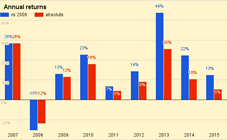
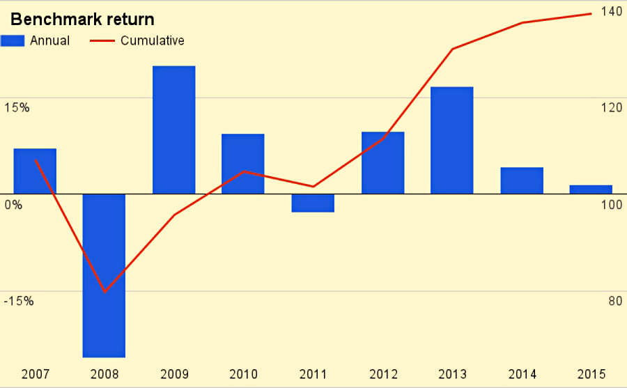
The next chart shows the returns by year. The labelling here could be confusing:
- the blue columns are comparisons to the 1st Jan 2007 baseline
- the red columns are comparisons to the previous year’s baseline
So the best year in money terms was 2013, when the portfolio made 44% of the Jan 2007 baseline, and the best year in percentage growth terms was 2007, when the portfolio made 28%.
There was only one down year – 2008.
Assets
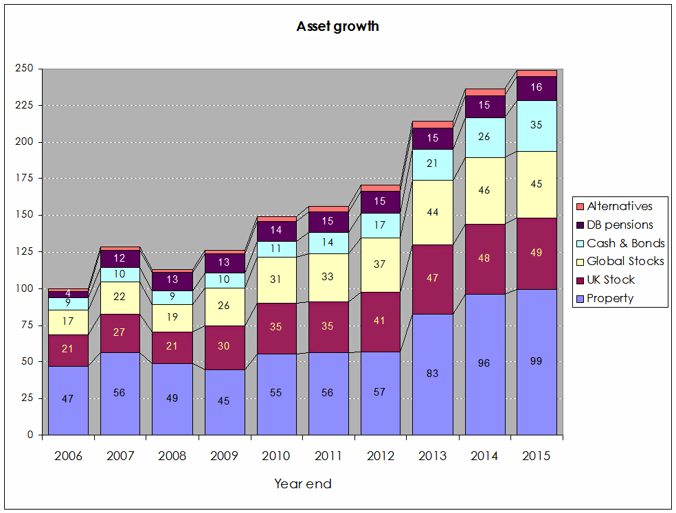
This chart should be familiar – it’s the regular chart I use for asset growth in the annual portfolio review, just extended out to cover the ten years.
- It interesting to note how the numbers change over the years – the property value today is the equivalent of the whole portfolio back in Jan 2007
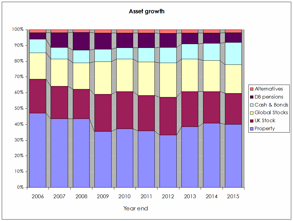
Despite this, the normalised version of the chart shows that the proportion of the portfolio held in property has actually fallen over the ten years.
- cash has increased, as I approached 55 and became more wary of the long equity bull market since 2009
- DB pensions have decreased – these are capitalised values that basically keep pace with inflation; since the portfolio has done better than that, their share of the total has fallen
Account types
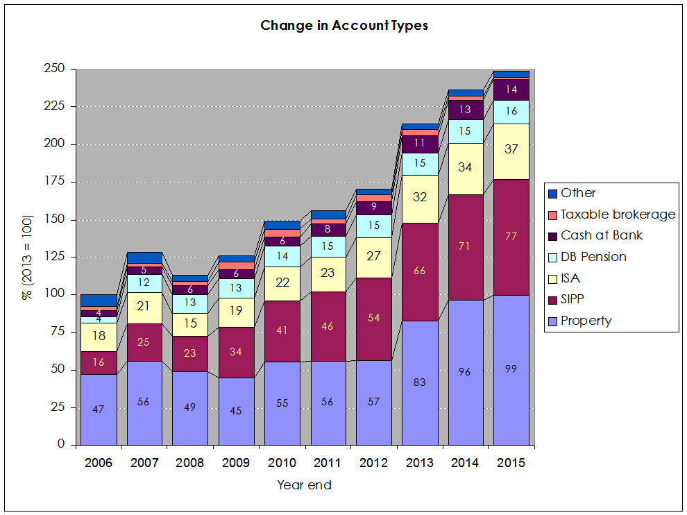
This is the other chart from the Annual Portfolio Review, which shows the changes in account types.
- SIPPs and ISAs look to be the big winners here.
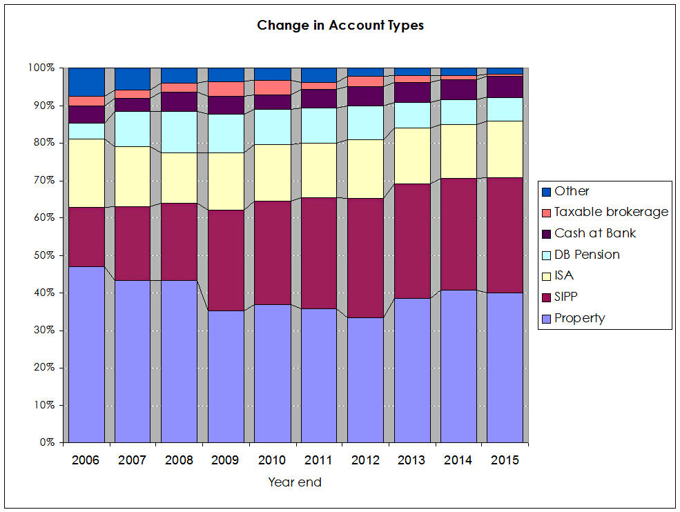
The normalised version confirms the growth in SIPPs, but ISAs have only held their own in percentage terms.
- ISAs have partly been the victim of cashflow issues – when cash is tight, money has gone to SIPPs first, because of the tax-relief.
- Cash has grown, but this is largely because of a big loan to an individual that I include here.
Property has fallen, DB pensions are shrinking, and taxable brokerage and “other” accounts have gradually been absorbed into the tax-advantaged accounts.
New money
Now back to the performance.
Annual compounded returns of 10.7% sound pretty good, but they are flattered by three things:
- new money added to the portfolio during the ten years
- inflation
- benchmark performance
So we’ll dig into each of these in turn, to see how well I really did.
New money is up first, since this is a straightforward boost to the bottom line.
- Inflation and benchmark performance are more complicated, since they are hurdles to beat, rather than steroids for the portfolio.
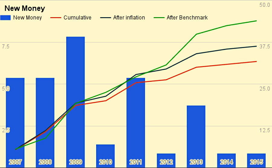
This chart shows the new money added by year, as percentages of the Jan 2007 portfolio value (left scale).
- The amounts drop off after 2011, when I stopped working (I didn’t work in 2010 either)
- 2009 and 2013 are boosted by small inheritances
The red line shows the cumulative amount added (right scale).
- The blue line is this red total boosted by cumulative inflation
- The green line is this red total boosted by cumulative growth in the portfolio’s benchmark
In Jan 2007 terms, the new money amounted to 31.7 out of the portfolio’s current value of 249.
- After inflation, this 31.7 became 36.3
- After benchmark growth, the 31.7 become 43.9
Inflation
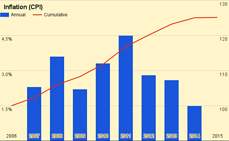
This chart shows UK inflation (CPI) over the period. It’s been one of the most benign periods of my life, with cumulative inflation over 9 years of 25.1%.
- That’s an annual compound rate of 2.5%
Benchmark
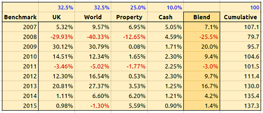
I’ve discussed the benchmark I use in previous Annual Portfolio Reviews – it’s a blend of UK stocks, international stocks, property and cash.
The numbers for the last 9 years are in the table above.
- 2008 was the worst year for the benchmark (-25.5%)
- 2009 was the best year (20%)
- Over the nine years the benchmark is up by 37.3%
- That’s an annual compound increase of 3.6%
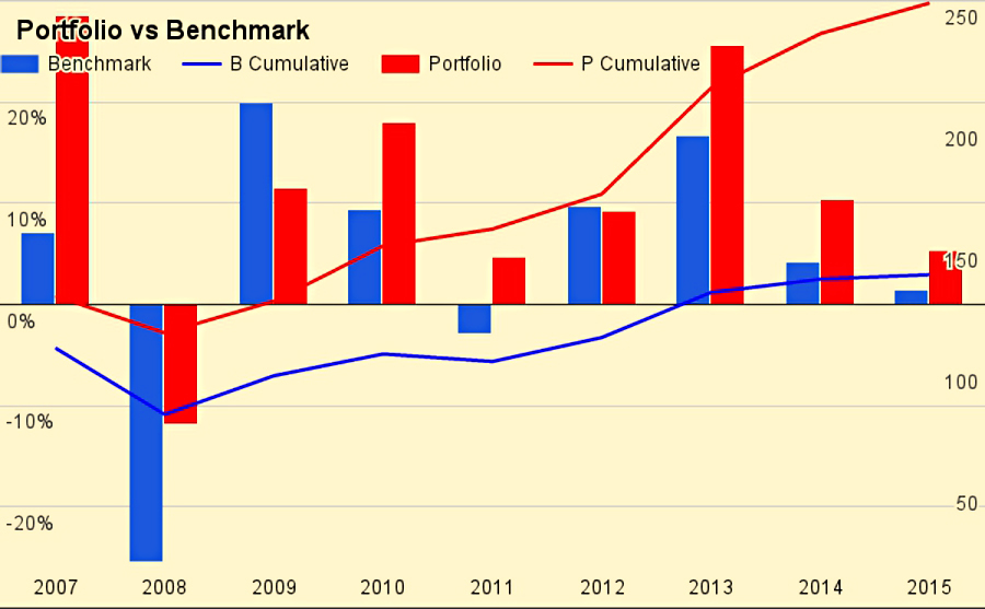
This chart shows the portfolio against the benchmark:
- the portfolio has never been behind the benchmark (red and blue lines, right scale)
- the portfolio has beaten the benchmark in six out of nine years
- cumulative performance of the portfolio is four times that of the benchmark (149% vs 37%)
Alpha
At this stage most people would be patting themselves on the back, but all we’ve done so far is look at each of the flattering factors in isolation.
- To work out how well we have been doing, we need to combine them.
Alpha is the (risk-adjusted) out-performance of an investment fund, used to work out how much value the fund manager has added with his decision-making.
- So lets compare the portfolio’s results with what would have happened if I’d done nothing.
First let’s look at inflation. In the chart above, the green area is the baseline portfolio from Jan 2007, with inflation applied.
- That’s what we needed to make just to keep pace with inflation.
The blue area is the new money we added to the portfolio during the nine years, with inflation applied each year.
- So our real target was to stay above the top blue line.
The red area is the difference between the portfolio value and that blue line.
- This is the extra money we’ve gained through investment decisions – the alpha.
We’ve done particularly well over the last few years, as inflation has fallen away but the portfolio has continued to make positive returns.
Inflation is a valid, but low, hurdle to beat. So what about our benchmark?
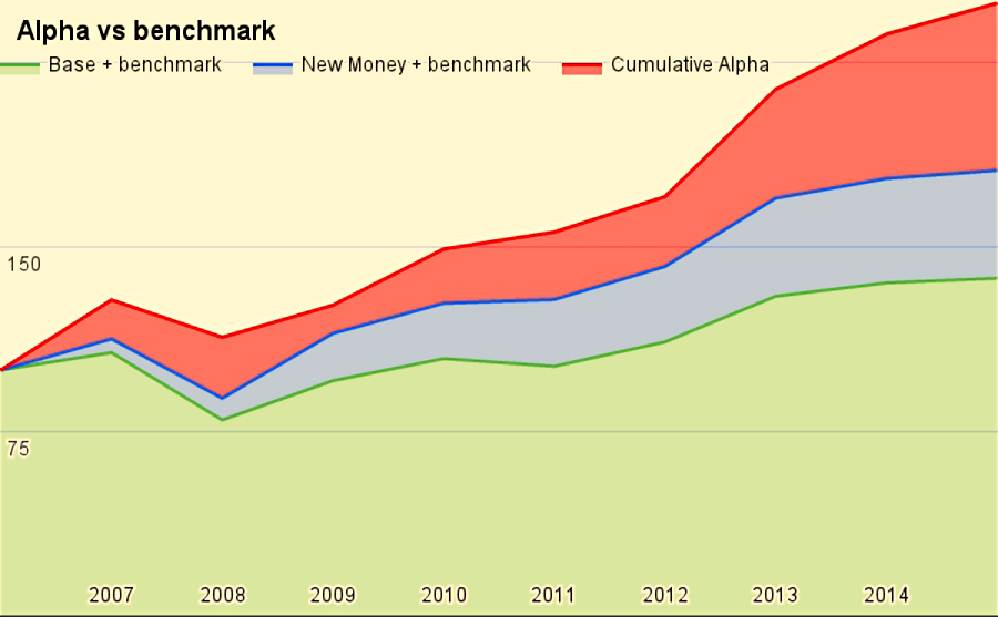
In some ways, the benchmark offers greater opportunities, since it has years when it falls, but over the nine years, the benchmark has easily beaten UK inflation.
- Once again, the green area is the Jan 2007 portfolio, grown in line with the benchmark.
- The blue area is new money added, grown in line with the benchmark.
- The red area is the value I’ve added – the alpha.
So of the current portfolio value of 249:
- 137 (55%) is down to the money we had back in Jan 2007
- 44 (18%) is down to money we added over the years
- 68 (27%) is alpha, generated by my investment decisions
In terms of the post-2006 growth of 149:
- 37 (25%) is is benchmark growth in the money we already had
- 44 (30%) is down to money we added over the years
- 68 (46%) is my alpha
Conclusions
I feel a lot happier with my boring diversified portfolio after this analysis:
- we’re up 149% over nine years
- annual compound returns averaged 10.7%
- we sailed smoothly through the 2008 financial crisis
- we’ve comfortably beaten inflation and our benchmark
Maybe slow and steady is okay after all.
Until next time.
Mike Rawson
Mike is the owner of 7 Circles, and a private investor living in London. He has been managing his own money for 40 years, with some success.