Annual Portfolio Review 2020

It’s that time of year again. Today we’ll be taking a look at how my overall portfolio performed last year. Stay tuned for the Annual Portfolio Review 2020.
Contents
Headlines
A few scene-setting points to begin:
- I run a large and well-diversified multi-asset portfolio.
- I’ve been in decumulation (retirement) for a few years and have dependents – so I can’t take on a high level of risk.
- I’m more interested in steady long-term compounding than in shooting the lights out during a good year for global stocks.
Our net worth increased by 9.2% in 2020 – my thirty-sixth up year in 37 years of investing.
- The listed portfolio was up by 10% and for once, the unlisted portfolio (property and DB pensions) also showed decent gains.
As usual, this result is not the stuff of Twitter legend, but I am content.
- The FTSE-All Share was down by more than a third in April, at which point I was down by less than 12%.
The All-Share recovered to -13.2%, so we are 22.5% ahead of that.
My benchmark returned 3.5%, so I have beaten that by 5.7%.
- Inflation was 0.7% and my theoretical target SWR is 3.3%, which gives a total target of 4% (easily beaten).
In practice, my actual withdrawal rate is around 0.7%, so my personal target would be 1.4% (again, easily beaten).
Because the portfolio is now a lot larger than it used to be, this is actually my third-best year ever in currency terms (pounds gained).
- My net worth increased by the equivalent of around twelve years of living expenses.
I now have around a net worth equivalent to 138 years of living expenses.
- With an average life expectancy for me and my partner of 27 years, (( The ONS calculator is a bit more pessimistic this year )) this gives a “death ratio” of 5.1 times.
Performance
We’re up 9.2%, and our average life expectancy has decreased by one year, so we’ve gained 9.9% on that basis (9.2% plus 0.7% for one year’s withdrawals).
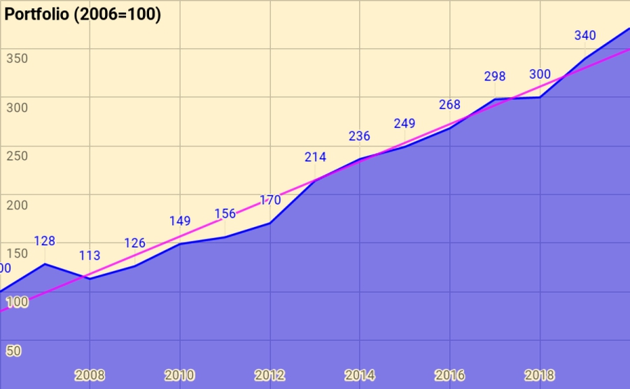
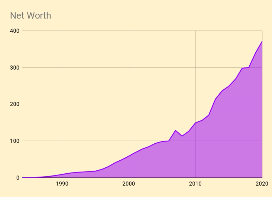
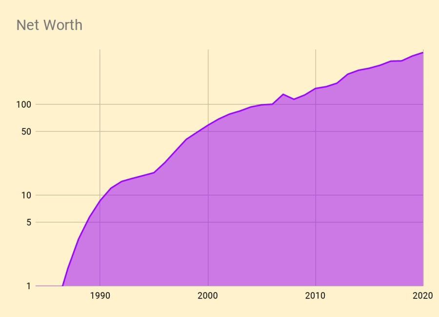
Rather than use UK currency, 2006 is baselined at 100, so that the portfolio is now worth 371 (up from 340 last year).
- Total growth over 14 years is 271%, or 9.8% compound pa.
This is acceptable given that it includes the 2007 financial crisis and thirteen years of low interest rates.
The chart below breaks the growth out into annual chunks:
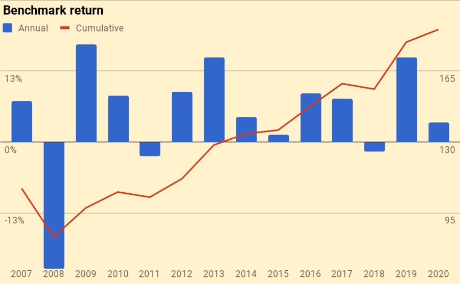
Benchmark
I use a composite benchmark made up of four items.
- It’s intended to be the average for a UK private investor aiming to reach financial independence.
It has four components:
- UK stocks – 20%
- International stocks – 35%
- UK residential property – 25%, and
- Cash/bonds – 20%
The weights start from allocating a target percentage to property and cash.
- I then divide the remainder between UK stocks and international stocks.
Note that I use DB pensions and cash rather than bonds proper (which I consider to be overvalued).
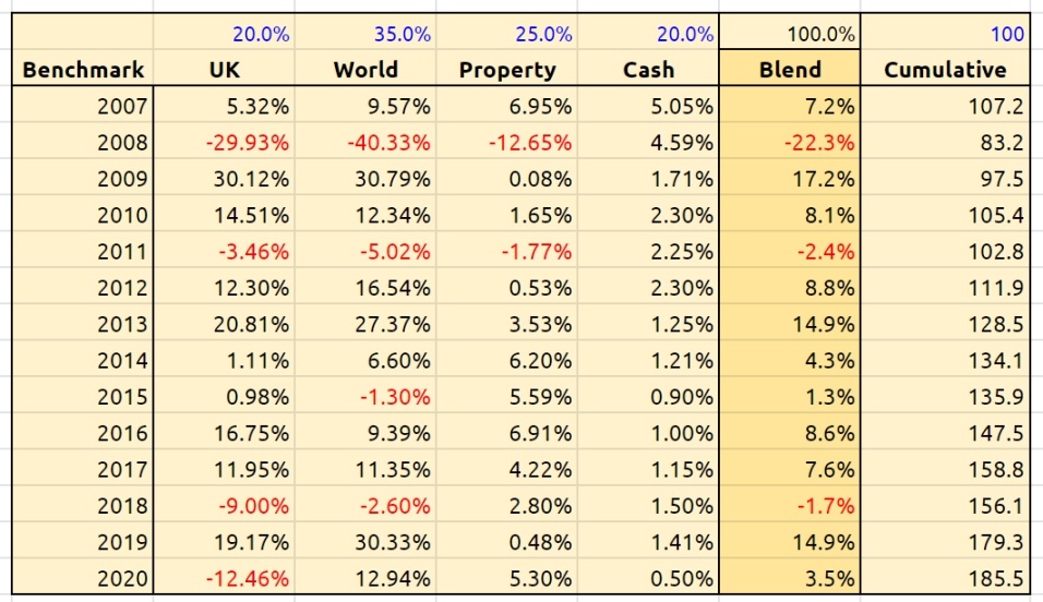
Over 14 years the benchmark is up 85.5%, or 4.9% pa.
- So my portfolio has on average outperformed by 4.9% pa (in nominal terms – see also the more detailed analysis below).
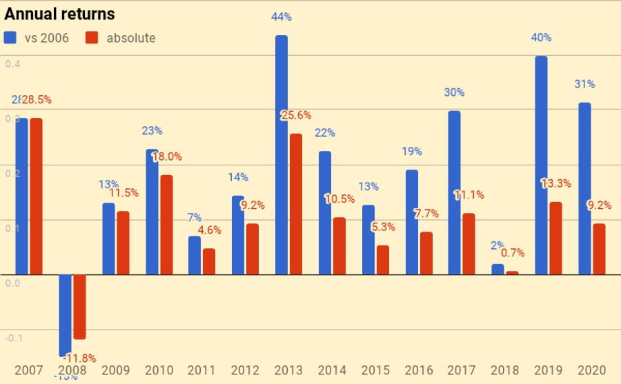
Here’s a year-by-year breakdown of the performance of the portfolio and the benchmark:

Asset allocation
Unlike many bloggers and Twitterati, I use a “total wealth” approach to my portfolio.
- This is primarily so that I maintain a high enough allocation to equities as I get older.

I use five high-level asset classes (targets are in brackets):
- Equities 40.9% (45%)
- Equity Alts 32.6% (30%)
- Bonds/Cash 9.5% (10%)
- Bond Alts 13.3% (10%)
- True Alts 3.6% (5%).
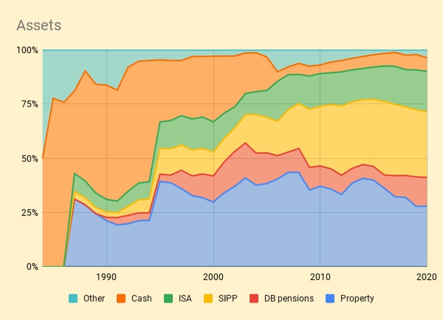
The second chart shows how these assets have grown over fourteen years.
- The split between UK and international stocks is now obsolete, but the numbers are otherwise pretty accurate.
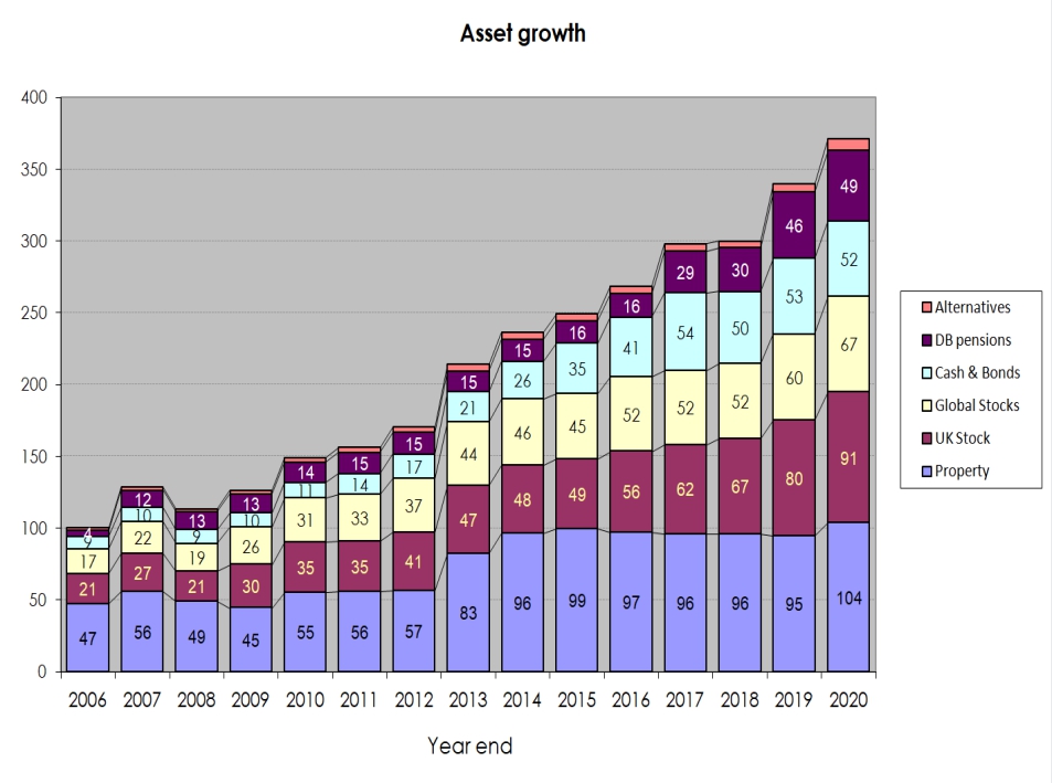
The third chart shows the same data in percentage terms rather than absolute numbers:

Portfolios
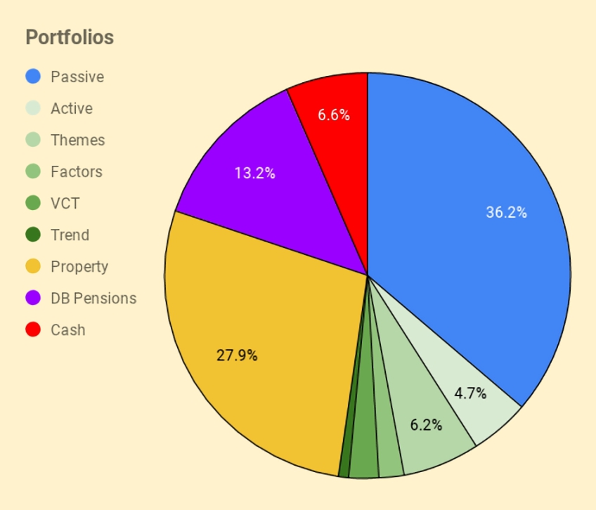
I have six listed portfolios:
- The core passive portfolio
- An active UK stock portfolio, split between AIM and the main market
- A theme portfolio (ESG, tech and biotech)
- A factor fund (smart beta) portfolio
- A VCT portfolio,
- And a trend-following (momentum) portfolio
I also have three non-listed “portfolios”:
- Property, including the house I live in
- DB pensions
- Cash
The table below maps the portfolios onto the high-level asset allocation that we’ve seen previously:
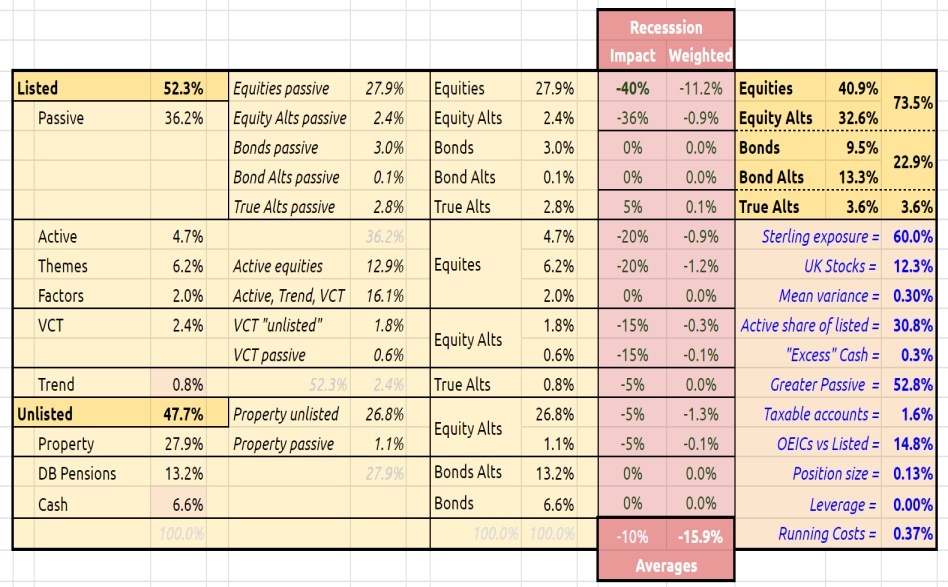
The red section is a stress test showing the impact of a 40% crash in global stock markets.
- Also worth noting are the running costs of the portfolio, now down to 0.37%.
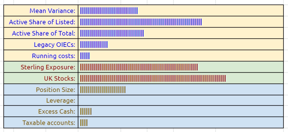
I’ve added a few bar chart indicators this year, but I’m not convinced they make things much clearer.
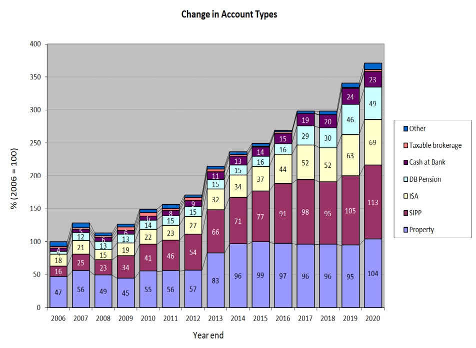
Accounts
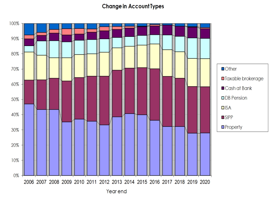
Apart from the 28% in property, another 49% is in SIPPs and ISAs (split 30%/19%).
- That’s 77% of the total accounted for.
The remainder is split between DB pensions (13%), Cash (7%), VCTs and taxable accounts.
The two charts below show how these account types have varied over the years, in absolute and relative terms:
New money
The long-term annual returns of 9.8% pa are flattered by three (overlapping) things:
- new money
- inflation
- the positive performance of the benchmark portfolio
Let’s look at new money first.
The chart below show the net extra contributions to the portfolio (from income and inheritance) or withdrawals (from pensions) by year:
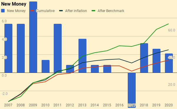
The chart also shows a cumulative total for the entire period (the red line), and then increases this to reflect inflation (blue line) and benchmark growth (green line).
- New money totals 35.9 of the total portfolio’s value of 371.
- After inflation, this rises to 43.5
- After benchmark growth, it rises to 62.6
Alpha vs inflation
The chart below shows inflation over the last fourteen years:
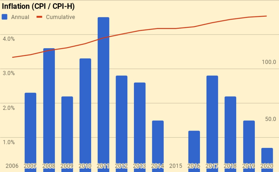
- Total inflation has been 36.0%, or 2.2% pa.
The second chart shows the portfolio against new money and inflation:
- the green area is the initial portfolio plus inflation
- the blue area is the new money added plus inflation
- the red area is the value added (alpha) from investment choices
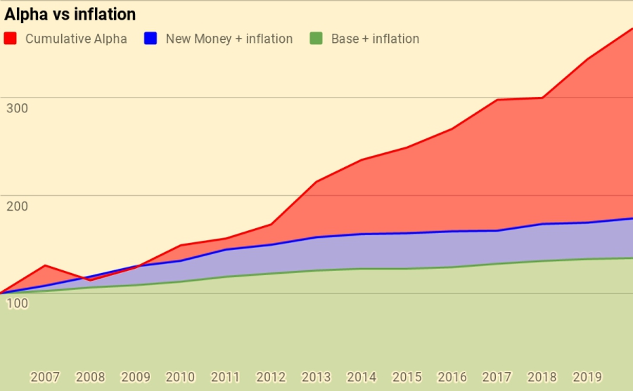
Of the current portfolio value of 371:
- 136 is the base portfolio plus inflation
- 43 is new money and inflation
- 192 is alpha
Alpha vs benchmark
The next chart shows the growth of the benchmark over the years:
The benchmark is up 85.5%, or 4.9% pa.
The final chart is the portfolio against new money and the benchmark:
- the green area is the initial portfolio plus benchmark growth
- the blue area is the new money added plus benchmark growth
- the red area is the value-added (alpha) from investment choices away from the benchmark portfolio
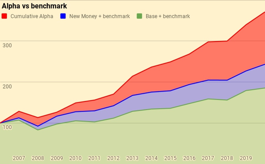
Of the current portfolio value of 371:
- 185 is the base portfolio plus benchmark growth
- 63 is new money and benchmark growth
- 123 is alpha
Counterparties
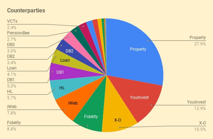
This year I have bitten the bullet and compiled a complete table of counterparties.
Counterparties to whom I expect to increase my exposure in 2021 include:
- Fidelity
- Trading 212
- Freetrade
- IG
Turnover
I didn’t get around to adding turnover analysis this year, but I estimate that I trade around 25% to 30% of my listed portfolio (12% to 15% of my total net worth) each year.
- That translates to an average holding period of somewhere between 3 and 8 years, depending on how you look at things.
This is, of course, an average, and includes positions which I have held for 30 years as well as others which are only open for a few days or weeks.
Snowball
I’ve also updated the snowball charts from the post I wrote last February.
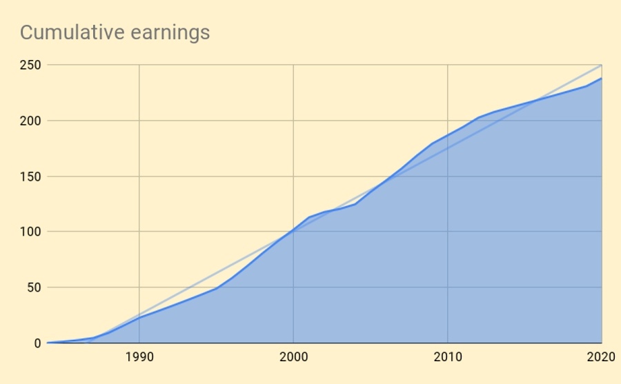
Here are our cumulative earnings.

And here is the chart of the rolling 10-year average.
Here is the net worth snowball.
Here is the exponential version.
And here’s the breakdown by assets.
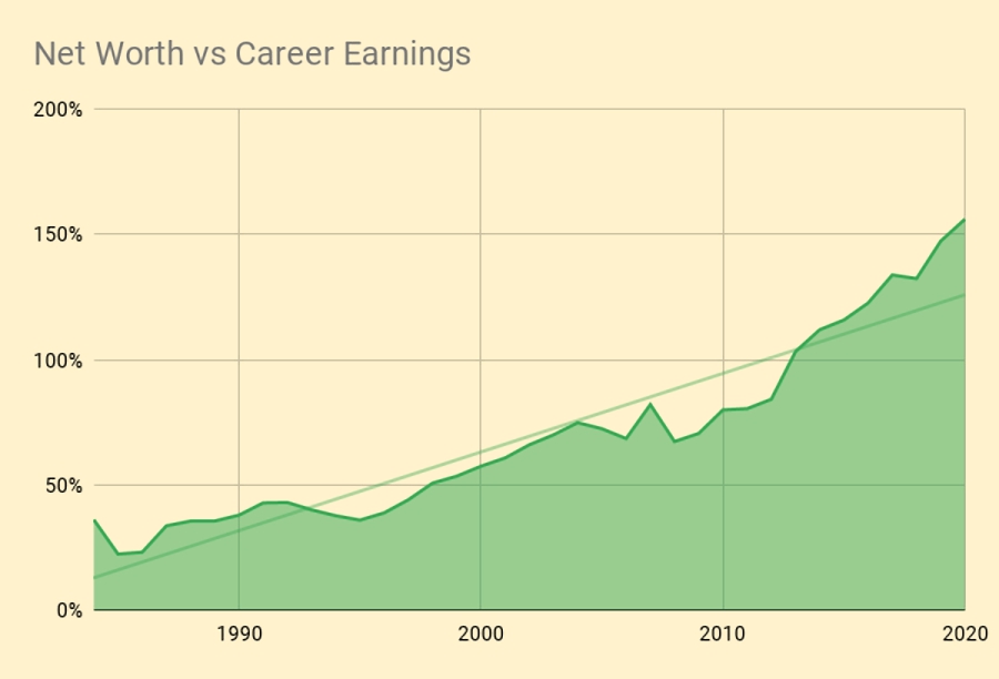
Here’s a chart of net worth compared to cumulative career earnings.

And here are the annual portfolio fluctuations as a percentage of salary.
Conclusions and outlook
That’s it for today.
- This has been another good year in financial terms, even if in lots of other ways it has been one of the worst I’ve had to live through (so far).
Until next time.
Mike Rawson
Mike is the owner of 7 Circles, and a private investor living in London. He has been managing his own money for 40 years, with some success.


A couple of quick Q’s if I may:
1) are you using CPIH (Sept – Sept) as your annual inflation measure now?
2) have you had a change of heart re Fidelity and/or iWeb, and if so why?
Thanks
Hi Al,
1) I try to publish in the first week of Jan and I just use the latest data available. I’m not sure why I couldn’t find the November CPIH figure (or even the October one) when I was writing the post. Some other stats are delayed by Covid, compared to 2019 (eg. house prices), so I probably found it easier to accept the stale number.
I’ll put the revised number in the underlying spreadsheet so that we catch up next year, but I can’t be bothered to reprint the charts for a 0.1% error in my favour.
2) I never went off iWeb, it’s just that the X-O accounts have done better over the last year, and I’m currently putting my ISA money into T212.
I have changed my mind about Fidelity as the “new” SIPP that I have been transferred to is easy to manage and very cheap for a core portfolio.
I’ve also changed my mind about PensionBee (which underperformed badly this year) and might move that account over to Fidelity.
Mike
Thanks for the prompt reply.
Re 1) OK – I asked because a lot of DB’s and Govt Depts use Sept to Sept inflation measure.
The snowball updates are a good addition too.
And, of course, all the best for 2021!
Thanks for such deep analysis. I wondered whether you had invested in bonds directly? And if so – how you would go about this?
Not really – I have DB pensions and cash instead, plus a tiny amount (less than 1%) of OEIC bond funds in my legacy accounts. I wouldn’t personally be looking to buy bonds right now as I expect inflation and interest rate rises.
Buying bonds direct is hard at private investor deal sizes. You can look at the ORB (Order Book for Retail Bonds) on the LSE, or at a service like Wise Alpha, which lets you buy slices of bonds. But you are probably better off with ETFs.