Annual Portfolio Review 2021

It’s that time of year again. Today we’ll be taking a look at how my overall portfolio performed last year. Stay tuned for the Annual Portfolio Review 2021.
Contents
Headlines
Let’s start with the usual scene-setting:
- I run a large and well-diversified multi-asset portfolio.
- I’ve been in decumulation (retirement) for quite a few years and I have dependents – so I can’t take on a high level of risk.
- I have a decent amount of non-listed assets (45% of property and DB pensions) which limits my risk asset exposure (equities are usually at close to 40%).
- I’m more interested in steady long-term compounding than in shooting the lights out during a good year for global stocks.
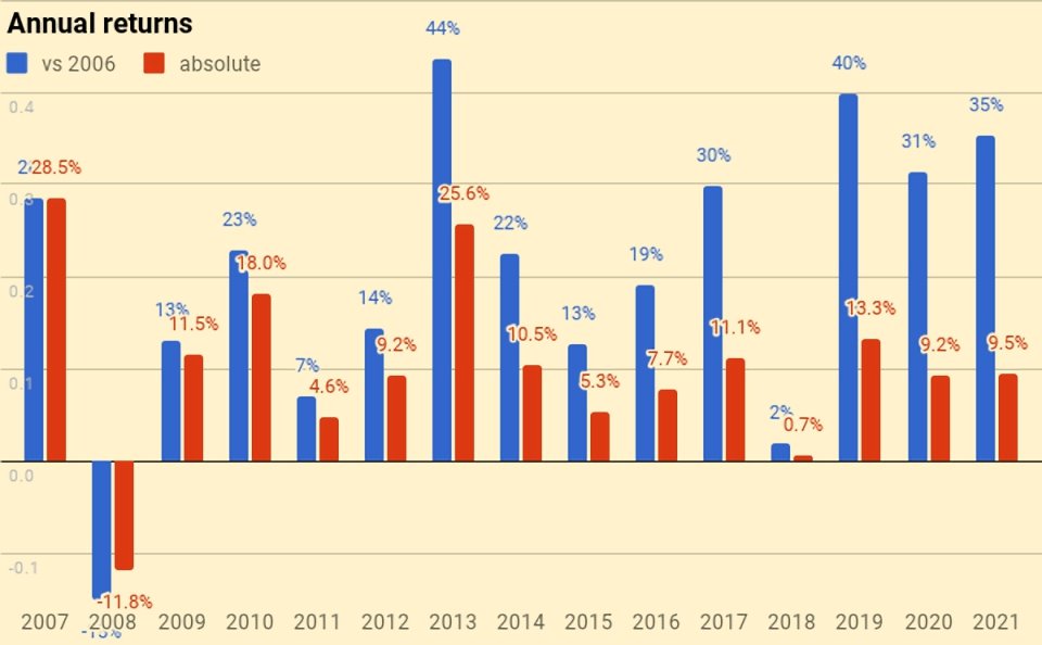
Our net worth increased by 9.5% in 2021 – my thirty-seventh up year in 38 years of investing.
- The listed portfolio was up by 13.7% but the unlisted portfolio (in particular, property) did less well.
Most of the stockpickers on Twitter are reporting much bigger gains than me, but as usual, I am happy.
- Compounding at sub-10% pa has allowed me to retire early, and I don’t ever expect to run out of money.
My blended benchmark was up 11.9%, so I am a couple of percentage points down this year.
- UK Inflation increased significantly but closed the year at 4.6%, so adding on my target SWR of 3.3% gives a target of 7.9%, which we have beaten.
In practice, my actual withdrawal rate is around 0.7%, so my personal target would be 5.3% (again, easily beaten).
Because the portfolio is now a lot larger than it used to be, this is actually my third-best year ever in currency terms (pounds gained).
- My net worth increased by the equivalent of around thirteen years of living expenses. (( I’m using my 2019 level of expenditure here since Covid has meant that I am currently spending quite a bit less ))
I now have around a net worth equivalent to 151 years of living expenses.
- With an average life expectancy for me and my partner of 26 years, this gives a “death ratio” of 5.8 times (up from 5.1 times last year).
Performance
We’re up 9.5%, and our average life expectancy has decreased by one year, so we’ve gained 10.2% on that basis (9.5% plus 0.7% for one year’s withdrawals).
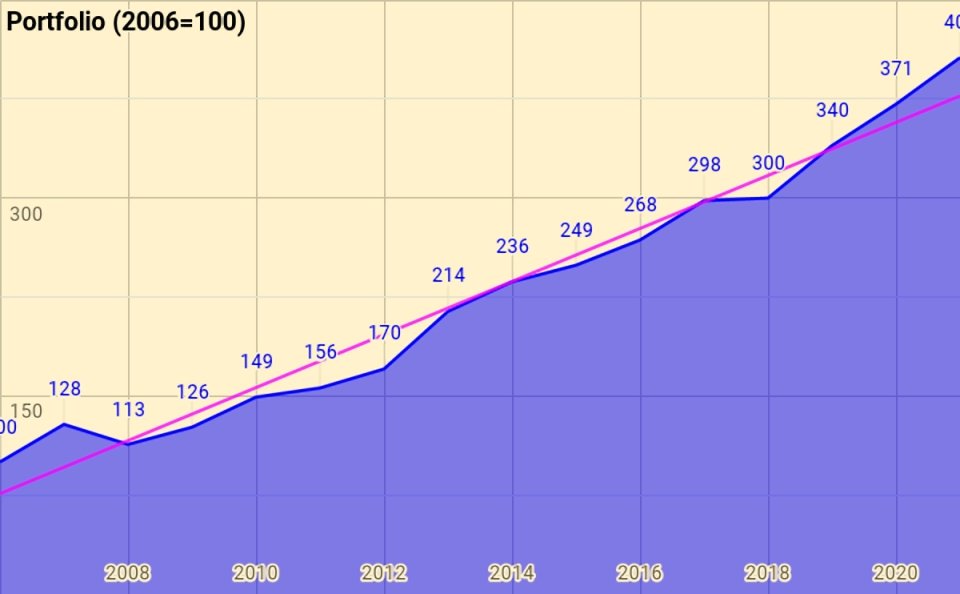
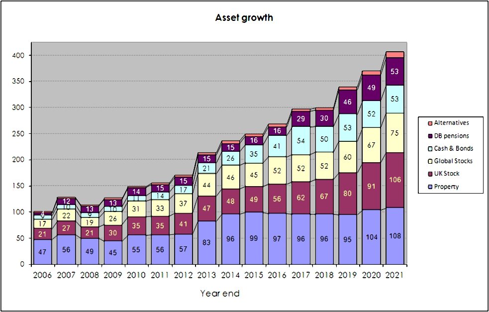
Rather than use UK currency, 2006 is baselined at 100, so that the portfolio is now worth 406 (up from 371 last year).
- Total growth over 15 years is 306%, or 9.8% compound pa.
This is acceptable given that it includes the 2007 financial crisis and thirteen years of low interest rates.
The chart below breaks the growth out into annual chunks:
Benchmark
I use a composite benchmark made up of four items.
- It’s intended to be the average for a UK private investor aiming to reach financial independence.
It has four components:
- UK stocks – 20%
- International stocks – 35%
- UK residential property – 25%, and
- Cash/bonds – 20%
The weights start from allocating a target percentage to property and cash.
- I then divide the remainder between UK stocks and international stocks.
Note that I use DB pensions and cash rather than bonds proper (which I consider to be overvalued).
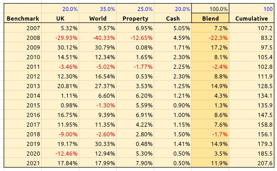
Over 15 years the benchmark is up 107.6%, or 5.0% pa.
- So my portfolio has on average outperformed by 4.8% pa (in nominal terms – see also the more detailed analysis below).
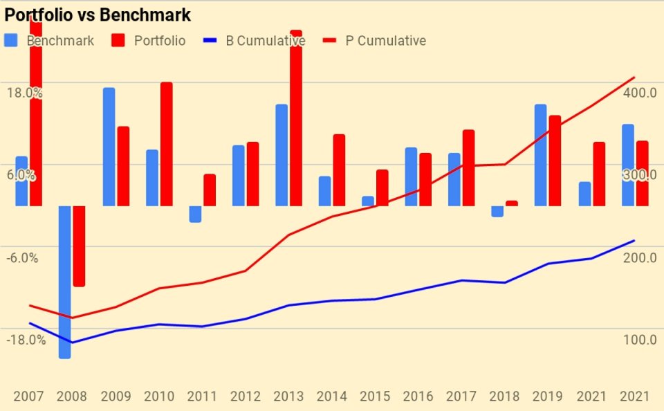
Here’s a year-by-year breakdown of the performance of the portfolio and the benchmark:
Asset allocation
Unlike many bloggers and Twitterati, I use a “total wealth” approach to my portfolio.
- This is primarily so that I maintain a high enough allocation to equities as I get older.

I use five high-level asset classes (last year in brackets):
- Equities 40.9% (40.9%)
- Equity Alts 32.2% (32.6%)
- Bonds/Cash 7.4% (9.5%)
- Bond Alts 13.7% (13.3%)
- True Alts 5.7% (3.6%).
The second chart shows how these assets have grown over fourteen years. (( The split between the UK and international stocks is now obsolete, but the numbers are otherwise pretty accurate ))
The third chart shows the same data in percentage terms rather than absolute numbers:

Portfolios
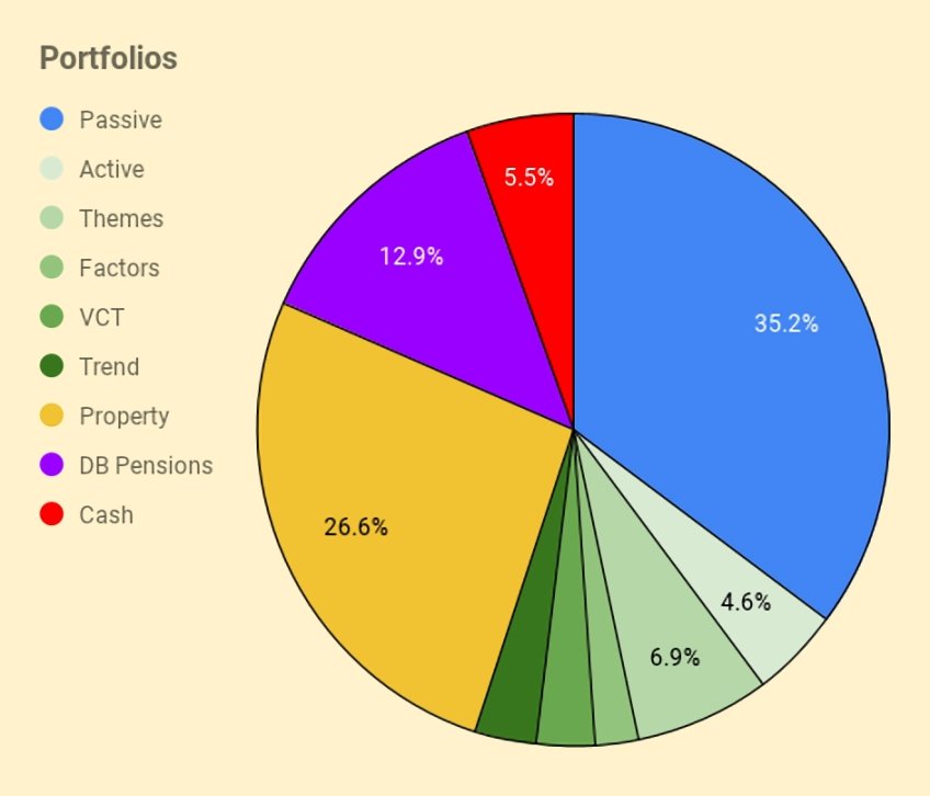
I have six listed portfolios:
- The core passive portfolio
- An active UK stock portfolio, split between AIM and the main market
- A theme portfolio (ESG, tech and biotech)
- A factor fund (smart beta) portfolio
- A VCT portfolio,
- And a trend-following (momentum) portfolio
I also have three non-listed “portfolios”:
- Property, including the house I live in
- DB pensions
- Cash
The table below maps the portfolios onto the high-level asset allocation that we’ve seen previously:
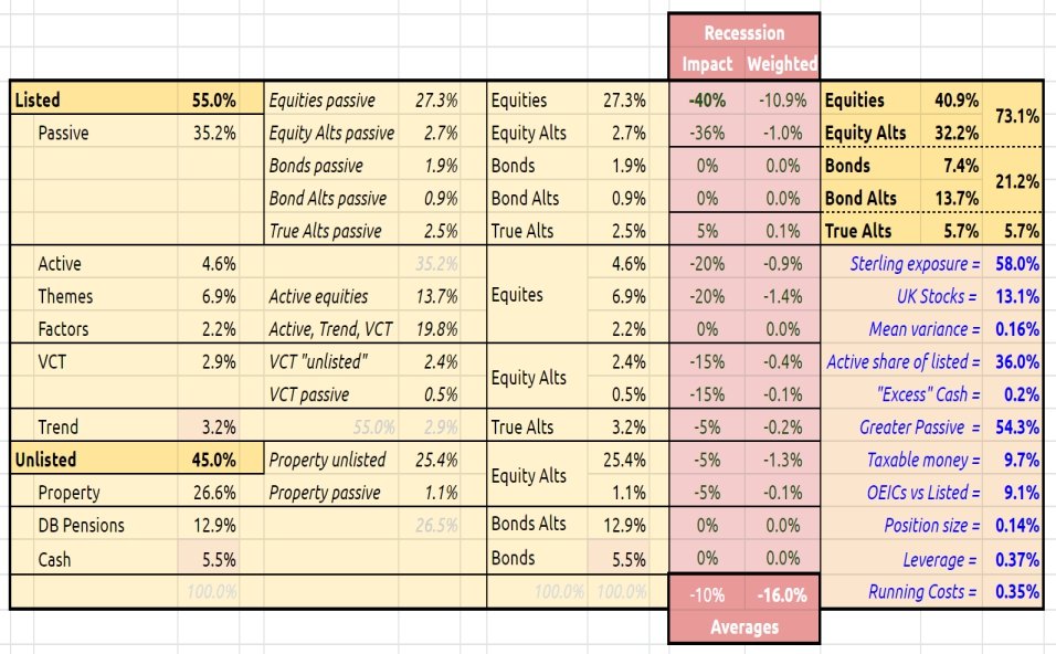
The red section is a stress test showing the impact of a 40% crash in global stock markets.
- Also worth noting are the running costs of the portfolio, now down to 0.35%.

I’ve added a few bar chart indicators, but I’m not sure they make things much clearer.
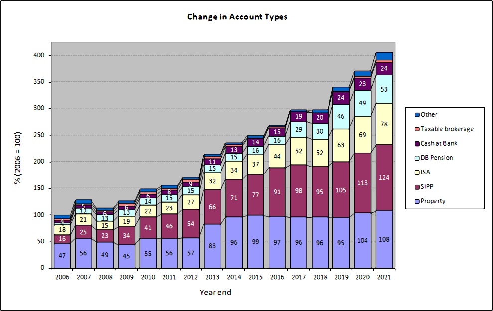
Accounts
Apart from the 27% in property, another 50% is in SIPPs and ISAs – that’s 77% of the total accounted for.
- The remainder is split between DB pensions (13%), Cash (6%), VCTs and taxable accounts.
The two charts below show how these account types have varied over the years, in absolute and relative terms:

New money
The long-term annual returns of 9.8% pa are flattered by three (overlapping) things:
- new money
- inflation
- the positive performance of the benchmark portfolio
Let’s look at new money first.
The chart below show the net extra contributions to the portfolio (from income and inheritance) or withdrawals (from pensions) by year:
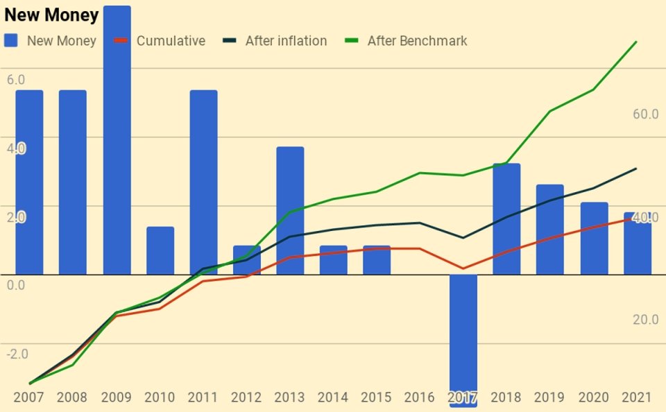
The chart also shows a cumulative total for the entire period (the red line), and then increases this to reflect inflation (blue line) and benchmark growth (green line).
- New money totals 42.1 of the total portfolio’s value of 406.
- After inflation, this rises to 47.3
- After benchmark growth, it rises to 72.0
Alpha vs inflation
The chart below shows inflation over the last fifteen years:
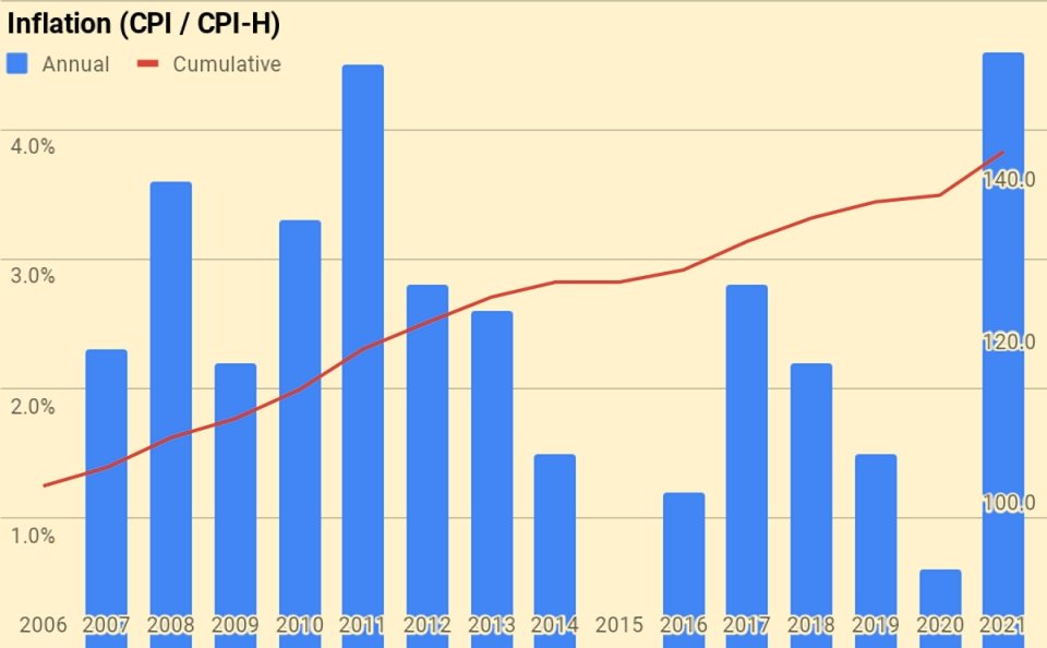
- Total inflation has been 41.3%, or 2.3% pa.
The second chart shows the portfolio against new money and inflation:
- the green area is the initial portfolio plus inflation
- the blue area is the new money added plus inflation
- the red area is the value-added (alpha) from investment choices
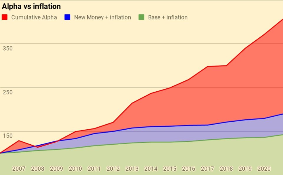
Of the current portfolio value of 406:
- 142 is the base portfolio plus inflation
- 47 is new money and inflation
- 217 is alpha
Alpha vs benchmark
The next chart shows the growth of the benchmark over the years:
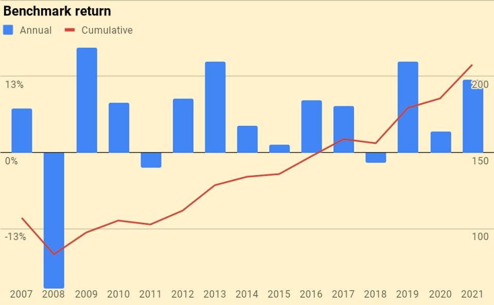
The benchmark is up 107.6%, or 5.0% pa.
The next chart is the portfolio against new money and the benchmark:
- the green area is the initial portfolio plus benchmark growth
- the blue area is the new money added plus benchmark growth
- the red area is the value-added (alpha) from investment choices away from the benchmark portfolio
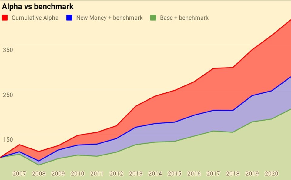
Of the current portfolio value of 406:
- 208 is the base portfolio plus benchmark growth
- 72 is new money and benchmark growth
- 127 is alpha
Counterparties
Here’s the complete pie of counterparties.

Counterparties to whom I expect to increase my exposure in 2022 are:
- “Trading Apps” (Trading 212, Stake, Lightyear, IG, eToro, IB).
Turnover
I still haven’t got around to adding turnover analysis.
I’ll stick with last year’s guesstimate that I trade around 25% to 30% of my listed portfolio (12% to 15% of my total net worth) each year.
- That translates to an average holding period of somewhere between 3 and 8 years, depending on how you look at things.
This is, of course, an average, and includes positions that I have held for 30 years as well as others that are only open for a few days or weeks.
Snowball
I’ve also updated the snowball charts from the post I wrote in February 2020.

Here are our cumulative earnings.
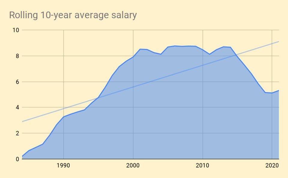
And here is the chart of the rolling 10-year average.

Here is the net worth snowball.
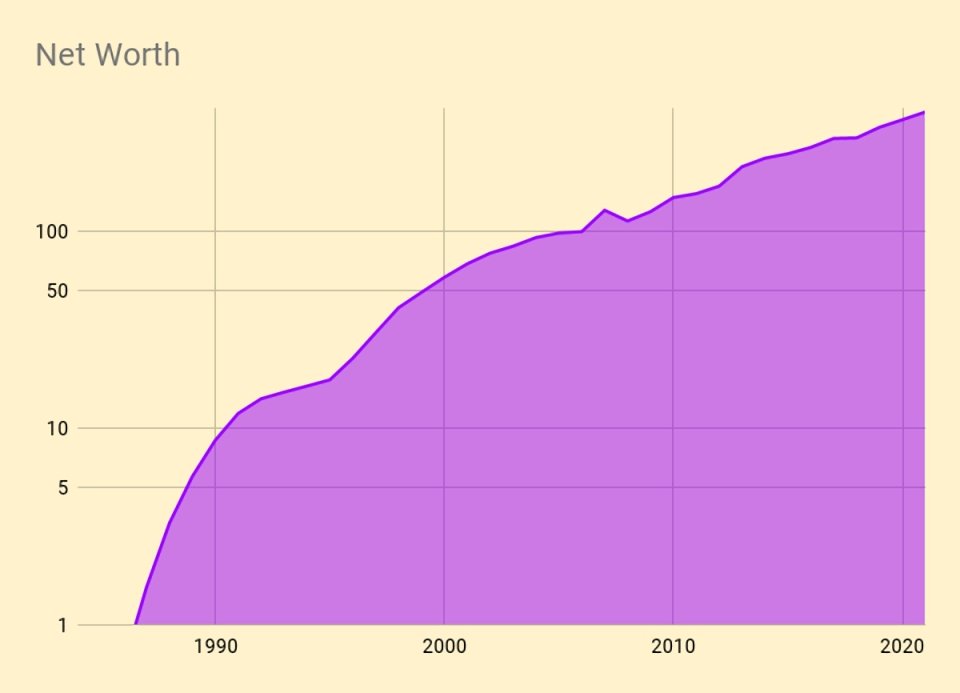
Here is the exponential version.

And here’s the breakdown by assets.
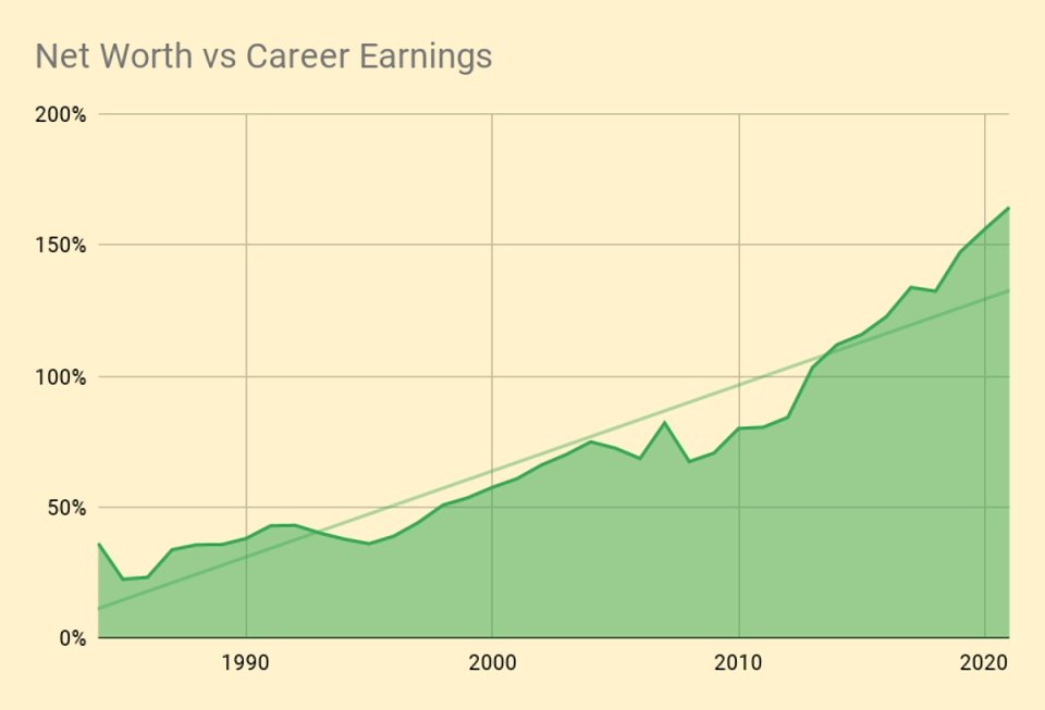
Here’s a chart of net worth compared to cumulative career earnings.
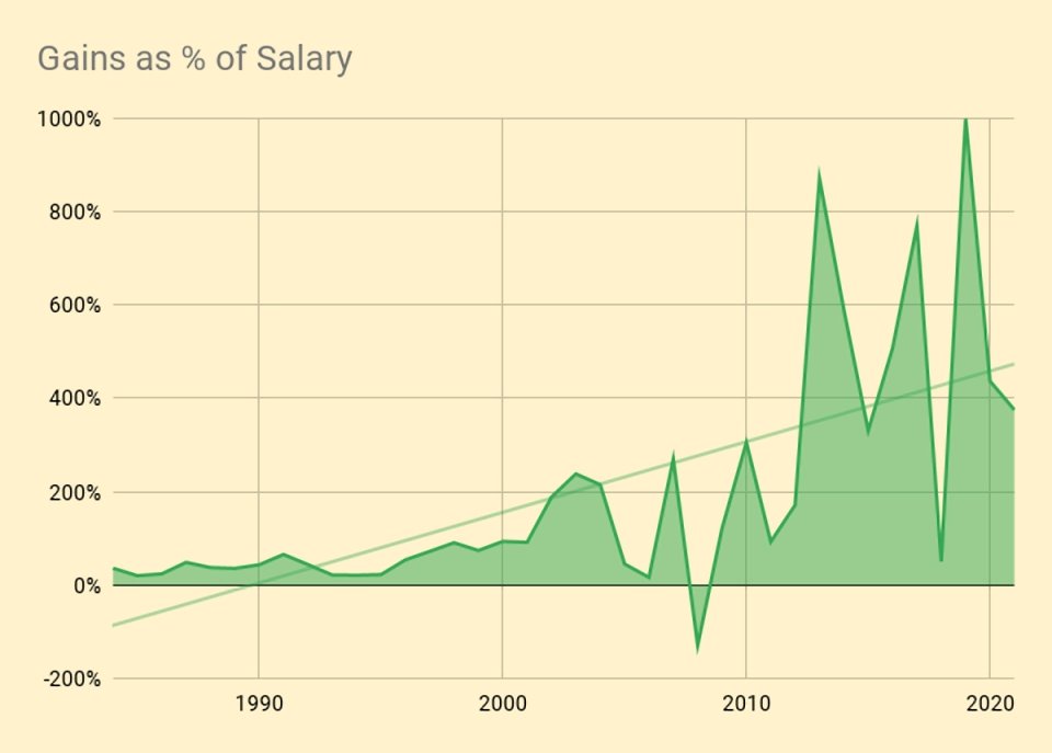
And here are the annual portfolio fluctuations as a percentage of salary.
Daily returns
During 2021I tracked daily changes in valuation for the first time.
- I’m more interested in volatility than actual returns.
I also want to see how much my listed portfolio varies against my overall net worth and against my tailored benchmark.
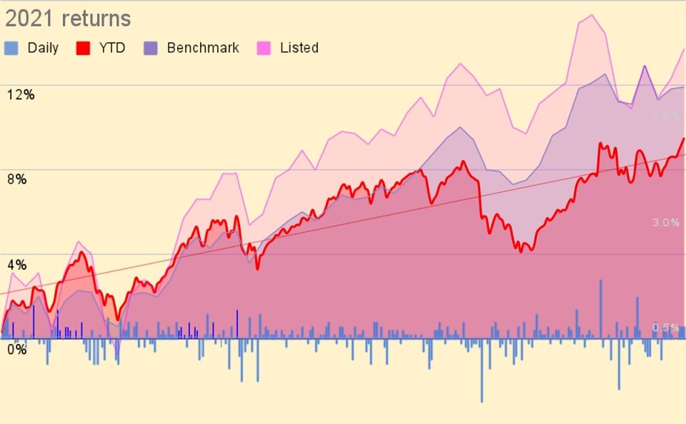
Here are the daily and cumulative movements.

And here is a distribution of daily returns, to which I have fitted a polynomial curve.
- The daily movements appear very small – the best day was +1.4% and the worst was -1.5%.
Most days are in the -0.1% to +0.3% range.
- It should be noted that since my annual living expenses (my withdrawal rate) are just 0.7%, the daily movements still feel pretty lively to me.
I also calculated a Sharpe Ratio from the daily movements, which was 1.7 (pretty good).
Conclusions and outlook
That’s it for today.
- This has been another good year in financial terms, and a boring one in life terms.
But we’re better off in January 2022 than a year ago, and things should improve through this year.
- Until next time.
Mike Rawson
Mike is the owner of 7 Circles, and a private investor living in London. He has been managing his own money for 40 years, with some success.


Very interesting.
A question please.
You are clearly still accumulating (growing your assets) even though you have been retired for a number of years. How do the rates of growth prior to and post your retirement date compare – I think they may be fairly similar from the “Performance” graphic and wandered what, if anything, this might indicate beyond “I don’t ever expect to run out of money”?
That depends on how far back you want to go. If you look at the exponential chart in the snowball section, the rate of growth in the early years was much higher. But for the last 15 years, it’s been pretty consistent. I think that reflects two things – a well-diversified portfolio and benign investing conditions since I retired.
If I had known how well the last decade would go, I would have quit sooner. I don’t expect the next decade to go nearly as well, but with a withdrawal rate of 0.7% pa, it’s always possible that I will continue to accumulate.
Thanks.
Crystal balls are still in short supply!
Putting aside the early years growth spurt, I think it is also notable how little impact the removal of your salary has had over the last 15 years. Of course, this may have been more noticeable had you been using a higher withdrawal rate (WR). Lastly, as your DB and state pensions come on stream will your absolute withdrawal needs reduce?
1 – I didn’t quit until the annual variation in the pot size was large relative to salary, so I didn’t expect its removal to have a massive impact (I think if you do expect this, you might not be ready to quit). Salary is important at the start (so that you can live within it and save) but investing is more important at the end.
2 – My DB & state pensions are capitalised in the pot size so the impact will be felt there. The nominal withdrawal amount won’t change but if the pot shrinks, the annual percentage withdrawal might rise. Conversely, if the pot grows, the percentage withdrawal might shrink. I am already using one of the DB pensions alongside a SIPP, and the next comes on stream during 2022.
Thanks again.
Re 1 – I do recall you explained this in your original snowball post – although, I suspect a lot of folks would struggle to ever reach that point
Re 2 – OOI, how do you nominally value pensions that you are drawing?
I use an average of six methods:
– PV of future cash flows, discounted at the 10-year Gilt yield
– Dividend yield from the FTSE-350 (how much to buy this income?)
– Using my failsafe withdrawal rate (3.33% pa, not the actual 0.7%)
– An annuity calculation based on the cashflows
– A reverse annuity valuation from the current yields available in the UK
– The 20 times rule used by the government to value DB pensions against the LTA
I used to also use the 10-year Gilt rate directly, but yields got too low (even today that calculation is more than double the next highest value).
Is it easier just buying the QQQ or SPY?
Easier in terms of the initial purchase and subsequent maintenance, yes. Not so easy to hold on through decades of volatility.
These one-fund solutions are popular with young people and those with small portfolios, less so with richer and older investors. Similarly the 100% allocation to equities.
I’ve never met anyone with significant wealth who has a 100% allocation to stocks, or anything close to that, let alone just a single fund.