Annual Portfolio Review 2016

It’s that time of year again. Today we’ll be taking a look at how my overall portfolio performed last year. Stay tuned for the Annual Portfolio Review 2016.
Contents
Headlines
2016 was a funny year in more ways than one.
- It was dominated by macro events (Brexit, Trump and the lack of interest rate rises) and so I stayed largely on the sidelines, making few trades in either direction.
- I did a few trades in some experimental portfolios (SmallCap and Bonkers) but these won’t materially affect my results for the year.
Inaction wasn’t a terrible approach last year, assuming that you already had a good asset allocation strategy (which included global diversification).
- Sterling collapsed after the Brexit vote, pushing up the value of foreign stocks and big firms in the FTSE-100 with lots of foreign earnings.
My overall portfolio is up 7.7% for 2016, which is slightly below its benchmark.
- My stocks were up around 15% in capital terms (a bit more after including dividends) which was better than the benchmark.
- I let the dividends roll into the cash total, so it looks as though cash outperformed, but it didn’t.
- What really held me back was property.
In absolute terms, this year has been perfectly fine.
- It’s a fairly big portfolio, and 7.7% equates to between seven and nine years of living expenses (depending on how frugal I’d like to be).
- It’s also a lot more than I ever earned in a year by working for somebody else.
So there’s no need to worry about a result like this.
- Last year I was concerned about a 5.3% return that had easily beaten its benchmark.
- I’m in danger of sounding like a glass-half-empty guy.
Note to self: one-year performance relative to a benchmark is not something to get worked up about.
I have close to 40% of my wealth in property because of the strong appreciation in London over the past decade and more.
- This year the outperformance of London went into reverse.
- The regions did well, and because of the way the index is calculated (transactionally, rather than on the value of the base) this mean that the national index was also positive.
Not only did my bits of London go down, but the outperformance in recent years means that I’m overweight in property compared to my benchmark.
- I’m also overweight in cash, which dampens returns in absolute terms, but not particularly against the benchmark.
Ten-year growth
Here’s what the growth of the portfolio looks like over the last 10 years:
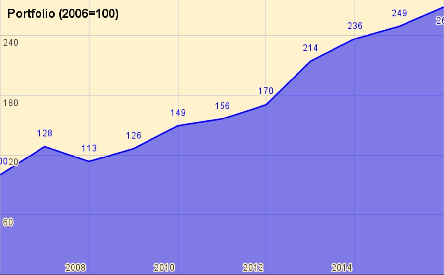
Rather than use UK currency, 2006 is baselined at 100, so that the portfolio is now worth 268.
- Thus total growth over 10 years is 168%, or 10.4% pa.
- This is acceptable given that it includes the 2007 financial crisis, and eight years of low interest rates.
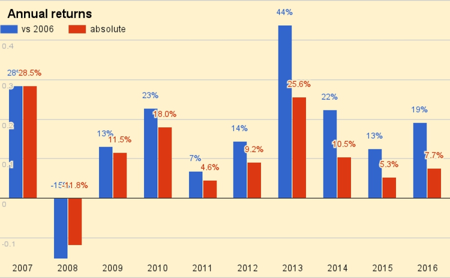
The chart below breaks the growth out into annual chunks:
Benchmark
I use a composite benchmark made up of four items:
- UK stocks – 32.5%
- International stocks – 32.5%
- UK residential property – 25%, and
- Cash – 10%
The weights come from allocating a target percentage to property and cash – intended to be average for a UK private investor aiming to reach financial independence – and dividing the remainder between UK stocks and international stocks.
- I exclude bonds because I don’t hold any at the moment – I’ve long been waiting for the market to crash – and I use a higher than normal cash balance instead.
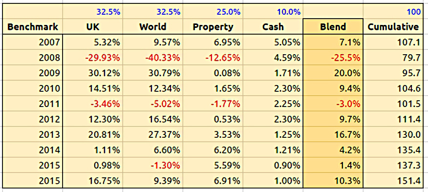
The benchmark had a good year – it was up 10.3%.
- Over 10 years the benchmark is up 51.4%, or 4.2% pa.
So my portfolio has on average outperformed by 6.2% pa (in nominal terms – see also the more detailed analysis below).
Here’s a year-by-year breakdown of the performance of the portfolio and the benchmark:

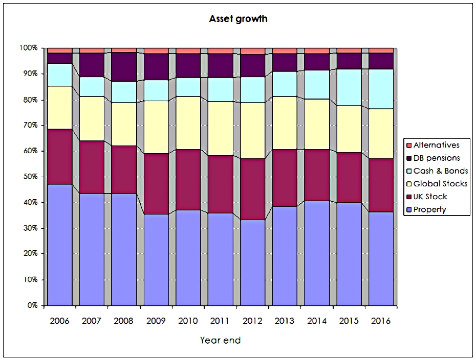
Asset allocation

The weights have switched a little since last year:
- Property is down from 39.9% to 36.3%
- UK stocks are up from 19.6% to 21%
- International stocks are up from 18.3% to 19.3%
- Cash and bonds (almost entirely cash) is up from 14% to 15.4%
- DB pensions are down from 6.3% to 6.1%, and
- Alternatives are up from 1.8% to 2.0%
The second chart shows how these assets have grown over the ten years:

The third chart shows the same data in percentage terms rather than absolute numbers:
Account types
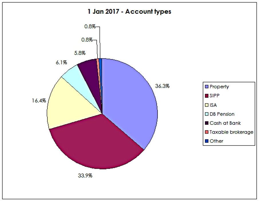
Apart from the 36.3% in property, another 33.9% is in SIPPs and 16.4% is in ISAs.
- That’s 87% of the total accounted for.
The remainder is split between DB pensions (6.1%), Cash (outside tax shelters, at 5.8%) and other taxable accounts (1.6%).
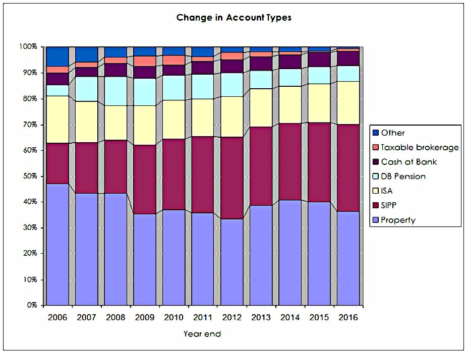
The two charts below shows how these account types have varied over the years, in absolute and relative terms:

New money
Now let’s dig down into the performance a little.
The annual returns of 10.4% pa are flattered by three things:
- new money
- inflation
- the positive performance of the benchmark portfolio
Let’s look at new money first.
The chart below show the extra contributions to the portfolio (from income and inheritance) by year:
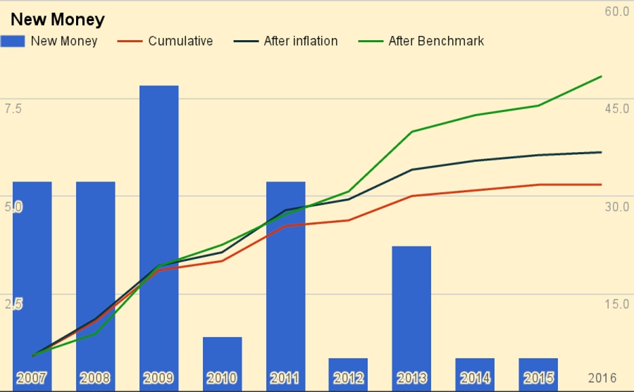
It also shows a cumulative total for the entire period (the red line), and then increases this to reflect inflation (blue line) and benchmark growth (green line).
- New money totals 31.7 of the total portfolio’s value of 268.
- After inflation this rises to 36.7.
- After benchmark growth, it rises to 48.4.
Alpha vs inflation
The chart below shows inflation over the last ten years:
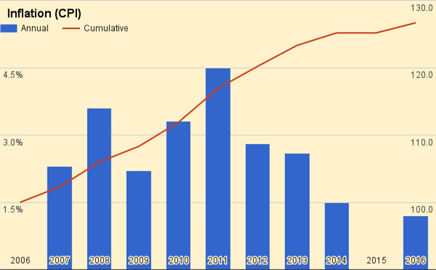
Total inflation has been 26.7%, or 2.4% pa.
The second chart shows the portfolio against new money and inflation:
- the green area is the initial portfolio plus inflation
- the blue area is the new money added plus inflation
- the red area is the value added (alpha) from investment choices
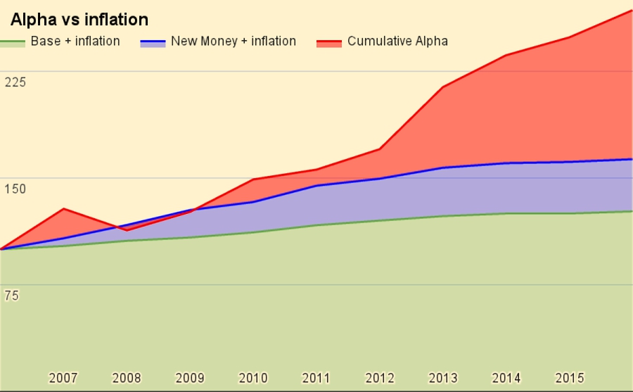
Of the current portfolio value of 268:
- 127 is the base portfolio plus inflation
- 37 is new money and inflation
- 105 is alpha
Alpha vs benchmark
The next chart shows the growth of the benchmark over the years:
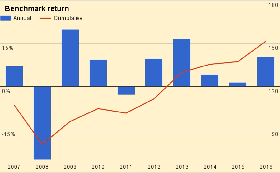
Over ten years the benchmark is up 51.4%, or 4.2% pa.
The final chart is the portfolio against new money and the benchmark:
- the green area is the initial portfolio plus benchmark growth
- the blue area is the new money added plus benchmark growth
- the red area is the value added (alpha) from investment choices away from the benchmark portfolio

Of the current portfolio value of 268:
- 151 is the base portfolio plus benchmark growth
- 44 is new money and benchmark growth
- 68 is alpha
Conclusions and outlook
In absolute terms this has been a fairly good year (5th best out of the last ten).
- In percentage terms it has been less good – the 7th best
- Against the benchmark is has been even worse – the 9th best (second worst)
That said, for a difficult year full of macro worries, it’s an acceptable result.
- At my stage of life and with my size of portfolio, capital preservation is important and rapid growth less so.
- 7.7% growth is way ahead of inflation and only slightly behind a benchmark that had a pretty good year.
Looking forward, the returns from sterling’s depreciation are extremely unlikely to be repeated and could be partially reversed.
- I’m also worried that London property could continue to reverse, though in the absence of serious inflation and higher interest rates, I don’t expect a full-on property crash.
There’s only so much I can do to avoid these risks, but I plan to be more active in 2017, not only in terms of numbers of trades but also by hedging and using other asset classes.
- I’m not confident that a virtually passive approach will net 7.7% in 2017.
But then again, I’ve laid out similar plans for the last two years, and events have got in the way.
- Maybe it will be third time lucky.
Until next time.
Mike Rawson
Mike is the owner of 7 Circles, and a private investor living in London. He has been managing his own money for 40 years, with some success.


I wouldn’t worry about London property prices. You know the situation all too well – excess demand and limited supply. It would be interesting to know if the property investment(s) mentioned in your portfolio is your own home or other rental property investments. I never include my own home (fully paid for and mortgage free) when assessing my portfolio because I will always need somewhere to live and therefore cannot sell it and use the money for other purposes.
Three properties (two and a half, really). One is my house.
It’s a major part of my wealth (more than 25%) so has to be included – there are plenty of nice places I could move to and free up 80% or more of that value.
And I need to include them so as to get my asset allocation analysis right. I capitalise pensions for the same reason.