UK budget breakdown – income and spending

Today’s post is a look at the UK’s income and expenditure expressed in terms of numbers that would make sense to most households in the UK – it’s a UK budget breakdown.
Contents
The UK as a family
This post is inspired by a picture I saw on Twitter last week, which reduced the US annual budget to a few lines on a scrap of paper, like a shopping list.
- Crucially, the astronomical numbers involved had been re-based to the scale of a typical US household budget.
- This made things much more real.
So I thought it might be worth having a look at the UK budget in the same way, particularly given that we have the first budget from a new Chancellor (( OK, an Autumn Statement for the pedantic )) in a few weeks’ time.
UK budget breakdown – data sources
The Guardian used to do half of this job as part of their budget coverage:
- they would break down the country’s income and spending into a couple of doughnut charts
- but they didn’t convert the numbers into household income terms.
But they seem to have stopped even that – the latest chart I could find is from 2013:
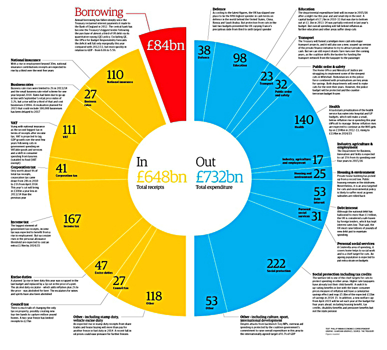
The yellow segments are income, the blue bit is spending and the red section is the extra borrowing that closes the gap between the spending and the income (the deficit).
I turned instead to UK Public Spending which takes data directly from Government sources.
- They have lots of graphs and tables directly on the site
- But they also let you download data in a variety of useful formats, including tab-delimited, which can be pasted straight into a spreadsheet.
So that’s what I did, using the data for the current fiscal year.
UK Income
Spending should be much more interesting than income, but the numbers on the income side of things are a lot simpler, so it will make what we are trying to achieve a bit clearer.
The table below shows the 10 sources of government income, arranged into three groups:
- Direct taxes
- Indirect taxes and
- Other

At this level the numbers are pretty easy to follow – direct taxes raise roughly 50% of national income, indirect taxes raise 40% and “other” things account for 10%.
- When we plot the ten sources on a pie chart, three items dominate (and only five of the ten percentages are even visible).
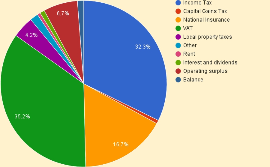
The big three are:
- VAT / Indirect taxes at 35.2%
- Income Tax at 32.3% and
- National Insurance at 16.7%
Between these three, more than 84% of national income is covered.
- The other two items worth noting are local property taxes (presumably council tax and rates) at 4.2% and the “operating surplus” of 6.7%.
- I have no idea what the surplus is – if anyone can let us know in the comments that would be great.
It’s also worth noting that capital taxes (presumably CGT and IHT) raise only 0.7% of national income.
- It’s not clear to me where corporation tax fits, but under Income Tax would make the most sense.
The table also came with a number for the National Debt: £1,590,600,000
- that’s 223% (or 2.23 years) of national income
- it’s also 209% (2.09 years) of government spending
Government spending was 43.2% of GDP in 2015, and has been tracking down over recent years – a decent estimate for 2016 is 42.5%.
- this implies that the National Debt is 89% of GDP
National income as household income
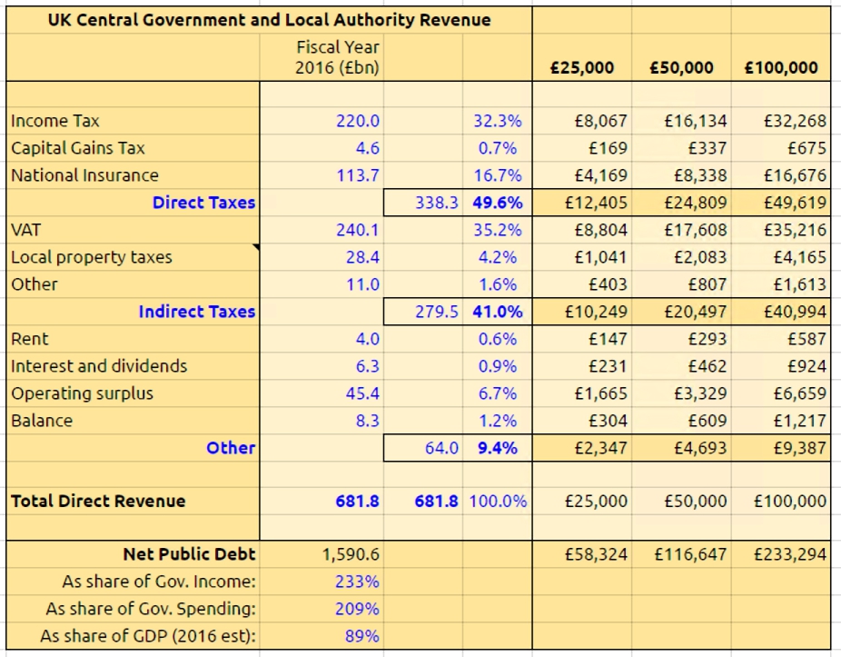
The second version of the table adds on three columns that match these sources of income to three typical levels for household income:
- £25K pa
- £50K pa
- £100K pa
Using nice round numbers like these means that the top-level 50 / 40 / 10 split that we noted above produces some more round numbers.
- For example, if the UK were a household on £50K pa, then it would get £25K from direct taxes, £20K from indirect taxes and £5K from “other”.
At the bottom of each column is a figure for what the national debt would look like for each household.
- So the £50K pa household would owe £117K.
Differences with the Guardian analysis
Matching this back to the Guardian analysis from 2013 is far from straightforward.
The first thing I did was inflate the Guardian’s numbers to get from their 2013 bottom line of £648 bn to the 2016 total of £681.8 bn.
- This meant that National Insurance and Council Tax (or Business Rates, whichever you prefer as the Local Property Tax) matched pretty well.
If my guess that Corporation Tax is included in Taxes on Income is correct, then they also match pretty well.
That leaves VAT as the big discrepancy.
- Adding in the “stamp duty, road tax etc” (which also includes petrol duty) lump fills the hole, but I’m not sure that it’s correct.
There is some logic to it, as they are all indirect / consumption / transactional taxes.
- I’m less comfortable that it leaves out excise duties and business rates, which match suspiciously well to the “other” section from the UK Public Spending site.
So that’s one way to do it.
- We’ll most probably revisit some of these issues in a future post.
UK Spending
The spending picture is much more detailed, with 65 lines remaining even after I’ve tidied up a bit.

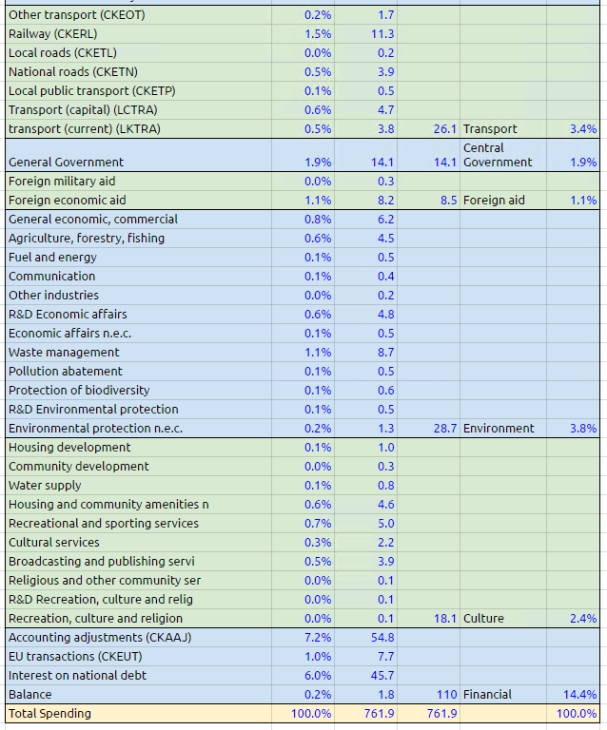
I’ll present this detailed picture without comment, and then look at an aggregated level of spending using just twelve categories.
Here’s the simplified picture:
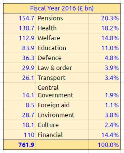
Pensions spending is 20% of the total, at £155 bn.
- This includes £43.7 bn / 5.7% of sickness and disability payments, but even the remaining 14.4% is close to double the 8% spend on pensions suggested by this month’s State Pension Age review.
But that’s because the Pension Review chose GDP as a benchmark, rather than public spending.
- As we saw earlier, government spending in 2015 was 43.2% of GDP – still unsustainably high, but at the same time, the lowest figure since the 2008 financial crisis.
- So 8% of GDP for pensions is equivalent to 18.5% of public spending, and we are currently well under the target.
Health, welfare and education add up to another 44% of the total budget.
- So the Welfare State is 64% of UK spending.
- That’s why it’s such a bit political issue every time we have an election.
Defence, law and order and transport add up to 12% of the budget, which sounds about ok.
- Culture and environment are 6.2%, which also seems ok.
- Foreign aid is 1.1%, which is a policy decision.
Central government costs 1.9%, which sounds a lot.
- It sounds even worse when you translate it back to £14.1 bn.
- I have no idea what we get for that, other that parliament and Whitehall.
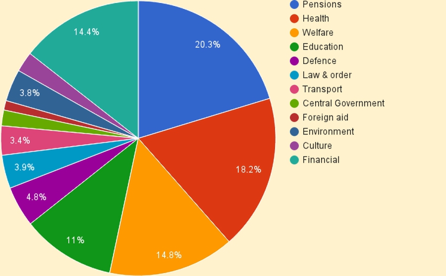
Here’s the pie chart, which emphasises the dominance of the welfare state:
The other big section on there is “Financial”, at 14.4%.
- 6% of this is interest on the national debt.
Since we’ve already seen that the national debt is 2.33 times annual income and 2.09 times government spending, paying only 6% of national spending on it doesn’t seem too bad.
- the interest amounts to 2.6% of GDP (( Assuming that government spending for 2016 will be 42.5% of GDP ))
- meaning that the average interest rate paid by the UK is almost 2.9%
- there must be quite a lot of outstanding debt issued at rates higher than those prevailing today
Much harder to explain is the 7.2% filed under “accounting adjustments”.
UK spending as household spending
Here is the spending projected on to the three annual household budgets that we met earlier:
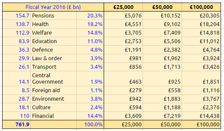
I think we can each pick out the bits of the budget that we’d rather not be responsible for.
Spending vs the Guardian
Matching the 2016 spending to the Guardian’s version from 2013 was easier than matching the income, but at the same time, the numbers in each category have drifted more than on the income side.
- That’s to be expected, since spending is more directly under the control of the government that is revenue raising.
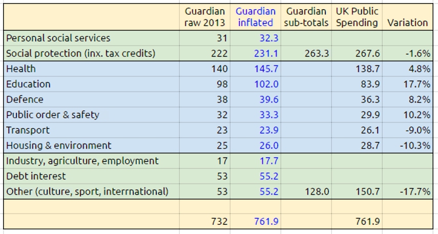
The Guardian splits out Pensions and Welfare in a different way to UK Public Spending, but combined they make a good match.
The next six departments are good one-to-one matches.
- Four of these have had budget cuts, and two have increased spending (transport and environment).
- Overall there has been around a 10% cut across these six departments.
The remaining three sections have too be combined, and show a significant increase in spending since 2013.
- As far as I can tell, this comes from the accounting adjustments which the Guardian doesn’t include.
Conclusions
It’s been an interesting if somewhat unsatisfying day.
- This is definitely a work-in-progress, and in some ways we are just laying the groundwork for another look at the UK budget once we have the Autumn Statement.
What we can say is that despite what you might read in mainstream media, UK government spending remains high.
- We are still running a deficit, and
- the public share of GDP remains unsustainably high compared to the level of taxes that can be collected
- That spending is largely driven by the welfare state.
Given that pensions and the NHS will come under increasing demographic pressures, the choice remains between:
- stimulating the economy to produce growth and increased productivity (if this is possible) or
- cutting the remaining welfare programmes even further.
We all expect Philip Hammond to attempt the former, but what exactly has he in mind, and will it work?
Until next time.
Mike Rawson
Mike is the owner of 7 Circles, and a private investor living in London. He has been managing his own money for 40 years, with some success.