Spending Risk Curves
Today’s post looks at a post from Michael Kitces’ website which explains how to use Spending Risk Curves.
Contents
The Authors

The paper is a collaboration between two authors:
- Derek Tharp – who is the lead researcher at Kitces.com and an assistant professor of finance at the University of Southern Maine – and
- Justin Fitzpatrick – who is Chief Innovation Officer at Income Lab, a financial planning software platform.

Retirement Income Planning
The paper begins by looking at retirement income planning, which is one of the main reasons that people engage financial advisors.
- The most commonly-used tool is a Monter Carlo analysis which calculates the probability of failure when employing a particular course of action (asset allocation) to achieve a particular outcome (spending plan).
Since I believe in return sequencing (particularly in equity markets, which are the main driver of portfolio returns), I don’t like Monte Carlo (MC) for this purpose.
- Some of the more modern tools use actual historical returns to work out failure rates, which I prefer.
The problem that the authors have with MC is that the single number leads to an iterative and “cumbersome” process of working out what the client can accept.
Visualisations
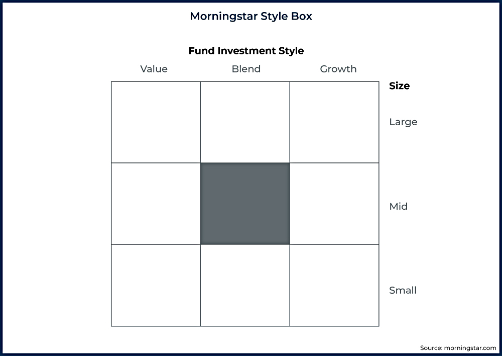
The authors are big fans of visualisations, and use the Morningstar Style Box as an example of how to quickly communicate abstract information (in this case, the size and value premia).
Spending Risk Curves
Spending Risk Curves (SRCs) are designed to map a range of spending levels to corresponding risk outcomes, visually conveying the trade-offs.
- Each SRC will map to a particular client’s circumstances (age, longevity expectation, fixed income from state and DB pensions).
The authors envisage SRCs being presented for different portfolio values, in order to illustrate options for future adjustments to spending levels (depending on portfolio performance).

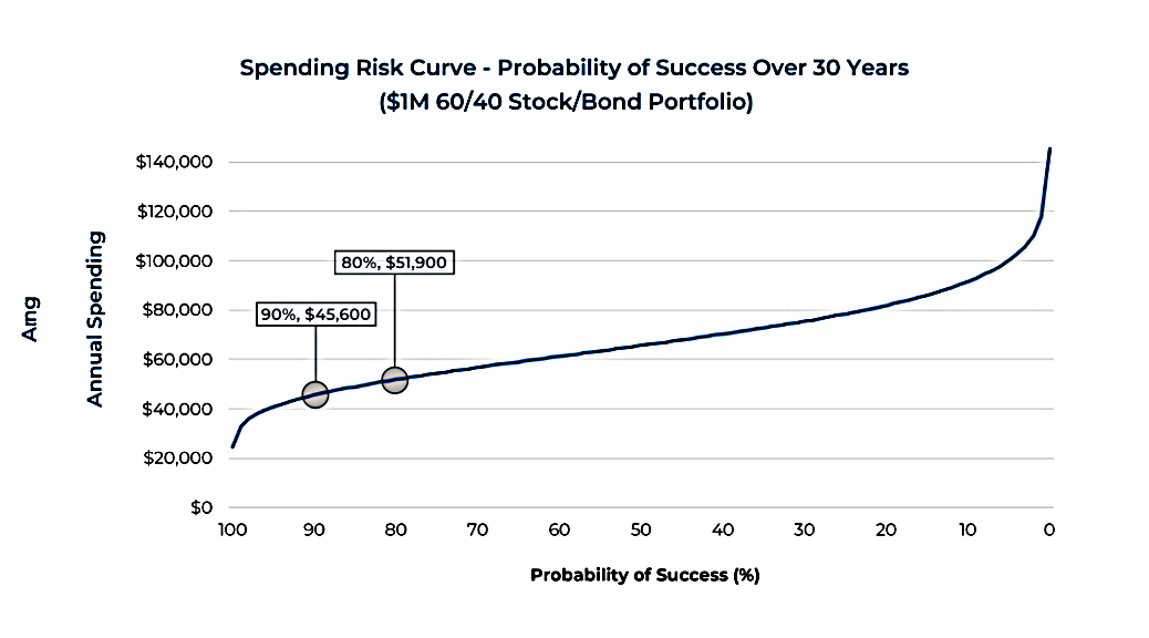
The first example of an SRC looks at the traditional 30-year retirement funded by inflation-linked withdrawals from a 60/40 portfolio.
- The assumed average real return is 6.05% and the standard deviation is 10.7%
- The curve is based on 100 runs of a 1,000-scenario Monte Carlo
The curve runs from 100% success on the left to 0% on the right.
- This is because the authors want to replace the traditional “probability of success” with a new measure called “spending risk”.
This is what used to be called the risk of failure, but the authors prefer the term “risk of spending adjustment”.
- It might also be because people prefer curves which go up towards the right, even when (as in this case), up is bad.
The key use of the curve is in illustrating trad-offs.
- In this case, withdrawing $45,600/year for 30 years has an estimated 90% probability of
success, but by accepting an 80% probability, withdrawals could rise to $51,900/year.
This is 14% more income for ten points of additional risk.
Failsafes
The curve also highlights just how dramatically spending falls off for those trying to achieve that last 10% in their probability of success – moving from 90% to 100% success cuts spending down by more than 40% (!) to below $25,000/year.
This concept of failsafe withdrawals is important and is one that I use myself.
- £25K from £1M is a 2.5% SWR
Using historical return data suggests that the true failsafe withdrawal rate is more like 3.3% pa, though this uses a different portfolio allocation from 60/40. (( Something like 75% stocks, 20% bonds and 5% true alternatives, if you are interested ))
- This might not seem impressive since 1/30 years = 3.33%, but: (1) inflation and (2) the 3.3% withdrawal lasts forever, not just for 30 years. (( This number comes from work by Big ERN on Early Retirement Now, who was looking at a 50-year retirement when he did his research ))

Another way of looking at failsafe rates is to think about Social Security (SS – the US state pension).
- SS is index linked, so the probability of success is 100%. (( I would show this as a dot rather than a line stretching over to 0% success ))
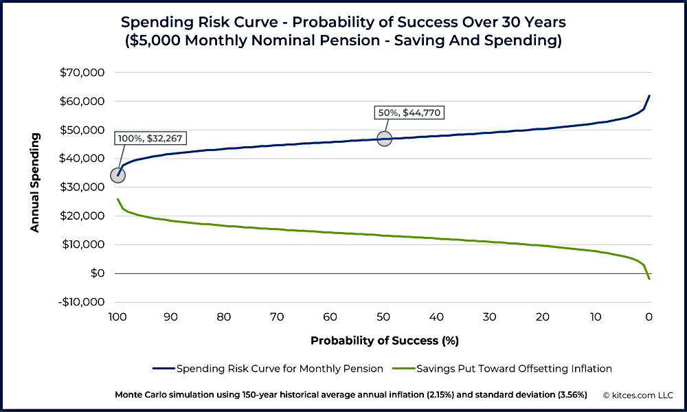
The next SRC shows the situation where a similar pension is not index-linked.
A certain amount of the incoming cash flow will have to be saved in order to offset future inflation. As a result, the income curve shows that annual spending is under $45,000/year with a 50% probability of success, and must drop from a nominal $60,000/year down to only $32,267/year to sustain a 100% success rate.
Inflation
The authors note that the original SRC above shows mainly sequence-of-returns risk, whereas this one shows mostly inflation risk (though some money is invested each year, so there is some sequence risk).
The curves show a range of choices: how much standard of living are they willing to give up in order to protect themselves from inflation risk? Or, conversely, how much inflation risk are they willing to accept in exchange for a higher current standard of living?
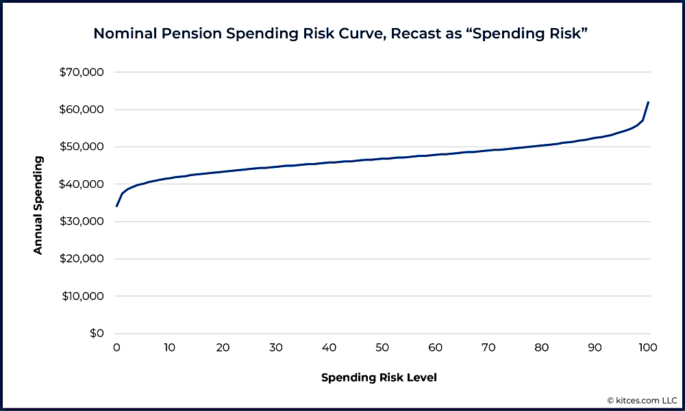
The extreme left of the curve shows how much spending would need to be restricted to guard against the worst possible inflation experience (from the MC simulation data).
- Most people would not experience this, and so would have saved “too much”.
Generalizability
Spending Risk Curves can be explored for households with mixes of ages, longevity expectations, investment portfolios, Social Security, and other cash flows, including flows with diverse inflation treatments and so on. The result will always be a single curve showing the amount of income available at each risk level.

SRCs can cope with the commonly found “hatchet”:
- This includes DB and state pensions coming online post-retirement, and
- The “spending smile” that results from the tendency of people to divide retirement into “go-go, go slow and no-go” phases (with high low and high spending).

This SRC includes a state pension, a nominal (non-index-linked) pension, rental income which is expected to rise with inflation and a legacy goal.
- But it still results in a simple spending curve.
Dynamic Spending
The next section looks at how to incorporate dynamic spending (the guard rails approach).
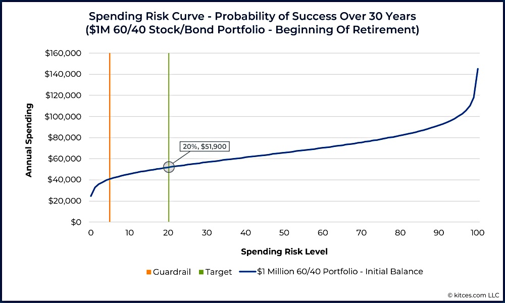
Here the spending starts at risk level 20 ($51.9K) and is recalculated each year to incorporate portfolio performance.
- If the risk level ever falls to 5, then the spending level is increased back to the original risk level of 20.

After 10 years of good portfolio performance, the curve has shifted up (since the pot remains the same size and there are fewer years to run).
- $51.9K of spending is now below the risk 5 level ($53.2K) and so spending is increased to the risk 20 level ($65.3 – a 26% increase).
To keep things simple, these numbers ignore inflation.
- It’s also worth noting that in practice there would be several small increases rather than one big one after 10 years.
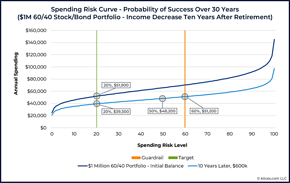
Guard rails can also work in the opposite direction.
- Here, poor performance means the portfolio has shrunk and the risk curve has moved downwards.
The original risk 20 spend of $51.9K is now higher than the risk 60 level.
- Spending would shift down to the new risk 20 level of $39.3K.
Of course, investors would need to decide each year what changes they want o make – the SRC is just a guideline to explain the implications of their decisions.
What risk level?
The Spending Risk Curve does make explicit the fact that an income-decrease guardrail set below a risk level of 50 would be extremely low. If a household were to decrease income at a risk level below 50 (i.e., a probability of success above 50%), they would be reducing income while the chances that such a reduction would ever be needed are still below 50%!
Recall that a risk level of 50 is the median. The analysis estimates that half the time we will not need a reduction, and half the time we will. Therefore, settings of 60, 70, or 80 are not as outlandish as they might seem for those who plan with probability of success.
I’m not sure I would be comfortable with a risk level of 50, but each to their own.
That’s it for today.
- I think that the Spending Risk Curve is a neat way of showing the risks of various levels of retirement spending and that the term “risk of spending adjustment” is an advance on “risk of failure”.
Let’s hope that they catch on.
- Until next time.
Mike Rawson
Mike is the owner of 7 Circles, and a private investor living in London. He has been managing his own money for 40 years, with some success.