The 36 Year Snowball

Today’s post is about the growth of my portfolio over 36 years.
Annual reviews
I’m not the kind of person who checks the value of my portfolio every day.
- In fact, I only look once per year and even that frequency is driven by the habit of an annual update post on this blog.
Left to my own devices, checking and rebalancing would take place every two or three years.
The latest update goes back 13 years because that’s how much detailed information I have.
- But I have patchy records dating back to when I first started work and investing, in the 1980s.
Upgrading a hard drive at the end of last year, I came across these files and decided to build a model that covers the entire 36 years.
- This has involved some interpretation and interpolation, but nothing that changes the big picture over close to four decades.
Salary
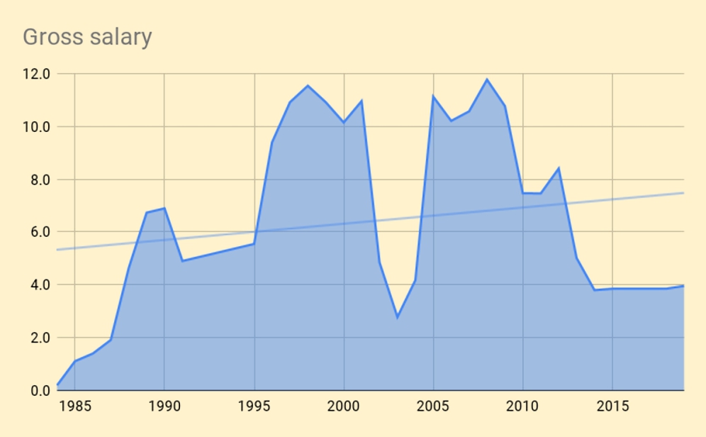
The first chart shows the combined annual salaries of me and my partner, dating back to 1984.
- Working out the post-tax income was too much work (and would be impacted by any tax-planning on our part), so these figures are gross.
For similar reasons, I have ignored inflation.
Units are the same as in my annual reviews, where 100 is the value of my portfolio at the end of 2006 (when detailed records began).
- On this scale, my current net worth is 341.
Annual income peaks below 12.
The chart shows the typical pattern of rapidly rising income during our 20s and a high plateau from 35 towards 50, followed by a decline.
- I retired eight years ago, but my partner still works.
The unusual bit is the trough in our early 40s.
- That’s when we decided to start a film production company together.
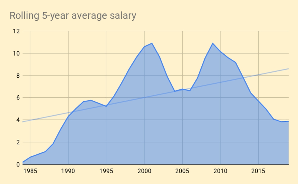
Even switching to a rolling 5-year average can’t sweep that mistake under the carpet.
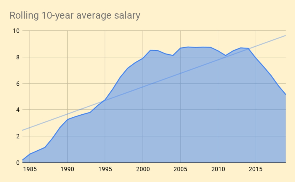
We have to move to a 10-year average to get something like the pattern that most people can expect (albeit shifted a few years to the right).
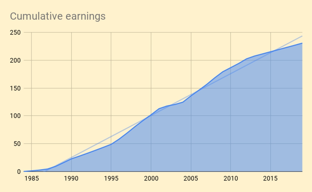
The final chart in this section shows cumulative or career earnings.
- There’s a slight S-curve here as we’d expect, plus an extra kink in the line from the film company.
Total gross career earnings to date are 231 – two-thirds of current net worth.
Net Worth
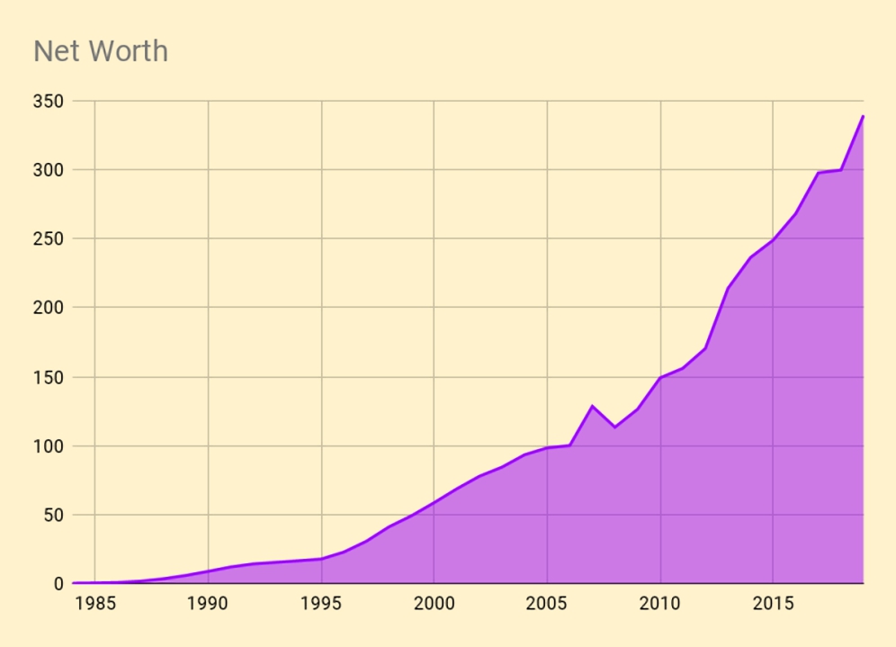
This chart shows the snowball effect that today’s article is named for.
- Despite earnings tailing off with age, growth in net worth remains close to exponential.
I’ve doubled my money since I retired.

But it’s a different story if we use a log scale.
- The highest growth rates were in the early years when the portfolio was small.
The last 15 years has been a trudge at a steady 10% pa.
- That’s because earnings and savings are now too small to provide a meaningful boost.
Assets
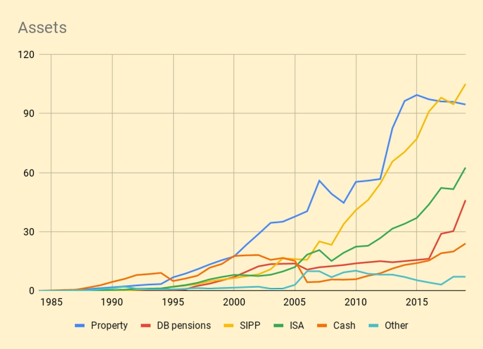
This chart shows the ebb and flow between assets and accounts over the years.
- Property was my biggest asset along almost all the journey but has now been overtaken by our SIPPs, which grow faster than I can take money out of them.
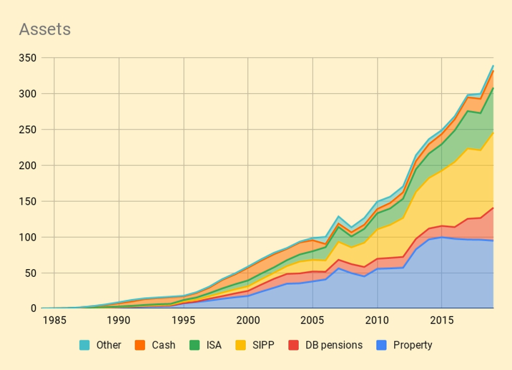
Stacking the assets and accounts makes things a little clearer.
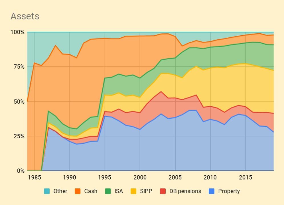
Stacking them to a constant 100% is even better.
- Now the property purchases are clear – note how property fails to keep up with the growth in the rest of the portfolio, despite the popularity of this asset class.
You can also see us filling up our SIPPs after Gordon Brown relaxed the rules in 2006.
Ratios

This chart has the second part of the snowball story.
- It shows net worth as a proportion of career earnings to date.
Our net worth didn’t reach our gross career earnings until I was already retired, but now it’s powering ahead.

This chart compares annual changes in net worth (all gains, apart from 2008) with the corresponding gross salary.
- Early on, the salary numbers dominate, but over the last 15 years, portfolio fluctuations have become much larger.
This is the third part of the snowball – it’s hard to focus on the day job when your portfolio has a much bigger impact on your life.
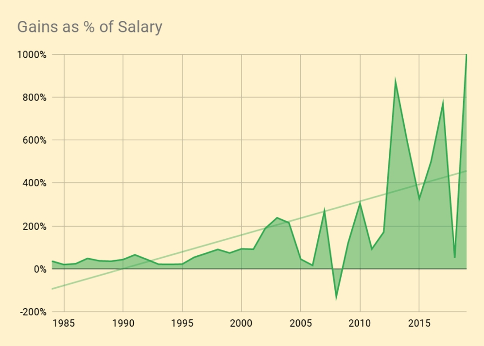
This chart makes things even clearer.
- There have been several recent years where the gains were close to ten times gross income.
That’s it for today.
- The message is that portfolio growth will sneak up on you if you let it.
And when your portfolio has more impact than the day job, it could be time to reprioritise.
- Until next time.
Mike Rawson
Mike is the owner of 7 Circles, and a private investor living in London. He has been managing his own money for 40 years, with some success.