Annual Portfolio Review 2019

It’s that time of year again. Today we’ll be taking a look at how my overall portfolio performed last year. Stay tuned for the Annual Portfolio Review 2019.
Contents
Headlines
Our net worth increased by 13.6% in 2019.
- The active stock portfolios were up by around 25%, though I haven’t calculated an exact figure.
Compared to some of the gains being posted by acquaintances on Twitter, that’s not terribly impressive.
- But this is a large and well-diversified multi-asset portfolio, whereas most of the Twitter portfolios I see are smaller and UK-focused, often with a high proportion of small-caps and AIM stocks.
I’ve been in decumulation (retirement) for a few years and have dependents – so I can’t take on the level of risk that some of those guys do.
- And I’m more interested in steady long-term compounding than in shooting the lights out during a good year for global stocks.
2019 was my thirty-fifth up year in 36 years of investing.
My (reconfigured) benchmark returned 14.9%, so I didn’t beat that.
- I’m overweight in property and in cash/bonds, which hampers returns.
But we did comfortably beat inflation plus the SWR.
- Inflation was 1.5% and my theoretical target SWR is 3.3%, which gives a total target of 4.8% (easily beaten).
In practice, my actual withdrawal rate is around 0.8%, so my personal target would be 2.3% (again, easily beaten).
Because the portfolio is now a lot larger than it used to be, this is actually my second-best year ever in currency terms (pounds gained).
- My net worth increased by the equivalent of fifteen years’ living expenses, which is not to be sniffed at.
I now have around a net worth equivalent to 126 years of living expenses.
- With an average life expectancy for me and my partner of 29.5 years, this gives a “death ratio” of 4.3 times.
The snowball (compounding) effect also explains why cumulative alpha has increased despite the percentage gain being lower than the benchmark.
- The comparator excludes the previously banked alpha, whereas this money contributes to overall portfolio growth.
So I’m going to award 2019 a silver medal.
Performance
We’re up 13.6%, and our average life expectancy has decreased by one year, so we’ve gained 14.4% on that basis (13.6% plus 0.8% for one year’s withdrawals).
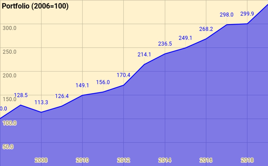
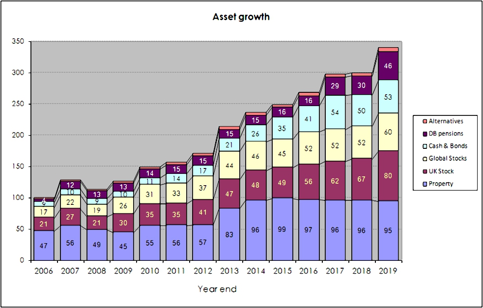
Rather than use UK currency, 2006 is baselined at 100, so that the portfolio is now worth 341 (up from 300 last year).
- Total growth over 13 years is 241%, or 9.9% pa.
This is acceptable given that it includes the 2007 financial crisis and twelve years of low interest rates.
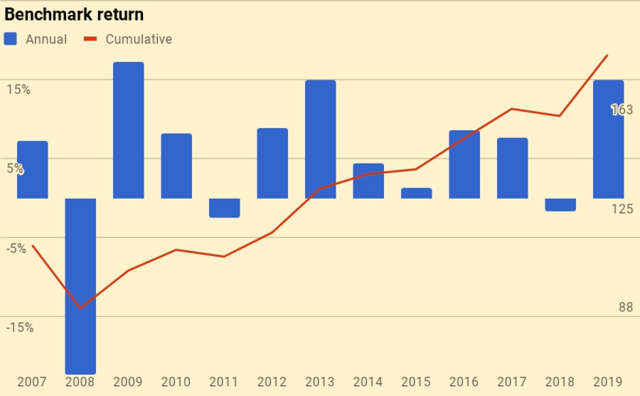
The chart below breaks the growth out into annual chunks:
Benchmark
I use a composite benchmark made up of four items.
- It’s intended to be the average for a UK private investor aiming to reach financial independence.
I changed the weights this year, so the old weights are given in brackets:
- UK stocks – 20% (32.5%)
- International stocks – 35%(32.5%)
- UK residential property – 25%, and
- Cash/bonds – 20% (10%)
The weights start from allocating a target percentage to property and cash.
- I then divide the remainder between UK stocks and international stocks.
Note that I use DB pensions and cash rather than bonds proper (which I consider to be overvalued).
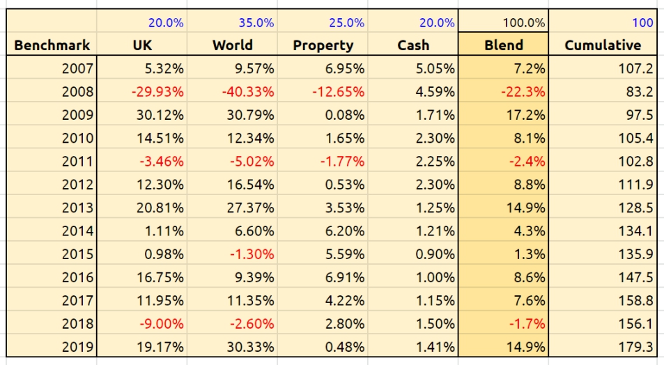
The strong returns from US stock mean that this has been a very good year for the benchmark.
- UK property was positive, but my extreme bias to London means that I underperformed.
Over 13 years the benchmark is up 79.3, or 5.0% pa.
- So my portfolio has on average outperformed by 4.9% pa (in nominal terms – see also the more detailed analysis below).
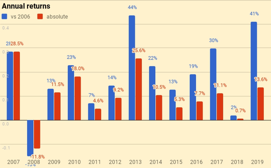
Here’s a year-by-year breakdown of the performance of the portfolio and the benchmark:

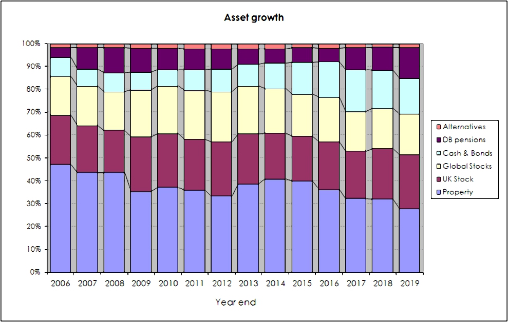
Asset allocation
Unlike many bloggers and Twitterati, I use a “total wealth” approach to my portfolio.
- This is primarily so that I maintain a high enough allocation to equities as I get older.
I’ve changed the way that I keep track of my asset allocation this year, and the pie chart I used last year is now obsolete.
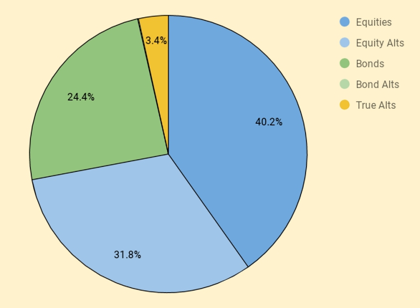
I use five high-level asset classes now (targets are in brackets):
- Equities 40.2% (45%)
- Equity Alts 31.8% (30%)
- Bonds / Cash 24.4% (18%)
- Bond Alts 0.2% (2%)
- True Alts 3.4% (5%).
As usual at year-end, I’m overweight in cash.
- Some of this will be used to top-up underweight asset classes in the near future.
The second chart shows how these assets have grown over thirteen years.
- The split between UK and international stocks is now obsolete, but the numbers are otherwise pretty accurate.
The third chart shows the same data in percentage terms rather than absolute numbers:
Portfolios

I have five listed portfolios:
- The core passive portfolio
- An active UK stock portfolio, split between AIm and the main market
- A factor fund (smart beta) portfolio
- A VCT portfolio,
- And a trend-following (momentum) portfolio
I also have three non-listed “portfolios”:
- Property, including the house I live in
- DB pensions
- Cash
The table below maps the portfolios onto the high-level asset allocation that we’ve seen previously:
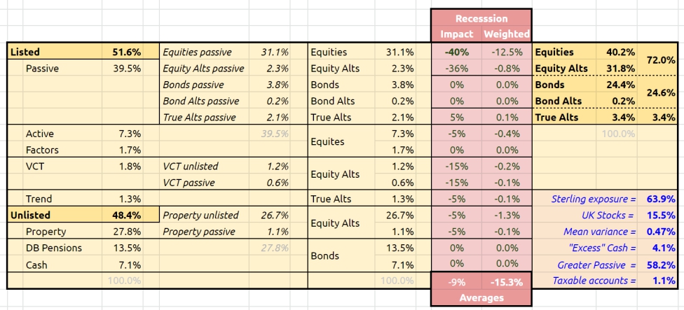
The red section is a stress test showing the impact of a 40% crash in global stock markets.
Accounts

Apart from the 28% in property, another 49% is in SIPPs and ISAs (split 31%/18%).
- That’s 77% of the total accounted for.
The remainder is split between DB pensions (13%), Cash (7%) and other potentially taxable accounts (2.4%).
The two charts below show how these account types have varied over the years, in absolute and relative terms:


New money
The long-term annual returns of 9.9% pa are flattered by three (overlapping) things:
- new money
- inflation
- the positive performance of the benchmark portfolio
Let’s look at new money first.
The chart below show the net extra contributions to the portfolio (from income and inheritance) or withdrawals (from pensions) by year:

The chart also shows a cumulative total for the entire period (the red line), and then increases this to reflect inflation (blue line) and benchmark growth (green line).
- New money totals 33.7 of the total portfolio’s value of 341.
- After inflation, this rises to 41.1
- After benchmark growth, it rises to 58.4
Alpha vs inflation
The chart below shows inflation over the last twelve years:

Since I am an owner-occupier, I have switched from CPI to CPI-H, introduced in 2017.
- Total inflation over 13 years has been 35.1%, or 2.3% pa.
The second chart shows the portfolio against new money and inflation:
- the green area is the initial portfolio plus inflation
- the blue area is the new money added plus inflation
- the red area is the value added (alpha) from investment choices
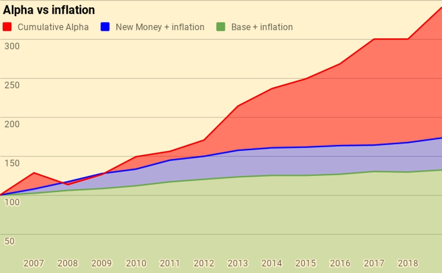
Of the current portfolio value of 341:
- 132 is the base portfolio plus inflation
- 41 is new money and inflation
- 168 is alpha
Alpha vs benchmark
The next chart shows the growth of the benchmark over the years:
Over ten years the benchmark is up 59.9%, or 4.0% pa.
The final chart is the portfolio against new money and the benchmark:
- the green area is the initial portfolio plus benchmark growth
- the blue area is the new money added plus benchmark growth
- the red area is the value-added (alpha) from investment choices away from the benchmark portfolio
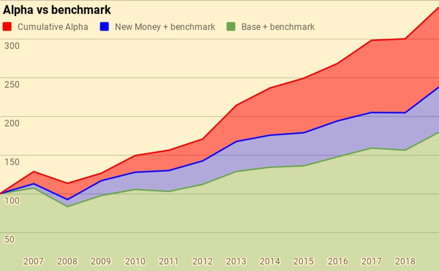
Of the current portfolio value of 341:
- 179 is the base portfolio plus benchmark growth
- 58 is new money and benchmark growth
- 103 is alpha
Counterparties
I can only present a few highlights from my counterparty analysis so that readers remain unable to translate from my percentage reporting into UK currency:
- Property is my largest counterparty at 27.8%
- YouInvest is second at 12.4% (up from 11.6%)
- This is a little too high for comfort but is unlikely to come down much in the near future.
- Fidelity comes next, at 10.2% (down from 17.2%).
- I plan to reduce further in 2020.
- iWeb is up to fourth at 8.1%
- X-O is now fifth, also at 8.1%
HL has now dropped down to the seventh place and is unlikely to return to the top five.
Counterparties to whom I expect to increase my exposure in 2020 include:
- X-O
- iWeb
- IG
Vanguard won’t be added, as their long-awaited SIPP has proved to be a damp squib for those with large portfolios.
Turnover
I want to add turnover analysis in the future, but I am still in the process of restructuring and simplifying my accounts, so the numbers would be misleading at the moment.
- Perhaps in 2021.
Conclusions and outlook
That’s it for today.
- Despite a mediocre percentage return relative to the benchmark, in absolute terms, this has been a very good year.
Let me know what you think in the comments.
- Until next time.
Mike Rawson
Mike is the owner of 7 Circles, and a private investor living in London. He has been managing his own money for 40 years, with some success.


With a W/D rate of <1% looks to me like you still have absolutely no worries!
A few quick Q's if I may:
a) should your "personal target" not be 2.3% rather than 4.1%;
b) are you using Nov 2019 CPIH as your annual measure of inflation
c) why have you moved away so much (with more planned) from Fidelity
I was worried about Corbyn until last month, but I’m not worried about anything at the moment. There’s a looming market crash to get through, but perhaps not this year.
a) yes – fixed, thanks for spotting that
b) yes – I update on 1st Jan and more than one Dec figure is not yet published. It’s the same every year so it works out long-term
c) I found Fidelity inflexible, even when I had a lot of money with them – they wouldn’t split a large ISA for me and I can’t trade my SIPP online. I also find them like HL in that they push you towards the active OEICs universe, where they make the most money. Budget brokers don’t market anything to me.
But apart from that, 10% is my target maximum exposure to any counterparty. AJ Bell is the exception because I can’t find another cheap SIPP. I had high hopes for the Vanguard SIPP but it’s aimed at small pots.
re b) above
As I understand it, most UK government depts seem to use Sept to Sept (usually available from around mid October) to estimate annual inflation and then apply the uplift/increase [to state pension, tax thresholds, etc] the following April. From what I can tell a lot of DB pension schemes also use this approach. IMO what they should use is the average of inflation over the 12 months immediately prior to the uplift being applied – but, I assume, as some of this inflation data may not be available and/or validated in good time – they have to use an alternative approach.
Great post and I love the death ratio idea!
But to be a bit pedantic – your life expectancy has not dropped by 1 this year – since you’ve not died in 2019 you are statistically going to live by about 0.97 fewer years!
That’s something to feel good about.
If you had died in 2019 then that would be a different matter.
Good point, but I think rounding is allowed in a high-level post like this. Glad you like the death ratio, it went down like a cup of sick the first time I presented it to an investor group (% gain last year was their only KPI).
Expected age to the nearest year is all I need for most of the relevant calculations, and my life expectancy has been stuck at 86 since I started looking it up.
re “I can’t trade my SIPP online”.
Could you clarify please if you meant income drawdown and/or just regular buy/sell type transactions?
In any case, do you know anybody that does allow all or even some of these transaction types online in a SIPP?
I ask as I am in the middle of another drawdown from my SIPP and am becoming somewhat irritated with the telephone calls/paper-based system.
I meant regular trades – it’s an old pension and they haven’t moved it on to their new platform. I’m waiting to find out if they can organise an in specie transfer to their “new” SIPP. If not I will cash in and move elsewhere. I’d been hoping the Vanguard offer would be compelling but they are targeting small pots.
I mostly drawdown from HL, which involves lots of form-filling. My partner uses PensionBee for some of her money and their drawdown process is very easy. Too expensive (and simplistic) to use for all of our pensions, though.
Thanks for the prompt and informative reply.
I see what you mean about PensionBee.
It looks to me like a whizzy interface to third party money managers; all of which/whom have to be paid!!
From what I can tell, the Vanguard SIPP looks like it should, in practice, be very similar to their S&S ISA – albeit with the pension overlay (tax relief, drawdown (in due course), etc)
I will just put up with my drawdown irritations for the time being – they did tell me they were planning to move it all online, and PensionBee does show that that can actually be achieved.
I have some over-arching questions about so-called alternatives.
Also, I have seen other folk consider real estate as being more bond like – possibly because they view the rental income (even if imputed for your own home) as a proxy for a coupon.
Thus, I am somewhat intrigued by your mapping of Property to Equity Alts.
Could you say a few words about what led you to make this particular mapping? Thanks.
It’s pretty simple – historical correlations between stocks and property are high. Rob Carver’s book Smart Portfolios has more detail.
I see the portfolio as built around stocks as a growth engine. Everything else is there to lower the volatility of stocks.
Thinking in terms of income/yield makes no sense to me. A pound is a pound, wherever it comes from.
Thanks for that, and I have re-read your helpful summaries of Carver’s SP book.
Some further discussion on this subject (inc. the topic of correlation) is at
https://www.bogleheads.org/forum/viewtopic.php?t=178501
Some more recent words on the topic of correlation between property & stocks at:
https://ace-your-retirement.blogspot.com/