Annual Portfolio Review 2018

It’s that time of year again. Today we’ll be taking a look at how my overall portfolio performed last year. Stay tuned for the Annual Portfolio Review 2018.
Contents
Headlines
Our net worth actually increased in 2018, albeit by only 0.7%.
- So my initial reaction after doing the totting up was that we have dodged a bullet.
But digging deeper, it’s not as great as it sounds.
- The terrible final quarter of 2018 – and indeed, the terrible final month – particularly in the UK, made the year seem a lot worse that it actually was.
After a bright start, we had a mini-crash in March, then a recovery and then a decline.
- But my multi-asset, international benchmark is only down 3% for the year.
And we added slightly to the portfolio in 2018, with a small potentially exempt transfer from the mother-in-law.
- Without that, we’d have been down around 0.3%.
We beat the benchmark, but didn’t match inflation, so I’ll have to call this a mixed year.
- And many threats remain in 2019 (trade war, rate hikes, Brexit and Corbyn).
Performance
Unlike many bloggers and twitterati, I use a “total wealth” approach to my portfolio.
- This is primarily so that I maintain a high enough allocation to equities as I get older.
As discussed, we’re up 0.7% compared to a benchmark fall of 3%.
- My annual spending is around 1% of my portfolio, so it might sound as though we have lost ground.
But we have one less year to live, so we actually gained 1.7% in those terms.
- That brings us much closer to the inflation target.
Long-term growth
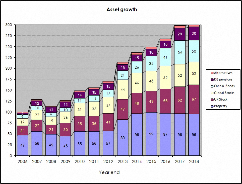
Here’s what the growth of the portfolio looks like over the last 12 years:
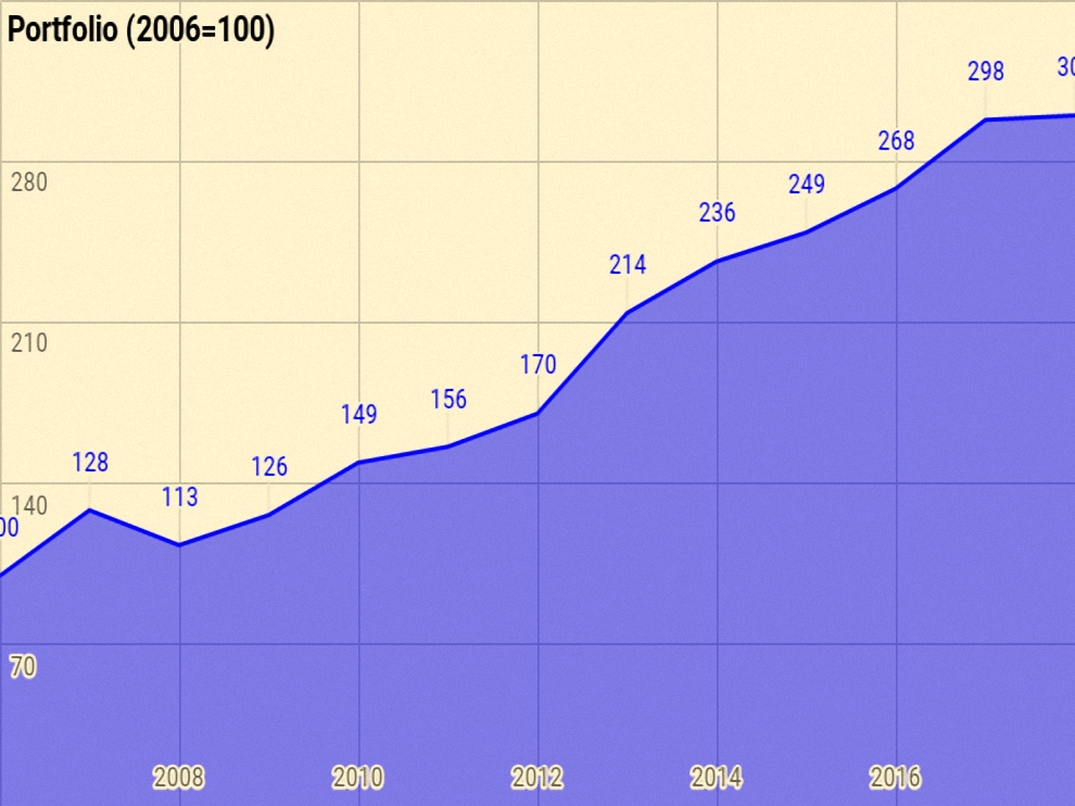
Rather than use UK currency, 2006 is baselined at 100, so that the portfolio is now exactly 300 (up from 298 last year).
Total growth over 12 years is 200%, or 9.6% pa.
- This is acceptable given that it includes the 2007 financial crisis, ten years of low interest rates, and now the start of QT.
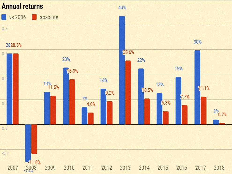
The chart below breaks the growth out into annual chunks:
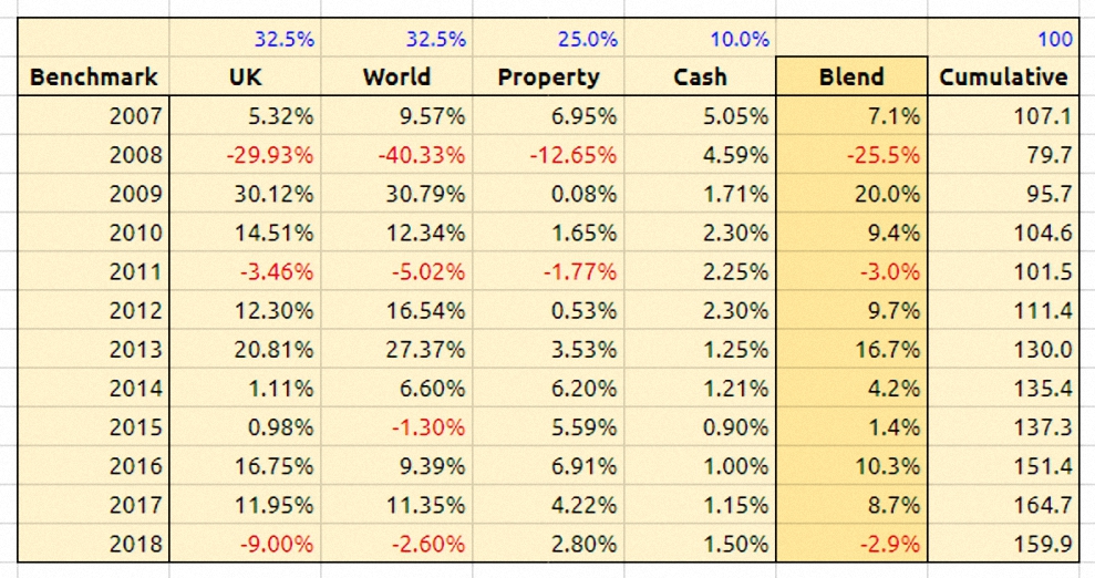
Benchmark
I use a composite benchmark made up of four items:
- UK stocks – 32.5%
- International stocks – 32.5%
- UK residential property – 25%, and
- Cash – 10%
The weights come from allocating a target percentage to property and cash.
- It’s intended to be the average for a UK private investor aiming to reach financial independence.
I then divide the remainder between UK stocks and international stocks.
- I exclude bonds because I don’t hold any at the moment (I’ve long been waiting for the bond market to crash before I buy).
- I use a higher than normal cash balance instead.
I added somewhat to UK stocks through the year – partly due to new VCT investments – but the fall in values acted in the opposite direction.
International stocks were only down 2.6% in sterling terms, though I seem to have done a little better than that.
UK property was positive, but my extreme bias to London means that I underperformed.
And cash returns increased, but a lot of my cash is held in non- interest-bearing accounts (SIPPs and ISAs).
- I remain overweight in cash, though this is likely to change in 2019.
Over 12 years the benchmark is up 59.9%, or 4.0% pa.
- So my portfolio has on average outperformed by 5.6% pa (in nominal terms – see also the more detailed analysis below).
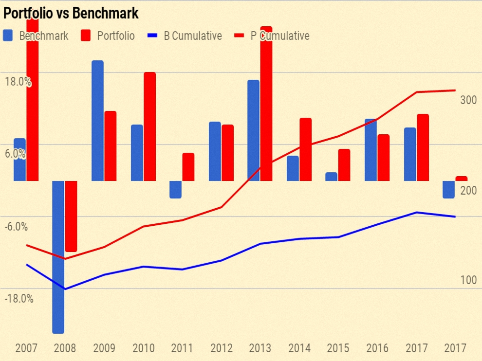
Here’s a year-by-year breakdown of the performance of the portfolio and the benchmark:
Asset allocation

As always, the weights have switched a little since last year:
- Property is down from 32.3% to 32.0%
- UK stocks are up from 20.8% to 22.2%
- International stocks are up own from 17.3% to 17.4%
- Cash and bonds (almost entirely cash) is down from 18.1% to 16.7%
- DB pensions are up from 9.7% to 10.1%, and
- Alternatives are down from 1.7% to 1.6%
The second chart shows how these assets have grown over the twelve years:
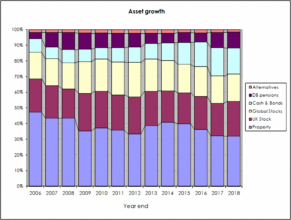
The third chart shows the same data in percentage terms rather than absolute numbers:
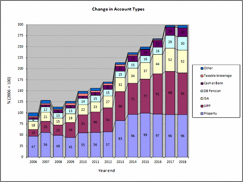
Account types

Apart from the 32.2% in property, another 31.8% is in SIPPs and 17.3% is in ISAs.
- That’s 81% of the total accounted for.
The remainder is split between DB pensions (10.2%), Cash (outside tax shelters – mostly a large personal loan – at 6.7%) and other potentially taxable accounts (1.8%).
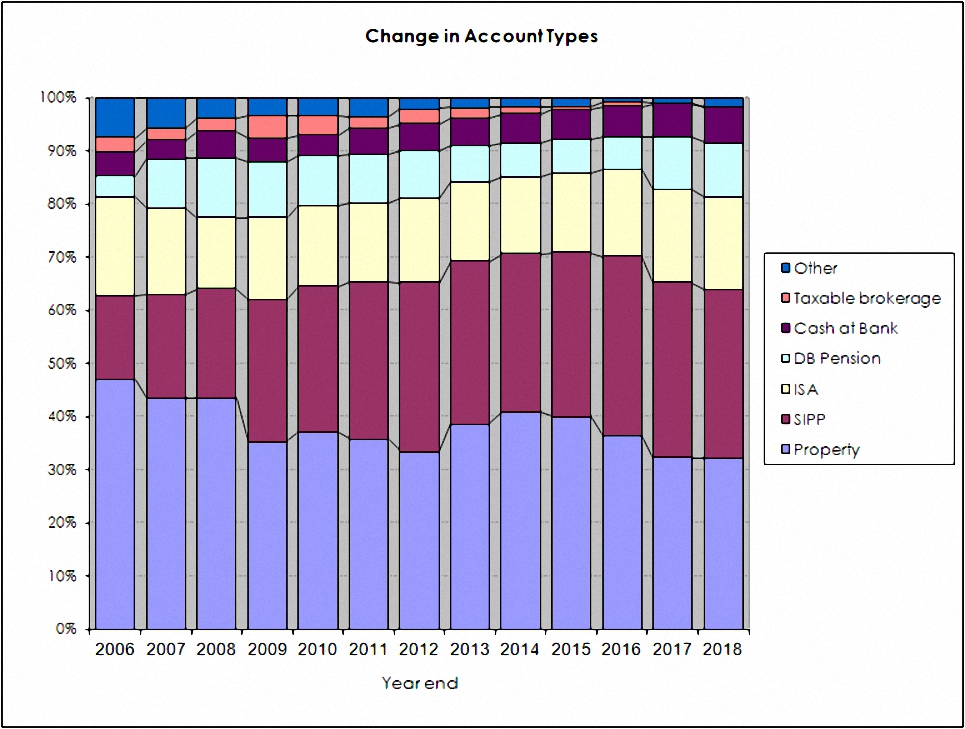
The two charts below shows how these account types have varied over the years, in absolute and relative terms:
New money
The long-term annual returns of 10.4% pa are flattered by three (overlapping) things:
- new money
- inflation
- the positive performance of the benchmark portfolio
Let’s look at new money first.
The chart below show the net extra contributions to the portfolio (from income and inheritance) or withdrawals (from pensions) by year:
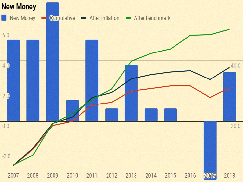
After a negative year in 2017, the annual SIPP withdrawal in 2018 was more than offset by a potentially exempt transfer from my mother-in-law.
The chart also shows a cumulative total for the entire period (the red line), and then increases this to reflect inflation (blue line) and benchmark growth (green line).
- New money totals 31.1 of the total portfolio’s value of 300.
- After inflation this rises to 37.8.
- After benchmark growth, it rises to 50.4.
Alpha vs inflation
The chart below shows inflation over the last twelve years:
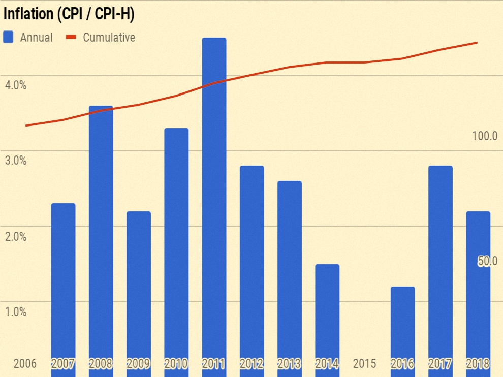
Since I am an owner-occupier, I have switched from CPI to CPI-H, introduced in 2017.
- Total inflation has been 33.1%, or 2.4% pa.
The second chart shows the portfolio against new money and inflation:
- the green area is the initial portfolio plus inflation
- the blue area is the new money added plus inflation
- the red area is the value added (alpha) from investment choices
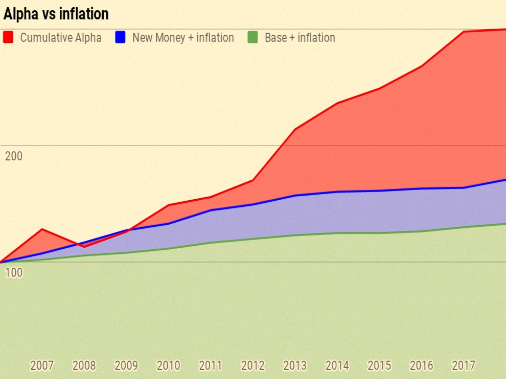
Of the current portfolio value of 300:
- 133 is the base portfolio plus inflation
- 38 is new money and inflation
- 129 is alpha
Alpha vs benchmark
The next chart shows the growth of the benchmark over the years:
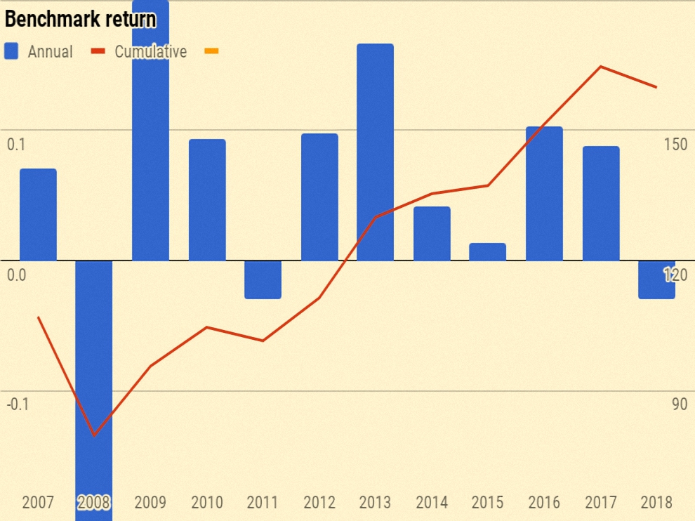
Over ten years the benchmark is up 59.9%, or 4.0% pa.
The final chart is the portfolio against new money and the benchmark:
- the green area is the initial portfolio plus benchmark growth
- the blue area is the new money added plus benchmark growth
- the red area is the value added (alpha) from investment choices away from the benchmark portfolio
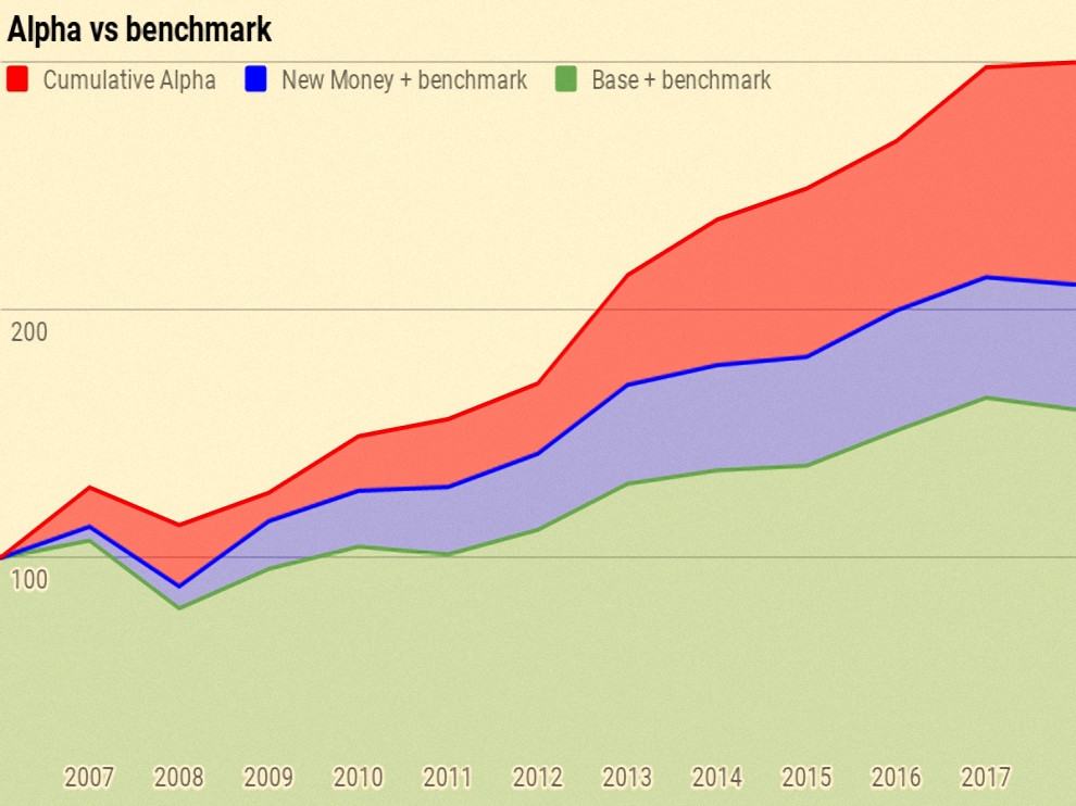
Of the current portfolio value of 300:
- 160 is the base portfolio plus benchmark growth
- 50 is new money and benchmark growth
- 90 is alpha
Counterparties
I can only present a few highlights from my counterparty analysis, so that readers remain unable to translate from my percentage reporting into UK currency:
- Property is my largest counterparty at 32.3%
- Fidelity comes next, at 17.2% (down from 18.1%).
- This is way too high and I plan to reduce in 2019.
- Third is YouInvest at 11.6% (down from 11.8%).
- This is higher than I would like and I will be reducing further.
- iWeb is up to fourth at 7.6%.
- HL is down to fifth at 7.0% (from 9.1%).
Counterparties to whom I expect to increase my exposure in 2019 include:
- X-O
- NEST
- IG
- Possibily Vanguard, should they ever offer a SIPP.
Turnover
I want to add turnover analysis in the future, but I am still in the process of restructuring and simplifying my accounts, so the numbers would be misleading at the moment.
- Perhaps in 2020.
Conclusions and outlook
In absolute terms this has been a decidedly mediocre year (2nd worst out of the last twelve, in both absolute and percentage terms).
- But in truth I’m pleased to be positive in what was a difficult year to make money.
I’m hoping for better in 2019, though I expect it to be a bumpy ride.
In terms of portfolios, some are now ticking along more or less according to plan:
- AIM IHT
- SmallCap AIM Growth (SGAP)
- PiggyBack (Main market)
The Bonkers (Momentum) portfolio is out of favour in current market conditions, and I would expect it to evolve into a multi-asset trend following portfolio.
- The “Defensive” portfolio has been a complete flop to date, falling more than the UK market.
That’s it for today – let me know what you think.
- Until next time.
Mike Rawson
Mike is the owner of 7 Circles, and a private investor living in London. He has been managing his own money for 40 years, with some success.


Hi Mike, happy new year.
You mention the desire to reduce Counterparty risk by using other SIPP / ISA providers but in the past talked about consolidating to Fidelity / IWeb and Youinvest mainly because they had the lowest fees and it being too complicated with lots of providers. Has your view on having multiple providers changed or are the likes of X-O and Nest better value? I ask mainly because I have the above 3 and am about to load up my SIPP and ISAS before the end of the financial year.
thanks,
Martin
Hi Martin,
Let’s hope 2019 is better than 2018.
It’s horses for course, really. YouInvest and Fidelity are the cheapest passive (ie. inactive, no trading) accounts until / if Vanguard launch their SIPP. iWeb, X-O and IG are for the active part of the portfolio.
My end goal is to have around 8 investment accounts – 2 ISAs and 2 SIPPs each for me and the other half. And no provider should have more than 10% of our money. Still some way to go on that, unfortunately.
But to answer your question, I haven’t gone off Fidelity, YouInvest or iWeb. Fidelity and YouInvest are overweight and iWeb is up to a 7.6% allocation (and rising).
I’m always looking for better options, so shout if you spot any.
Mike