Expected Returns 7 – The Bond Premium

Today’s post is the seventh in our series looking at papers by Antti Ilmanen, as a prelude to tackling his magnum opus, Expected Returns.
Contents
Story so far
We’ve looked at six papers, a blog article and a slide deck so far.
- The lessons learned had become as long as a blog article in themselves, so I have moved them to a separate master page here.
The Bond Premium
Last time out, we looked at the first part of a fairly hefty pamphlet produced by the CFA Institute and based around extracts from Antti’s book Expected Returns.
- That section was about equities, and this time we’re going to look at bonds.
Historical return patterns are less important for bonds because market yields provide good information on prospective returns.
You would expect that lending money for a longer period of time would require a larger return (premium) since there is a liquidity issue, and the opportunity for something to go wrong is greater.
- Returns from bonds are also higher when interest rates are falling, due to windfall gains.
In general, the yield curve reflects this – but it also takes into account interest rate and inflation expectations.
- Antti says that the yield curve is a better predictor of short-term excess bond returns than it is of yield changes.
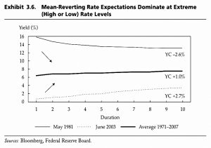
Mean-reverting rate expectations dominate curve steepness when short-term rates are exceptionally high or low.
High inflation and yield levels are associated with falling rate expectations but with elevated bond risk premia. These forces tend to push the curve shape in opposite directions and offset each other.
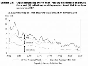
One way around the “contamination” from expectations is to estimate them – perhaps via survey data – and then subtract them from yields.
- This, in turn, uncovers an inflation premium which increased from zero in the sixties to 4% in the 80s and then fell back once more.
Safe-haven and supply/demand factors also play a part.
Returns
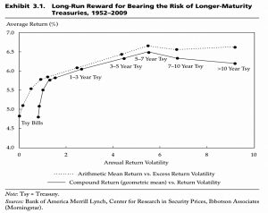
Perhaps surprisingly, returns from 1952 to 2009 peak around a 5-year maturity.
- Sharpe ratios decline steadily with increasing maturity.
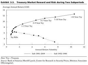
But this pattern of returns obscures two contrasting sub-periods.
- Since 1981, the curve rises with maturity as expected.
Prediction
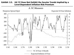
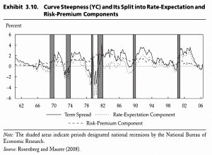
Antti notes that curve steepness is not a good proxy for the long-term BRP:
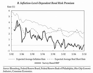
The main story about the ex-ante BRP’s postwar behavior is the mountain shape: a secular rise and fall apparently related to level-dependent inflation uncertainty and the related
inflation premium.In contrast, curve steepness has not exhibited any secular uptrend or downtrend. It has been range bound between +400 and –400 bps for most of the past half century (and longer).
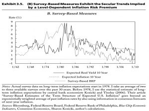
In contrast, surveys of expectations do show secular trends.
It appears that mean-reverting rate expectations dominate at extreme (High or Low) rate levels.
Decomposition
Antti decomposes the survey data into three parts:
- expected inflation
- expected T-bill yield, and
- the required BRP
Much of the curve’s cyclical fluctuation reflects mean-reverting rate expectations while the risk premium exhibits the mountain shape that echoes inflation trends over the sample period.
The long-run variation in the BRP has been primarily driven by a level-dependent inflation premium. This is the only premium that can move yields by several percentage points; the yield impact of other factors amounts at most to 1%.
Stock-bond correlation
So far, I must confess to not getting too much out of this chapter.
- I’m not holding bonds at the moment – the bond allocation in my portfolio is filled by DB pensions and cash.
But if I were to buy bonds, my chief concern would not be bond returns so much as their correlations with stocks.
- Which is what Antti looks at next.
At some times in history, Treasuries have been terrible investments that have lost money “at the worst possible time,” while at other times, they have been wonderful recession hedges and safe-haven assets that smooth portfolio returns “just when it is most needed.”
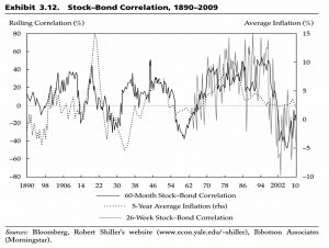
The stock–bond correlation was especially consistently positive between 1965 and 1997 during a period of large gyrations in expected inflation. During this period, changes in inflation expectations drove stock and bond returns in tandem.
Periods of negative stock–bond correlations have been shorter: a decade between the mid-1950s and the mid-1960s and a few years around the 1929 crash.
Then, during the past decade [to 2009] the stock–bond correlation reached its most negative level ever, reflecting government bonds’ role as the ultimate safe-haven assets.
It seems that the correlation is linked to inflation, which means that rising inflation would have a “triple-whammy” effect on bonds – the inflation impact on yields, a rising BRP and the loss of safe-haven status.
Unemployment
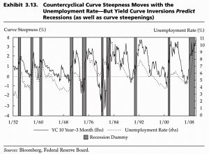
A steep yield curve tends to coincide with a high unemployment rate.
- And as we all know from recent press coverage, a yield curve inversion predicts a recession.
Conclusions
This was a long and fairly complicated chapter, but the takeaways for private investors are quite simple:
- Returns should be higher from longer maturity bonds.
- But interest rate and inflation expectations complicate the picture.
- As do safe-haven and supply/demand factors.
- Stock-bond correlations are not consistently negative (indeed on average they are slightly positive).
- Bonds are most useful when inflation is low and they can act as a safe haven from equity volatility.
- A steep yield curve tends to coincide with a high unemployment rate, and a yield curve inversion predicts a recession.
Until next time.


