Trading For A Living #3 – Technical Analysis
Today’s post is our third visit to Trading for a Living by Alexander Elder. Today we look at Technical Analysis.
Contents
Toolboxes

We met Elder’s classification of trading softwares in our previous post in this series:
A toolbox allows you to display data, draw charts, plot indicators, change their parameters, and test your trading systems.
What goes on inside a black box is secret.You feed it data, and it tells you what and when to buy and sell.
Black boxes are usually sold with excellent track records, since they were created to fit old data. Markets keep changing, and black boxes keep blowing up.
Gray boxes are usually put out by prominent market personalities. They disclose the general logic of the system and allow you to adjust some of the parameters.
The implication is that all you might need is a toolbox.
Toolboxes are for serious traders, black boxes are for people who believe in Santa Claus, and gray boxes are in between.
Elder provides some features you might look for when comparing toolboxes.
- But it seems to me that you won’t know which are crucial to your eventual process until you have developed that process.
I also get the impression that many charting packages – including those which come free from brokers and with data providers – include many of the tools that were hard / expensive to get your hands on a decade or two ago.
- Elder makes the very good point that most of these packages only work when you are online.
- But then again, that’s pretty much all the time these days.
He recommends StockCharts.com as a good, basic, free charting service.
- As we did a couple of years ago.
Elder also suggests that you turn off the display of your gains / losses in real time, quoting Kenny Rogers as he does so:
Never count your money while you’re sitting at the table—there’ll be time enough for counting when the dealin’s done.
Market Data
Elder likes to enough data to cover two bull-and-bear market cycles.
- He calculates that to be 10 to 12 years of prices.
In practice, prices tend to mean revert in the short term (say 1 week), trend in the medium term (1 year), then revert again in the long-term.
So the past year of price data is the most crucial.
- Elder himself won’t trade stocks with less than a year’s price history (ie. IPOs).
Approach
Don’t chase too many markets at once. Focus on quality and depth rather than quantity. Begin by following the key market indexes.
Then focus on a relatively small number of stocks. Get to know them well and become familiar with their behavior patterns. You could start out by focusing on a dozen stocks.
Try to stick to the data in your own time zone. It is risky to trade in a different time zone,allowing locals to pick your pockets while you sleep.
Beginning traders should steer clear of day-trading. It demands instant decision making, and if you stop to think, you’re dead.
A good place to get started is swing trading, i.e., holding positions for several days. Some swing traders manage quite well with end-of-day data.
Indicators
Indicators are used to identify trends and reversals.
- Of course, they may contradict one another.
Some work best in trending markets, others in flat markets, still others at turning points.
Many beginners look for a “silver bullet” – a single magic indicator, but markets are too complex for that.
Others try to poll a multitude of indicators to create an average, but the results will be heavily skewed by the selection of indicators.
The majority of indicators are derived from the same five pieces of data: open, high, low, close, and volume.
- That’s why more is less with indicators.
Elder identifies three main groups:
- Trend-following indicators work best when markets are moving.
- MAs, MACD, DMS, On-Balance Volume, Accumulation / Distribution
- Oscillators catch turning points in flat / ranging markets.
- MACD-Histogram, Stochastic, RSI, Williams %R etc.
- Other “Miscellaneous” indicators provide insights into mass psychology (bullish / bearish intensity)
Elder’s Triple Screen system aims to combine indicators from the different groups so that their strengths remain and their negative features are cancelled out.
- This is a bit like blending grapes in a wine – or cooking.
Elder recommends only using indicators when their signals are clear.
Moving Averages
A moving average represents an average consensus of value for the period of time in its window. Its most important message is the direction of its slope.
Apparently, moving averages (MAs) were used in World War II by anti-aircraft gunners to target enemy planes.
- Early practitioners include Richard Donchian (who used MA crossovers) and J. M. Hurst.
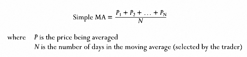
MAs can be simple, exponential or weighted (complicated, and not often used).
Simple MAs used to be popular because they were easy to calculate in pre computer days.
Simple MAs, however, have a fatal flaw – the MA changes when an old price is dropped off at the end of its window.
This is obviously a bigger problem with short MAs – the 200-day MA would not be massively affected.
A simple MA is like a guard dog that barks twice – once when someone approaches the house, and once again when someone walks away from it.
Exponential Moving Averages
An exponential moving average (EMA) is a better trend-following tool because it gives greater weight to the latest data and responds to changes faster than a simple MA.
It also reacts less to old data dropping out of the average (which instead fades slowly in significance).
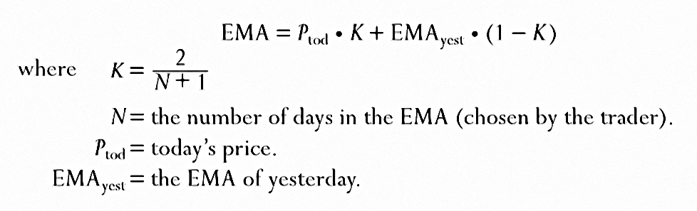
In a 10-day EMA, the last closing price is responsible for 18% of EMA value.
This would be only 10% in the simple MA.
Shorter EMAs are more sensitive, but show more whipsaws.
A moving average should be half the length of the dominant market cycle. If you find a 22-day cycle, use an 11-day moving average.
This is hard to apply, as short-term cycles appear and disappear.
Most traders can use an EMA between 10 and 30 days. Among the numbers I like are 22 because there are approximately 22 trading days in a month and 26 – half of the number of trading weeks in a year.
The EMA-200 is good for long-term investors.
Don’t change indicator parameters while looking for trades. Fiddling with parameters to obtain signals you’d like to see robs your indicators of their most valuable feature – their objectivity.
Trading Rules 1
- When an EMA rises, buy when prices dip near the moving average.
- Place a protective stop below the latest minor low, and move it to break-even as soon as prices close higher.
- When the EMA falls, sell short when prices rally toward the EMA.
- Place a protective stop above the latest minor high and lower your stop to breakeven as prices drop.
- When the EMA goes flat, do not trade.
Crossovers
Old traders used fast and slow MA crossovers. Donchian used crossovers of 4-, 9-, and 18-day MAs. Trading signals were given when all three MAs turned in the same direction.
His method, like other mechanical trading methods, only worked during strongly trending markets. Filters reduce profits as much as losses.
Support and volume
Moving averages often serve as support and resistance. A rising MA tends to serve as a floor below prices, and a falling MA serves as a ceiling above them.
Moving averages can be applied to indicators as well as prices. Some traders use a 5-day moving average of volume.
When volume falls below its 5-day MA, the trend is likely to reverse.
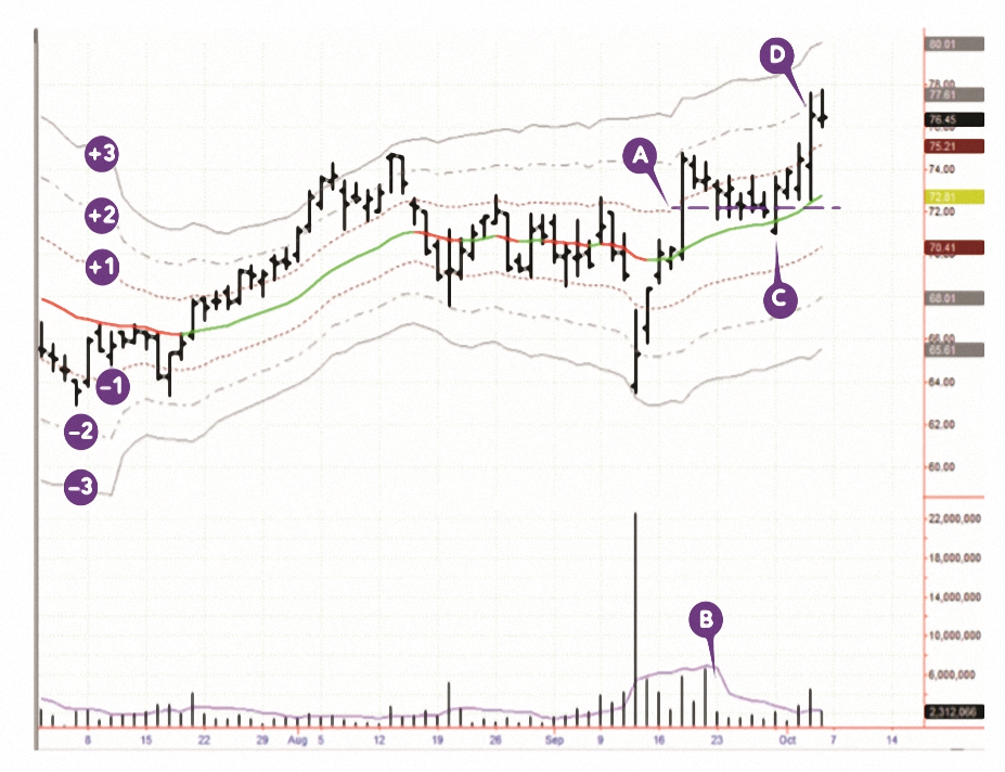
Dual EMAs
Elder is not a fan of crossovers, but he does like to use two EMAs – say 26- and 13-weeks.
- Or 22- and 11-days.
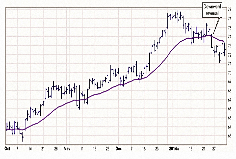
I believe that value “lives” between these two lines. I call the space between the two EMAs the value zone.
Fundamental analysts don’t have a monopoly on the concept of value. Technical analysts can define values by tracking the spread between a fast and a slow EMA.
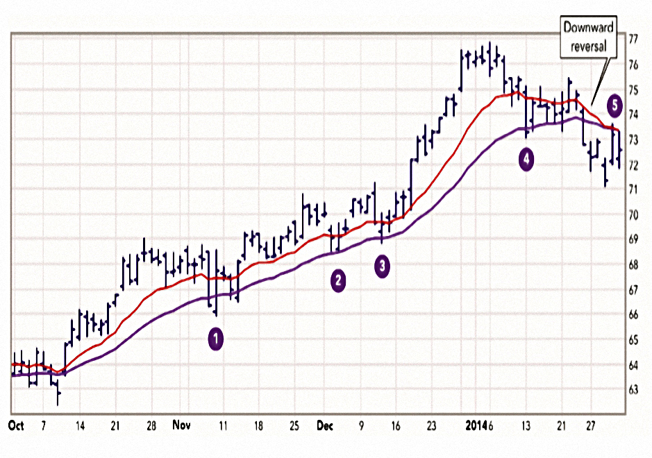
In the chart above, the numbers show pullbacks to value.
- 1 through 4 are buying opportunities in an uptrend.
- 5 is a shorting opportunity in a downtrend.
A channel consists of two lines drawn parallel to a moving average. A well-drawn channel should contain approximately 95% of all prices that occurred during the past 100 bars.
That makes Elder’s channel a 2-standard deviations (“2 sigma”) channel.
- This is the same measure used in Bollinger bands (which are based on the price, not an MA).
Longer-term and more volatile markets have wider channels.
Moving Average Convergence-Divergence
MACD lines and the MACD-Histogram help identify trends and their reversals.
MACD was invented by Gerald Appel.
- It uses three EMAs, but appears on charts as two lines whose crossovers provide signals.
- The MACD line is made from two EMAs and is then smoothed with a third to form the slower Signal line.
This is pretty close to Donchian’s use of MA crossovers.

When the fast MACD line rises above the slow Signal line, it shows that bulls dominate the market, and it is better to trade from the long side.
When the fast line falls below the slow line, it shows that bears dominate the market and it pays to trade from the short side.
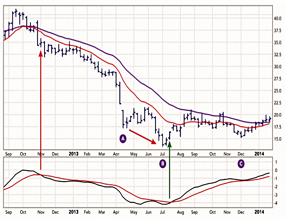
Notice the sell signal, marked by a red vertical arrow, when the fast line crossed below the slow line. That signal reversed more than a year later, when the fast line crossed above the slow line, marked with a green vertical arrow.
Bears’ last attempt to drive ABX lower, in area C, wasn’t confirmed by MACD Lines, which maintained a steady uptrend. At the right edge of the chart, MACD Lines have reached a new high for the up move, indicating strength. Both EMAs are rising, confirming the bullish trend.
MACD Histogram
As the name suggests, this indicator adds a histogram of (MACD – Signal) to make it easier to read.
- Elder really likes it.

A rising MACD-Histogram shows that bulls are becoming stronger. A falling MACD-Histogram shows that bears are becoming stronger.
When the slope of MACD-Histogram moves in the same direction as prices, the trend is safe. When the slope of MACD-Histogram moves in a direction opposite to that of prices, the health of the trend is in question.
The slope of MACD-Histogram is more important than its position. Trade in the direction of the slope.
The best buy signals occur when MACD-Histogram is below its centerline but its slope turns up, showing that bears have become exhausted. The best sell signals are given when MACD-Histogram is above its centerline but its slope turns down, showing that bulls have become exhausted.
Trading Rules 2
- Buy when MACD-Histogram stops falling and ticks up.
- Place a protective stop below the latest minor low.
- Sell short when MACD-Histogram stops rising and ticks down.
- Place a protective stop above the latest minor high.
The changes of slope of MACD-Histograms are much more meaningful on the weekly charts.
A record peak for the past three months of daily MACD-Histogram shows that bulls are very strong and prices are likely to rise even higher. A record new low for MACD-Histogram for the past three months shows that bears are very strong and lower prices are likely ahead.
Bullish divergence
Divergences between MACD-Histogram and prices are infrequent, but they give some of the most powerful signals.
Bullish divergences occur towards the ends of downtrends – they identify market bottoms.
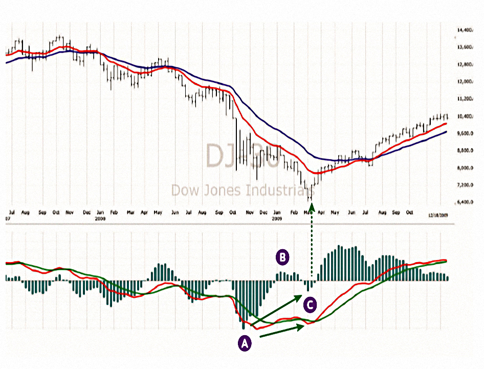
Prices and the oscillator both fall to a new low, rally, with the oscillator rising above its zero line, then both fall again. This time, prices drop to a lower low, but an oscillator traces a higher bottom than during its previous decline.
The record low A of MACD-H indicated that bears were extremely strong and that the price bottom A was likely to be retested or exceeded. In area B, MACD-H rallied above its centerline, “breaking the back of the bear.”
Notice that the brief rally reached the “value zone” between the two moving averages. In area C, the Dow slid to a new bear market low, but MACD-H traced a much more shallow low.
The tick up of MACD-H from the second bottom is the buy signal.
Bearish divergence
Bearish divergences occur in uptrends – they identify market tops.
As you might expect, they are the reverse of bullish divergences.
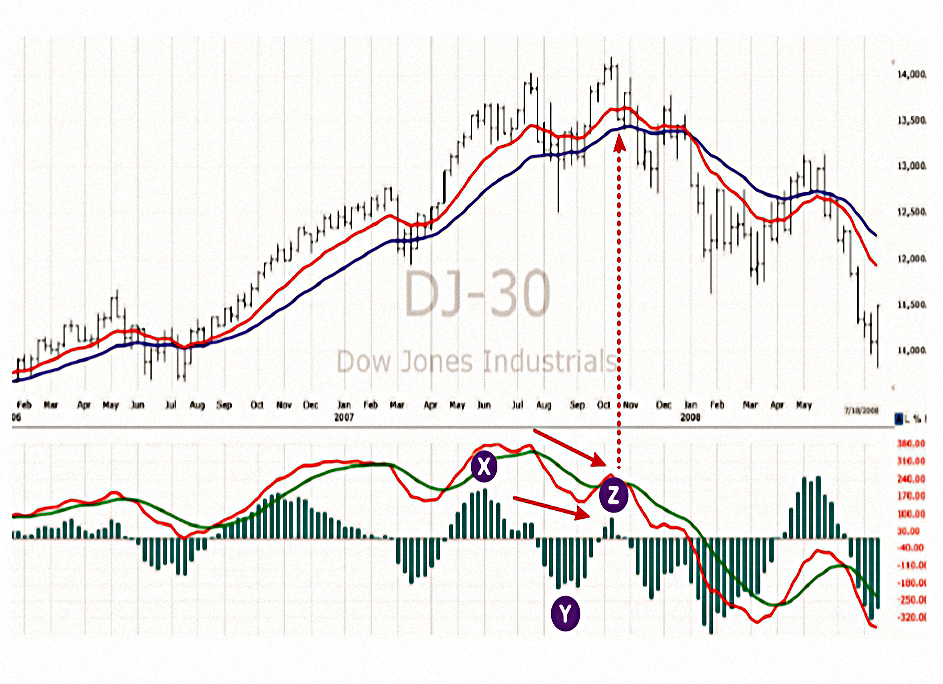
At Y, MACD-H fell below its centerline, “breaking the back of the bull.” Prices punched below the value zone. In area Z, the Dow rallied to a new bull market high, but the rally of MACD-H was feeble.
The most tradable divergences occur when the distance between the two peaks or the two bottoms of MACD-H is between 20 and 40 bars – and the closer to 20, the better.
The best signals come from divergences in which the second top or bottom is no more than half the height or the depth of the first.
Triple Divergences consist of three price bottoms and three oscillator bottoms or three price tops and three oscillator tops. They are even stronger than regular divergences.
The third top or bottom has to be more shallow than the first but not necessarily the second.
Hound of the Baskervilles
A divergence may indicate that an uptrend is over, but if prices continue to rise, they give the Hound of the Baskervilles signal.
In the story, the fact that the family dog didn’t bark meant that a murder was an inside job.
When the market refuses to bark, this shows that something is fundamentally changing below the surface.
On those rare occasions when a bearish divergence aborts, I may go long. In the rare instances when a bullish divergence aborts, I look to go short.
Note that a triple divergence also requires an abort, so this is tricky territory.
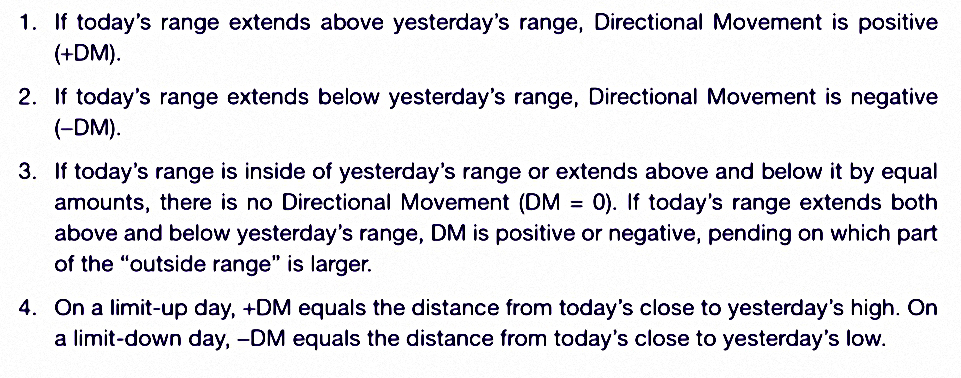
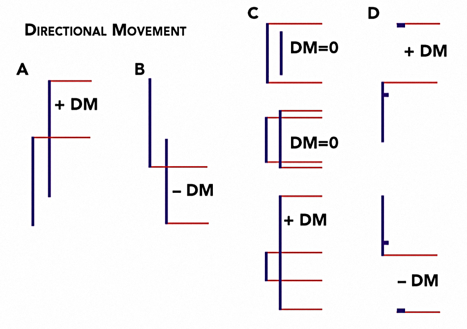
The Directional System
This indicator (now known as ADX / DMS) was originally developed by J. Welles Wilder in the 1970s.
- It’s quite complicated, as the following three diagrams explain:
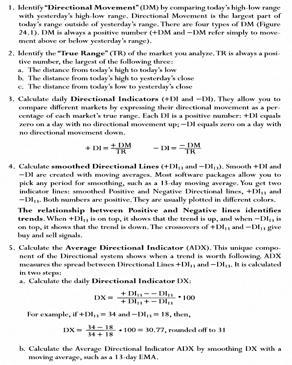
During a persistent trend, the spread between two smoothed Directional lines increases, and ADX rises. ADX declines when a trend reverses or when a market en- ters a trading range. It pays to use trend-following methods only when ADX is rising.
When the Positive Directional line is above the Negative Directional line, it shows that bullish traders dominate the market.When the Negative Directional line rises above the Positive Directional line, it shows that bearish traders are stronger. It pays to trade with the upper Directional line.
The Average Directional Indicator (ADX) rises when the spread between Directional lines increases. This shows that market leaders are becoming stronger, the losers weaker, and the trend is likely to continue.
ADX declines when the the dominant market group is losing its strength. It suggests that the market is in turmoil, and it’s better not to use trend- following methods.
The Directional system gave its buy signal during the bar marked with a vertical green arrow: the green bullish Directional line was above the red bearish line, while the ADX penetrated above the red line.
There’s a similar (earlier and opposite) signal in the lettered area, but this would have meant shorting a stock that had already fallen a long way.
Trading Rules 3
- Trade with the higher Directional line, particularly when the ADX is rising.
- When ADX declines, it’s best not to use trend-following.
- ADX below both lines means a sleepy market.
- ADX below the lines also allows for a stronger signal – the price is forming a stronger base for the next move.
- A move up by ADX from is lowest point below both lines is “ringing a bell” on a new trend.
- ADX above both lines is an overheated market, and when ADX turns down, you should look to take profits.
Average True Range
ATR averages True Ranges (see DMS definition above) to measure volatility over, say, 13 days.
- Elder shows ATR as lines around the moving average (again, like Bollinger bands) but you can also plot it below the price chart.
ATR is useful for entries and stops and exits:
- Entries should be close to one ATR below the fast EMA.
- Stops should be at least one ATR away from the entry (I prefer two ATR).
- Exits could be considered at 2 ATR from the slow EMA.
- Some traders exit in thirds, at +1, +2 and +3 ATR.
Three ATR from the EMA is an extreme move, and a pullback can be expected.
Oscillators
Oscillators are designed to catch turning points – they tell us when a market is overbought or oversold.
- This means that the oscillator has reached a level previously associated with a top or a bottom.
But:
An oscillator can stay overbought for weeks when a new strong uptrend begins, giving premature sell signals. It can stay oversold for weeks in a steep downtrend, giving premature buy signals.
Oscillator lines (overbought and oversold) should be drawn such that the oscillator spends only 5% of its time beyond each of them.
MACD-H is an oscillator, but Elder likes two more.
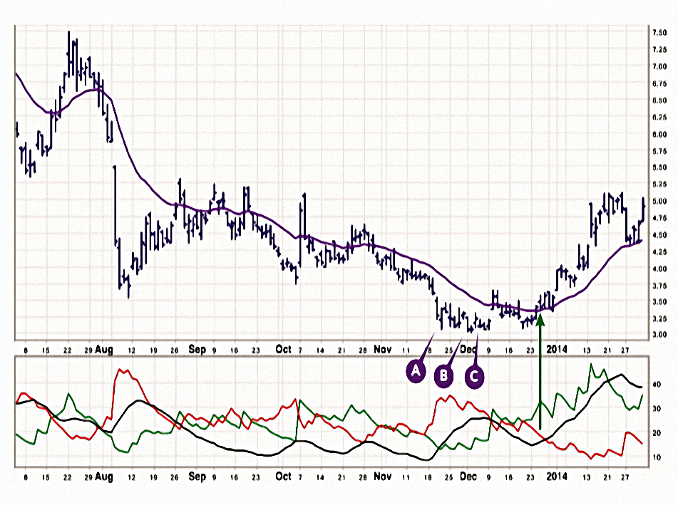
Stochastic
Here’s how you calculate it:
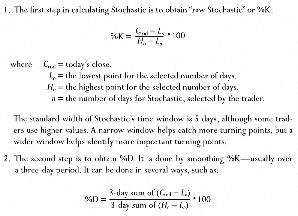
There are two ways to plot Stochastic.
- Fast Stochastic is %K and %D as above.
- This is very sensitive but has a lot of whipsaws.
- Slow Stochastic adds an extra layer of smoothing.
- The %D of Fast Stochastic becomes the %K of Slow Stochastic.
- This is smoothed by repeating step 2 to obtain %D Slow.
Stochastic fluctuates between 0 and 100, with signal levels at 20 and 80.
Stochastic measures the capacity of bulls or bears to close the market near the upper or lower edge of the recent range.
When prices rally, markets tend to close near the high. If bulls can lift prices during the day but can’t close them near the top, Stochastic turns down. It shows that bulls are weaker than they appear and gives a sell signal.
Daily closes tend to occur near the lows in downtrends.When a bar closes near its high, it shows that bears can only push prices down during the day but cannot hold them down. An upturn of Stochastic shows that bears are weaker than they appear and flashes a buy signal.

As long as the stock stays in a sideways trading range, which is where it was for most of the time covered by this chart, Stochastic keeps nailing down short-term tops and bottoms.
These are shown by the green and red arrows.
- But note that the rightmost buy signal is false, overridden by a strong down trend.
Stochastic doesn’t work in a trend.
In uptrends, Stochastic quickly becomes overbought and keeps giving sell signals while the market rallies. In downtrends, it quickly becomes oversold and keeps giving premature buy signals.
Trading rules 4
The most powerful buy and sell signals of Stochastic are given by divergences.
- A bullish divergence occurs when prices fall to a new low, but Stochastic traces a higher bottom than during its previous decline.
- It shows that bears are losing strength and prices are falling out of inertia.
- As soon as Stochastic turns up from its second bottom, it gives a strong buy signal: go long and place a protective stop below the latest low in the market.
- The best buy signals occur when the first bottom is below the lower reference line and the second above it.
- A bearish divergence occurs when prices rally to a new high, but Stochastic traces a lower top than during its previous rally.
- It shows that bulls are becoming weaker and prices are rising out of inertia.
- As soon as Stochastic turns down from the second top, it gives a sell signal: go short and place a protective stop above the latest price peak.
- The best sell signals occur when the first top is above the upper reference line and the second below.
- Do not buy when Stochastic is overbought, and don’t sell short when it is oversold.
Relative strength index
RSI comes from J. Welles Wilder again.
- It monitors closing price changes and its strength is that it is not a lagging indicator.
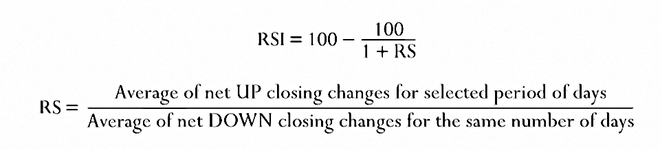
RSI fluctuates between 0 and 100. When it reaches a peak and turns down,it identifies a top. When it falls and then turns up, it identifies a bottom.
Lines can be drawn at 30 and 70, but some use 40 and 80 for bull markets, 20 and 60 for bear markets.

Like Stochastic, RSI works well in a trading range, but gives false signals in a trend.
- RSI is less noisy than Stochastic, and signals earlier.
The red arrow shows a bearish divergence where the price goes to a new high but RSI fails to break the upper line.
- This is a strong sell signal.
But of course you then need to recognise that you are in a trend and ignore the false buy signal to the right.
Trading rules 5
- Bullish divergences occur when prices fall to a new low but RSI makes a higher bottom than during its previous decline.
- Buy as soon as RSI turns up from its second bottom, and place a protective stop below the latest minor price low.
- Buy signals are especially strong if the first RSI bottom is below its lower reference line and the second bottom is above that line.
- Bearish divergences occur when prices rally to a new peak but RSI makes a lower top than during its previous rally.
- Sell short as soon as RSI turns down from its second top, and place a protective stop above the latest minor high.
- Sell signals are especially strong if the first RSI top is above its upper reference line and the second top is below it.
- When RSI breaks above its downtrend line, place an order to buy above the latest price peak to catch an upside breakout.
- When RSI breaks below its uptrend line, place an order to sell short below the latest price low to catch a downside breakout.
- Buy when RSI declines below its lower reference line and then rallies above it.
- Sell short when RSI rises above its upper reference line and then crosses below it.
Conclusions
It’s been a long slog today, but ultimately a rewarding one.
- There are no shortcuts when it comes to the hard technical aspects of trading.
EMAs, DMS, MACD-H, ATR and RSI (in ranging markets) have come out well from today’s analysis.
- DMS was new to me, and looks interesting for shorter-term trading (which I don’t do much of).
The next section of the book is on volume.
Until next time.
Mike Rawson
Mike is the owner of 7 Circles, and a private investor living in London. He has been managing his own money for 40 years, with some success.