Weekly Roundup, 20th September 2016

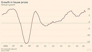
We begin today’s Weekly Roundup in the FT, with the Chart That Tells A Story. This week it was about the impact of Brexit on house prices.
Contents
House prices
James Pickford looked at some new ONS data which shows that house prices are still going up, though not as quickly as before.
- Prices went up 8.3% in the year to July, down from 9.7% in June.
- London was up 12.3%, the South East by 11.9%, and the East by 13.2%.
- The lowest rise was Yorkshire, at 4.7%.
Average prices were up by £1K in July, to £217K.
- There were falls in Aberdeen (because of the oil slump) and at the top end (above £2M) in London.
- Mortgage lending was down 13% on June, but re-mortgaging was up 7%.
Nothing too dramatic so far then, though one month is a bit early to draw conclusions.
Nifty Fifty
Terry Smith presented the second part of his article comparing the Nifty Fifty stocks from 1960s and 1970s USA with today’s bond proxies.
- The Nifty Fifty were large caps with solid earnings growth, and were considered the quintessential buy and hold investment.
The composition of the list of Fifty varied depending on who you asked, but the key characteristic was that their PEs gradually became inflated to the point that they were between double and treble that of the market as a whole.
- When the US market crashed in 1973 because of the oil price shock and rapidly increasing inflation, the Nifty Fifty crashed (though they held out longer than most stocks).
- Many of the stocks fell by between 40% and 80%, and continued to underperform until the next bull market begain in 1982.
The S&P 500’s PE is currently 20.5, similar to its value in 1972.
- But the Consumer Staples sector has a PE of only 22.8, whereas the Nifty Fifty were all on PEs of more than 40 in 1972.
- So the read-across to bond proxies is not clear.
Terry has created an updated version of the Nifty Fifty, with similarly inflated valuations.
- They included Amazon, Adobe, Expedia, Facebook, Netflix, RedHat, TripAdvisor, Yahoo and Monster Beverages.
- These are not the bond proxy stocks, and none of the New Fifty appear in Terry’s fund.
So feel free to worry about inflated valuations in the S&P 500, but focus on the right stocks.
Hedging
David Stevenson was worried about the damage that a Trump election victory would do to the markets.
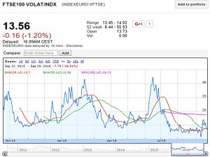
He began by looking at current low levels of volatility, as measured by the VIX in the US and the VFTSE in the UK. ((For a change, the chart below shows the UK index ))
- Similar low volatility was found in the bull markets of 1992-97 and 2003-07.
- David thinks this could be the calm before the storm, and the storm could be Trump.
The people David talks to (“strategists and hedge fund types”) expect a 15% to 20% correction in equity markets if Trump wins.
- You could hedge using the VIX, but David prefers to hedge using the US and UK indices.
- He’s using products called “infinite turbos”.
- These are listed structured products from SG, the French bank and stockbroker.
They are leveraged products with predictable price behaviour that are listed on the exchange like normal shares.
- I’ve looked at them before and will write more about them in the future.
- The problem I’ve had with them in the past (2 to 3 years ago) is that none of my brokers (including the one that used to be owned by SG) supported online trading of them. ((I don’t like trading by phone ))
Back to the hedges.
David has 2% of his portfolio split between MF37 (US) and MF02 (UK).
- There’s no price data for these stocks on Google Finance, but Hargreaves Lansdown lists them.
- They aren’t eligible for ISAs but you can trade them within a SIPP.
- HL now appears to offer online trading in them, so perhaps this category of products is now worth another look.
The MF37 has a leverage of 14 times, so assuming that MF02 is the same, David has hedged around 30% of his equity exposure.
A Trump victory would also push down the dollar (and push up the pound against it).
- The yen would also likely rise as offshore Chinese money was parked there instead of the dollar.
So that’s another couple of bets you might consider.
Insurance
Tim Harford looked at insurance.
Most types of insurance make little sense.
- You’re paying a middle man over the odds (his profit) for payment in the event of a risk occurring.
- Over your lifetime, you would be better off self-insuring.
Only two kinds of insurance are a good idea:
- Legally mandated insurance (eg. third-party car cover).
- Big ticket insurance (eg. against your house burning down).
Tim says that people buy insurance because they are risk averse.
- More specifically they are loss averse – they have an assymmetry of preferences.
- Losing £1M hurts more than how good winning £1M would feel.
But this doesn’t explain why we insure small risks (mobile phones, concert tickets, travel insurance etc).
- Tim thinks the problem is that we view risks in isolation, focusing more on the hassle of buying a new phone than on the money we would save in the long run.
He also thinks that the conditions of sale are important.
- If insurance can be focused on the narrowest possible slice of risk, and sold alongside another product or service, particularly at the last moment, then the anxiety created can produce an incentive to make that anxiety go away.
All of the worst insurance products (extended warranties, mobile phone insurance, PPI, collision damage waivers) are sold this way.
GDP
Gillian Tett looked at GDP, and the difference between a country’s overall and its per capita GDP.
Japan is now closing in on “two lost decades” according to most commentators, with annual GDP growth broadly flat, compared to US growth of 2% pa.
- But Japan’s population is falling, and its per capita GDP growth has been similar to that of the US (1.5% pa from 2000-2010 and 2% pa from 2010-2015).
It’s the opposite story for the UK:
- Our headline GDP growth rate is higher than most of Europe, but our population is increasing, and per capita GDP has hardly budged recently.
Should we switch to tracking per capita GDP rather than the headline?
- Perhaps, but many will prefer the overall number, since it helps to quantify the risk that a nation won’t repay its debts.
These distinctions have greater significance as we approach an age of declining populations in many Western countries (and in China).
- Gillian wonders whether robots might come to the rescue, and finally allow countries with shrinking populations to grow their overall GDP.
As she says, here’s hoping.
Lifetime allowance
Josephine Cumbo reported that “middle earners” are being caught out by the Lifetime Allowance on pension contributions (LTA).
- The treasury’s take from the 55% penalty tax on withdrawals above the limit (now £1M, down from £1.25M in April) has gone up by 62%, from £47M to £78M.
- 1,539 pensioners were affected, up from 1,482 the previous year
I’m afraid I haven’t got much sympathy, even though I think that the LTA is a bit too low at £1M.
According to this mornings best buy annuity rates, £1M will buy you:
- £16.8K pa at age 55, with RPI inflation protection
- £22K pa at age 55, with 3% escalation
- £26.4K at age 65, with joint life protection (“widow’s pension”) and 3% escalation
So the LTA is not generous for those with DC pensions.
But Jospehine is reporting on those with DB pensions.
- Someone on £70K pa with a guaranteed two-thirds DB pension will retire with an income of £47K.
- HMRC uses a multiplier of 20 to gross up DB pensions, so that will convert to £933K.
So a DB pension of £47K is still under the new lower LTA.
- You would need a pension of more than £50K pa to breach the allowance.
The government has no obligation to subsidise excessive pensions, but it seems to me that aspiring to live on the average wage in retirement is reasonable.
- Assuming a retirement age of 60 (as per most DB pensions), £1M gives a DC income of £25K with 3% escalation.
- So the current limit is just about OK.
- For those retiring before 60, it is not so generous.
Those with large DB pensions would be best advised to keep quiet.
- After a series of cuts from £1.8M down to £1M, it’s unlikely that the LTA is going to be increased.
- But the DB conversion factor could be reasonably increased from 20 to 40, to bring it in line with the treatment of DC pensions.
Which would bring the maximum DB pension within the LTA down to £25K pa.
- Be careful what you wish for.
Bank of England pensions
Sticking with pensions, Neil Collins noted that last Thursday was Pensions Awareness day.
He also became aware last week that the Bank of England’s pension was a rare example of a scheme that is in surplus.
- That’s because they paid in a whopping 55% of their salary bill as contributions last year.
No wonder Andy Haldane doesn’t know much about pensions.
- He’s got a copper-bottomed, inflation-proofed £84K pa to look forward to.
Eight years since Lehmans
John Authers looked at what we can learn from the collapse eight years ago of Lehman Brothers.
The main legacy has been the impact on banks.
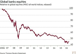
- There may not be many bankers in prison, but the companies they work for have suffered as regulation, reduced leverage and low interest rates have impacted their profitability and valuations.
- Banks have underperformed global equities by 50% over the eight years.
Despite this, both US Presidential candidates have pledged to restore the Glass-Steagall act, which separated investment banking, insurance and commercial banking.
- Note that none of the companies to fail in 2008 would have been affected by Glass-Steagall.
[amazon template=thumbnail&asin=B01FTF81R4]
John also covers a new book by Hal Scott called Connectedness and Contagion.
Conventional thinking on the 2008 crisis is that it was caused by “connectedness” – a domino effect where one failed bank impacts all the others that it owed money to.
- This led to the idea that banks that are “systemically important” are also “too big to fail”.
Hal points out that none of the banks that failed or were rescued were big enough to bring down another bank.
- It was the fear of connectedness (what Hal calls contagion) that led to the crisis.
- Short-term funding dried up, creating a cashflow crisis.
Apparently the public reaction to the bank bailouts in the US – which ended up being profitable to the taxpayer – means that the Fed has lost some of its powers to act as lender of last resort.
- Which means in turn that we are more vulnerable to contagion than we were in 2008.
REITs
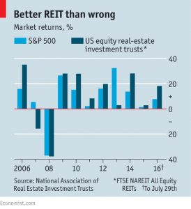
The Economist looked at Real Estate Investment Trusts (REITS) which have just been carved out of the Financials sector in the US indices, and given their own listing.
- A REIT owns property, but pays no tax on the income it earns, instead paying out 90% of the earnings to shareholders.
They are a great way to invest in property without the hassle of managing tenants.
- Unfortunately, although the sector has diversified a lot in recent years (see last week’s article on investment trusts), UK residential property – private rentals – are still under-represented.
- Exposure to US residental property is more readily available.
- You can also buy into data centres, student accommodation, doctors’ surgeries, and ground rents.
They’ve done well in recent years, and are getting a bit expensive (at least in the US).
- They are priced at 23 times earnings, compared with 17 times for the S&P 500.
- Yields remain higher than cash and bonds, at 3.6% (the 10-year Treasury yields 1.7%).
Elephant chart revisited
We’ve seen the “elephant chart” before.
- It shows how well various global income percentiles have done from 1988-2008.
- Globalisation has benefited the very rich and the poorest 70%, but those between the 70th and 90th percentiles did not do well.
A report from the Resolution Foundation has taken a closer look at the chart.
- Many people think the chart shows what happened to the people in each percentile over the 20 years.
It does, but they are not the same people.
- People can get richer and move up the ranks.
- Or be left behind and move down.
- Or they can change countries.
Countries being born and dissolving (eg, the Soviet Union) will affect the data, and data for all of the countries was not available in both years.
Faster population growth at the bottom end of the distribution means that most of the original people would move up the ranks even if they didn’t get richer.
The people who did worst on the original chart were the 75th to 80th percentile.
- They were mostly poor Westerners and rich Latin-Americans in 1988.
- By 2008 they were mostly rich Chinese.
Branko Milanovic, author of the original chart, was aware of these limitations, and produced an alternative chart (less well-known) to account for them.
- This chart shows how the original people from 1988 did over the 20 years.
- It’s still elephantine, but the the top 1% do less well.
The worst-performing group is now the 90th percentile (middle-class Westerners).
- They’ve done better on the modified chart, but still not well.
The original chart may not explain Trump and Brexit, but the modified chart does nothing to challenge the assertion that the uneven spread of the benefits from globalisation is a big factor in both.
London and the rest
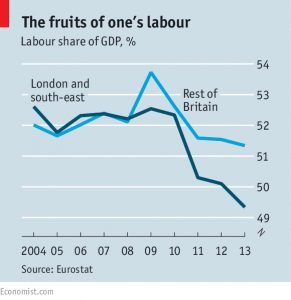
Sticking with inequality, the Economist compared London and the South East (“LSE”) to the rest (henceforth “The Rest”) of the UK.
- London is the most economically important city in Europe.
- If LSE are excluded, Britain’s GDP growth from 2008-14 is lower than that of France.
- Investment and company formations are much lower in the The Rest.
The Rest has a per capita GDP 10% below that of Europe, level with Spain.
- Anglesey is 57% below the EU average.
- London is 86% above the average.
Yet since 2009, pay in The Rest has grown faster than in LSE.
- After the lower housing costs in The Rest are subtracted, the gap is even bigger.
For some reason, workers in The Rest are hanging on to a bigger share of GDP growth.
- This “labour share” is falling in the LSE.
Factors include the higher age (and therefore greater bargaining power) of workers in The Rest.
- They are also more highly unionised, and more have jobs in the public sector (where pay has grown faster).
- There are also more of them on the minimum wage, which has risen quickly in recent years.
- It’s also likely that the replacement of low paid workers with automation and the “gig economy” has gone further in LSE.
Most of these trends could end or reverse:
- public sector jobs could be cut, and automation could sweep the country.
But for now, The Rest are doing well.
Incentives
And finally, the Economist had a couple of stories – both commercial banking scandals – that illustrate the importance of incentives.
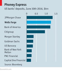
In the US, employees of Wells Fargo were incentivised to cross-sell additional products to existing customers.
- And so they opened 1.5M deposit accounts and 0.6M credit cards without the permission of their customers.
- On average, customers ended up with 6.3 products (the target was 8).
Wells Fargo has been fined $185M and 5,300 staff have been sacked.
- The head of the retail bank has escaped unharmed with an annual $9M package.
- The stock price has fallen and Wells Fargo is no longer the largest US bank.
In India, the Jan Dhan scheme was designed to provide poor people with bank accounts.
- Hundreds of millions of accounts were opened, but most were unused.
- Then the scheme appeared to take off, with unused accounts falling from one half to less than one quarter of the total.
What really happened was the “One-Rupee Trick”.
- Bank employees deposited one rupee (around 1p) of their own money into each account.
- One bank found that 29% of its accounts had only 1 rupee, and another 5% less than 10 rupees.
Most of the banks involved were state-owned and subject to pressure from above.
- Plus ca change.
Until next time.


