Weekly Roundup, 6th March 2018

We begin today’s Weekly Roundup in the FT, with the Chart That Tells A Story. This week it was about regional house prices.
Contents
Regional house prices

James Pickford looked at house price changes over the last nine years.
The chart breaks the period down into four sub-divisions of of 3, 2, 2 and 2 years), and shows gains (and occasional losses) across 19 regional cities in the UK – including London.
- London and other southern cities (particularly Oxford and Cambridge) recovered quickest after the 2008 crisis, as foreign money came in.
- But this area peaked in 2015 as prices became unaffordable.
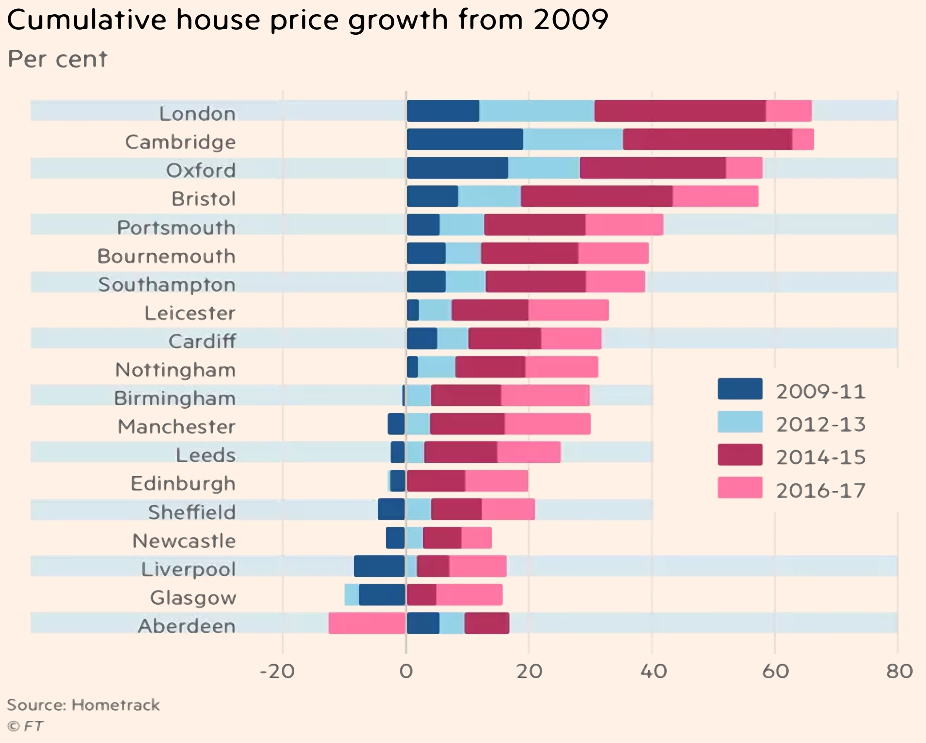
In the last two years, regional cities – particularly in the north and in Scotland – have started to catch up.
- But they are not expected to show the overall growth that London did.
ISAs and IHT

Merryn’s column was about her dislike of the ISA’s IHT status (it doesn’t shelter money from IHT).
- Given that the data shows that the over-65s aren’t decumulating their ISAs, that means they will be heading for serious IHT bills.
The only alternative is to move your ISAs into AIM stocks.
- You can do this yourself, or take advantage of ready-made (but expensive) solutions from people like Octopus or Unicorn.
You know what I think – go DIY.
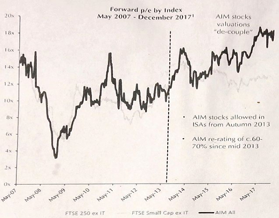
Merryn also points out that valuations of AIM stocks have de-coupled since they were granted IHT exemption – this is certainly something I’ve noticed in our own AIM IHT portfolio.
- Apologies for the quality of the chart – Merryn had me sign up to Instagram to get this, but it’s lacking in contrast.
ISA special
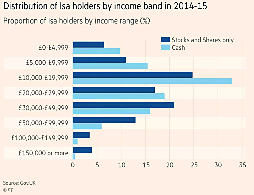
This week was “ISA Special” week for the FT, so there were a lot of articles.
- They are mostly entry-level, but you might find something of interest.
- They also contain some useful charts and tables.
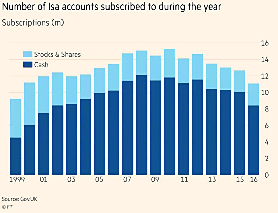
- Note the shocking dominance of cash ISAs over stocks and shares ISAs.

Kate Beioley had a couple of scene-setter articles (here’s the second one).
She also had an article on how to mix and match between the various types of ISA.
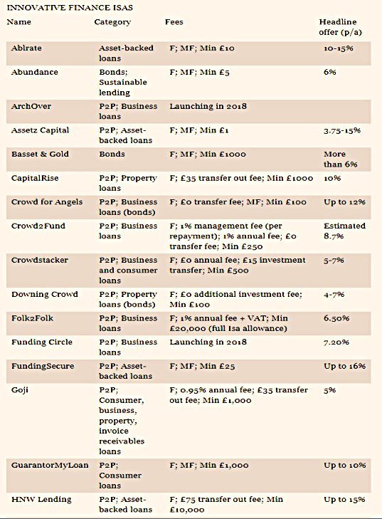
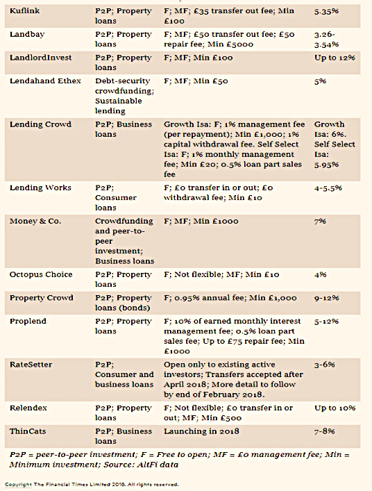
Her fourth article summarised the P2P options within the IF-ISA.
Lucy Warwick-Ching had an article on how to use ISAs to build a nest egg for your children.

Lucy’s second article was about ISA transfers.
James Pickford wrote about the poor returns on cash ISAs.
Australian pensions

Josephine Cumbo wrote in praise of the Australian pension system.
- This superannuation scheme (the “super”) involves mandatory contributions from all work income (mostly from employers, at 9.5% of earnings).
- Employees can make additional voluntary contributions and many do.
Employees can also choose where to invest their pot and don’t need to stick with what their employer chooses (though most do).
- This flexibility leads to lots of comparison websites and a spirit of competitiveness between workers saving towards their retirement.
It also means that Australians save – on average – four times what the typical Brit puts away.
- It’s not surprising, given that the UK workplace pension rollout has only just completed, and contributions are currently 2% pa (1% from the employee and 1% from the employee).
This will rise to 8% (3% employer, 5% employee) over the next two years.
- It remains to be seen how many UK workers will remain in the system as the contributions go up.
But I expect that we will need to make contributions compulsory over here at some point, too.
60 years

John Lee’s irregular column was this week not about a stock one of his mates had done well on, but instead, a look back over his 60 years of investing.
It was largely based around dividends and the distant past
- I didn’t get much from it, but perhaps it will mean more to you.
It does list his current portfolio, but I’m already familiar with those stocks.
John will be speaking at the Mello private investor conference in Derby next month (which I am attending).
Automation and interest rates
Over in the Economist, Buttonwood wrote that automation will drive interest rates higher (according to a new report from the Bain management consultancy).
- The logic is that $8trn will need to be invested in automation by 2030.
And this demand for capital will mean that lenders can charge higher rates.
- In turn, more automation will lead to higher productivity.
Buttonwood points out that productivity has been hit by the shift from manufacturing to services (where productivity gains are much harder to achieve).
- But automation should improve productivity even in services.
Lower-skilled workers will be most impacted, leading to greater inequality.
- And since richer workers save and invest more, interest rates could fall again once the investment in automation is complete.

A 2017 paper from the BIS argued for a rise in interest rates on demographic grounds – driven by a glut of retirees runnning down their savings pots.
- Companies will need to substitute capital for labour as the workforce in advanced economies shrinks.
On this model, a smaller pool of workers will earn higher wages, and inequality will fall.
- This wage inflation will need to be controlled with higher interest rates.
Higher wages means lower profits, and combined with higher interest rates, they both imply lower share prices.
Pension transfers

In Pensions Expert, Angus Peters reported that the government will allow the bulk transfer of defined contribution scheme members without their consent.
- This is seen as an important step towards DC scheme consolidation.
There are currently 2,180 trust-based DC schemes and 80% have fewer than 1,000 members.
- A=around a third are expected to combine with larger schemes.
Existing legislation was based on DB schemes, and required member consent or a certificate from an actuary that members were not losing guarantees (which typically don’t exist within DC schemes) because of the transfer.
Robot advisors
FT Adviser had good and bad news for robo advisors.

Damian Fantato reported that the high-risk portfolios from many robo advisors had outperformed the FTSE 100 during 2017, with lower risk.
The top performing portfolios analysed were Scalable Capital’s 25 per cent (which returned 19.27%), Nutmeg’s Portfolio 10 (13.41%), followed by Evestor’s Portfolio Three (12.72%).
The average aggressive portfolio returned £562 [on an initial £5K] while the FTSE 100 returned £597, but with more volatility. The average medium risk robo-advice portfolio returned 6.9% and the average mild risk portfolio returned 2.1%.
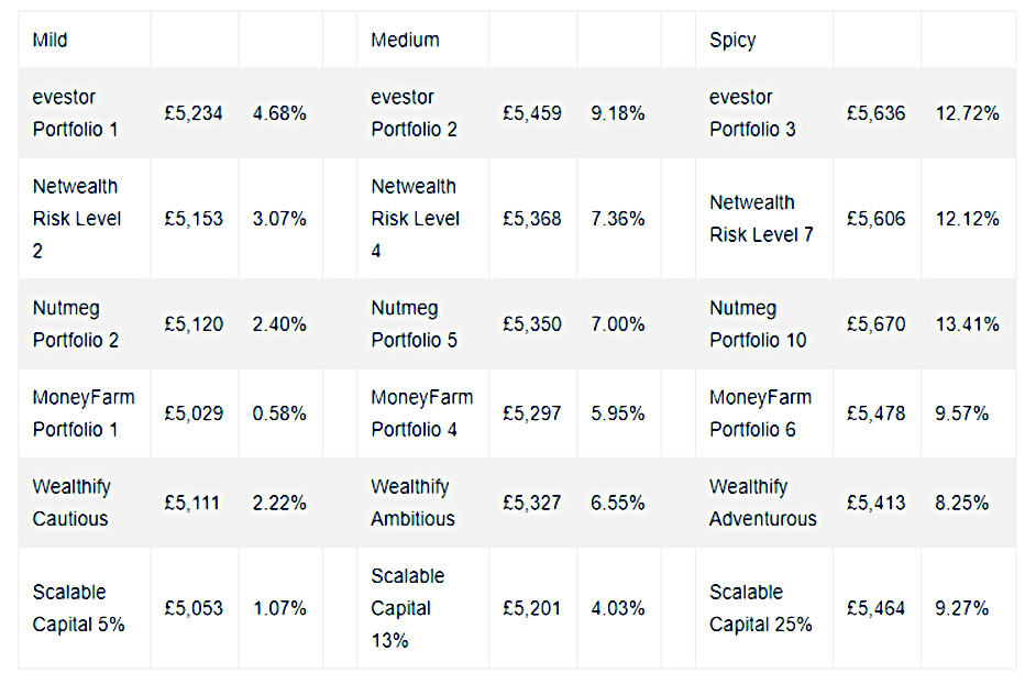
The analysis was done by Boring Money.
Damian’s second article (on more work from Boring Money) reported that robo advisors weren’t attracting lots of new customers.
Assets under administration in the robo-advice grew by 19.7% during 2017 but this compared to FTSE 100 growth of 11.9%. Customer numbers have remained “largely static” while the average account size has more than doubled from £25,000 five years ago to £53,000 in 2017.
Hargreaves Lansdown continued to dominate the non-advised investment market with its market share increasingly very marginally to 42.1 per cent. The top five companies had a 72 per cent market share.
While I’ve been none too impressed by robo advisor offerings to date (with the honourable exception of PensionBee) the continued dominance of the expensive HL platform staggers me.
- Inertia and glossy mail outs still have the upper hand over slick websites and algorithms.
McDonnell watch

Jim Pickard (of the FT) interviewed Labour shadow chancellor John McDonnell.
It’s a fairly bland interview (no doubt the FT would love to see him in power) and I only have a few quotes:
Business leaders can’t do anything unless they’re part of a collective. Unless they’ve got that wealth creator, that engineer and that work person, that skilled person at the bench to fulfil that idea . . . they’re nothing.
We don’t accept money from bourgeois organisations.
Our objectives are socialist. That means an irreversible shift in the balance of power and wealth in favour of working people.
I love that “irreversible”.
A lot of FT readers are upset that McDonnell’s been given the platform, but I’m still a believer in public debate.
- I just wish that the FT had asked him where he would get the money to buy everyone a pony.
Surplus
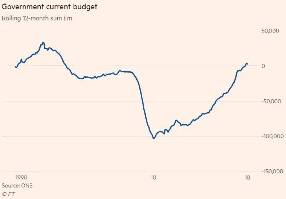
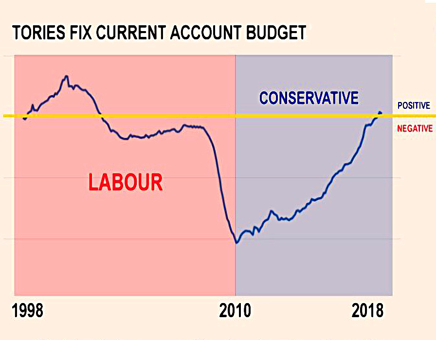
Let’s end in a better place – the UK is back in the black.
- For the first time since 2002, we’re running a current budget surplus.
- Capital investment is excluded, so it’s only a qualified success.
It’s a victory for austerity, if you accept the media definition of austerity as “over-spending by less than we did last year”.
- If – like me – you prefer a stricter definition, then it’s the start of austerity (after an eight year wait, and three years late).
But it’s still welcome news, even though I notice that the mainstream media is trying to focus on spurious “consequences” of “severe cuts in spending” (actually a small increase in real terms).
- The real cause of the surplus is a rise in receipts from income tax and capital gains tax.
The deficit is not the debt, of course.
- That remains at £1.74 trn, or 84% of GDP.
Twitter pics
It was another bumper week for Twitter – I have eleven charts for you today.
First up, some pushback against Warren Buffett.
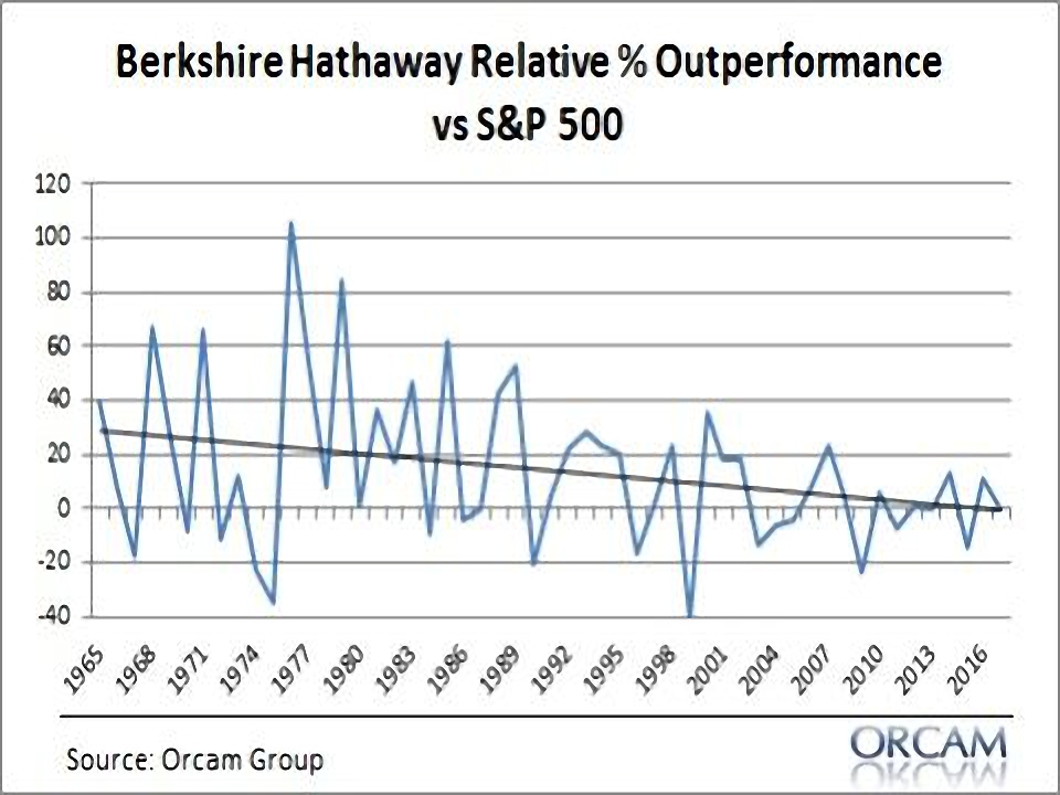
The first chart shows the slowly declining trend in outperformance of BRK relative to the S&P500.
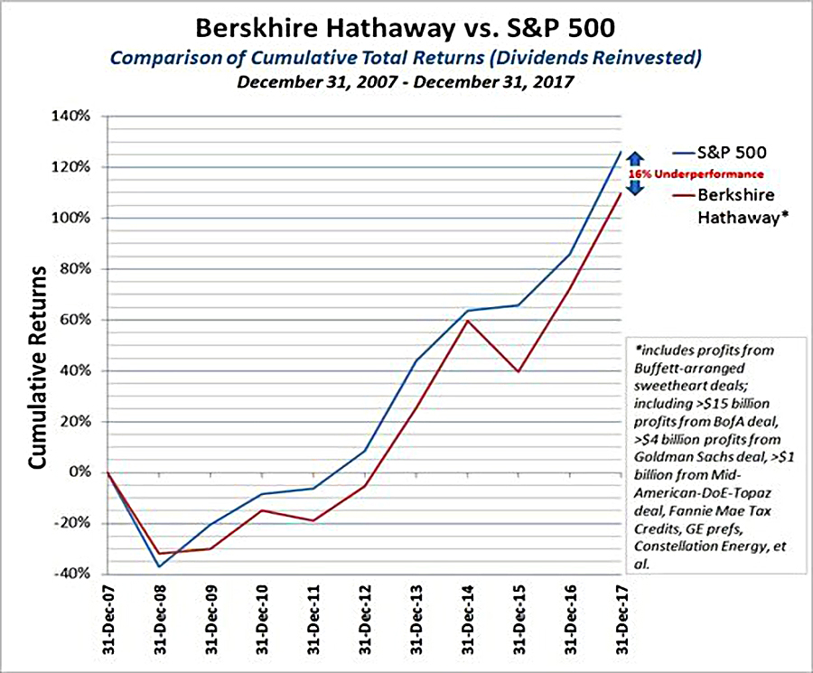
The second chart shows the recent underperformance in more detail, and goes back to 2007.
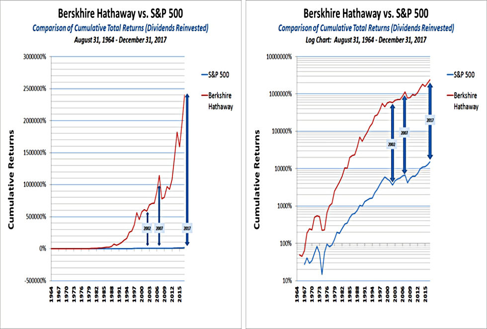
Of course, over the long run, Warren is still way ahead (because of his early outperformance).
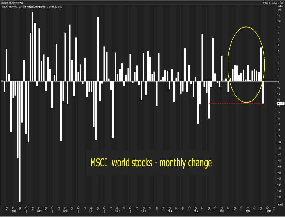
This chart shows that the world index has finally turned down (in Feb) after two years of steady gains.
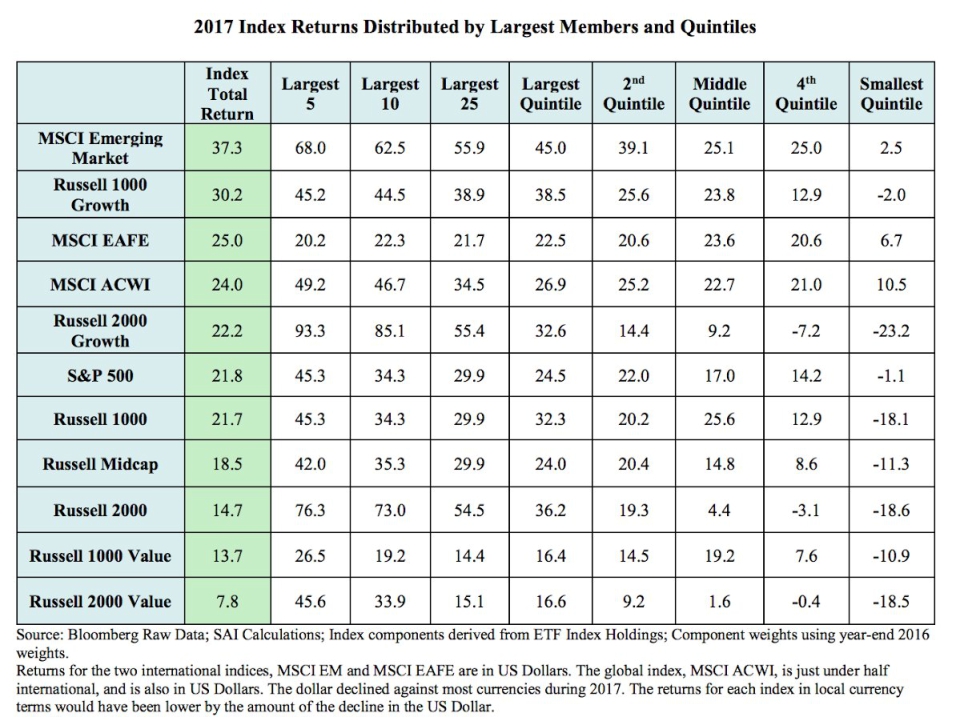
And this one shows that the gains of 2017 were relatively concentrated.
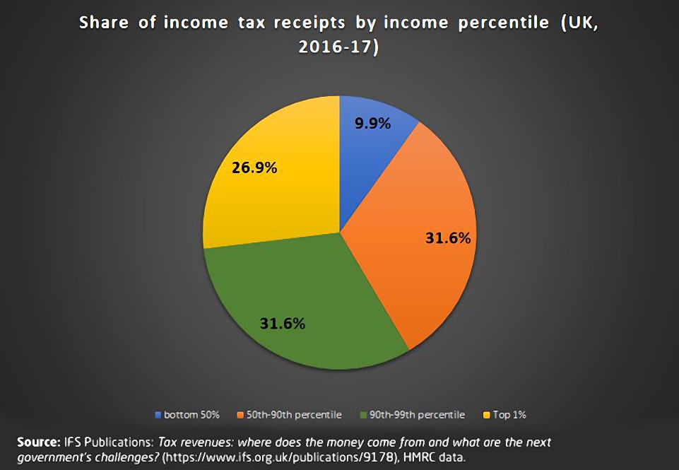
This chart shows who pays income tax:
- “the 1%” pay 27%
- and “the 10%” pay 59% of it
- the bottom 50% in society pay only 10% of the tax
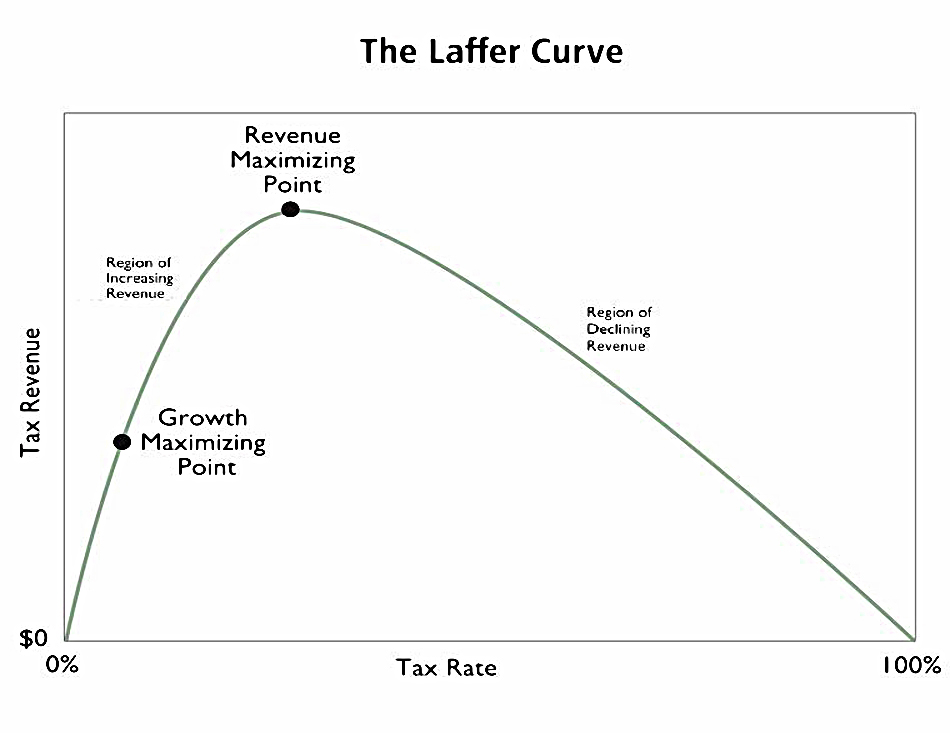
Next up is a reminder of the Laffer Curve:
- Increasing rates of tax first reduces growth and then eventually (not that eventually – at around 45%) reduces the amount of tax that you raise.
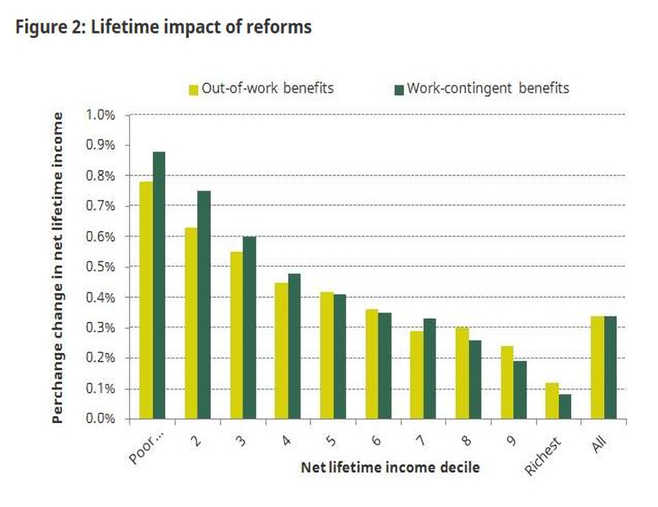
This one shows that in-work benefits have a greater lifetime impact on the poor than do out-of-work benefits.
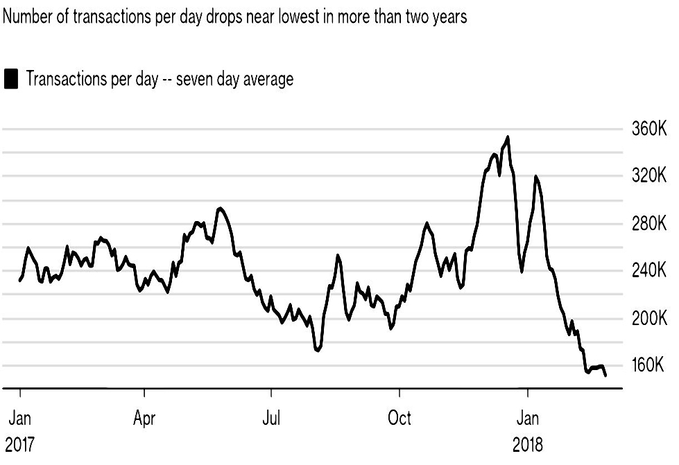
This chart shows that while the Bitcoin price may have recovered to $11K, the number of transactions in the cryptocurrency has fallen off a cliff since the price bust in mid-January.
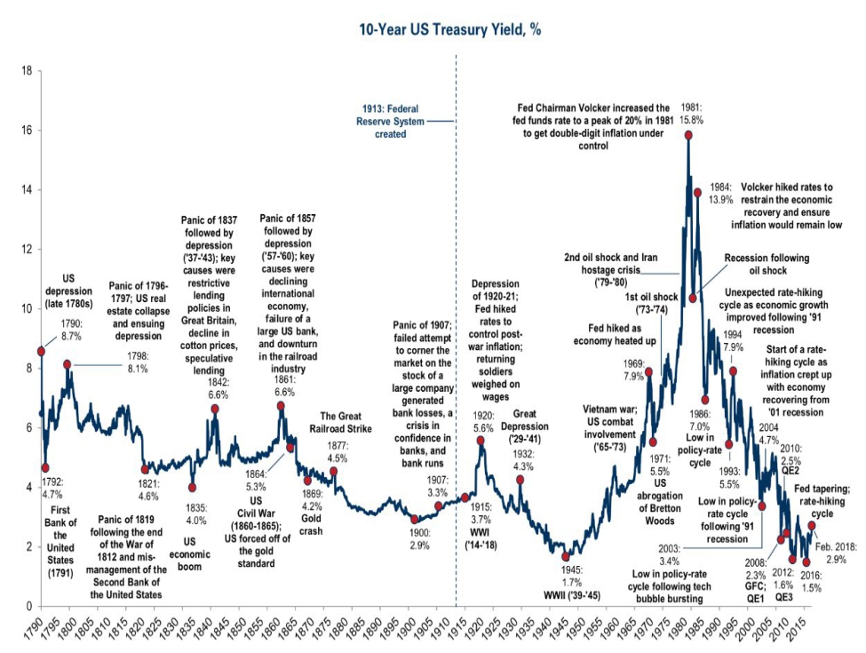
The penultimate chart shows 230 years of US 10-year Treasury yields, with notes on the most interesting developments along the way.
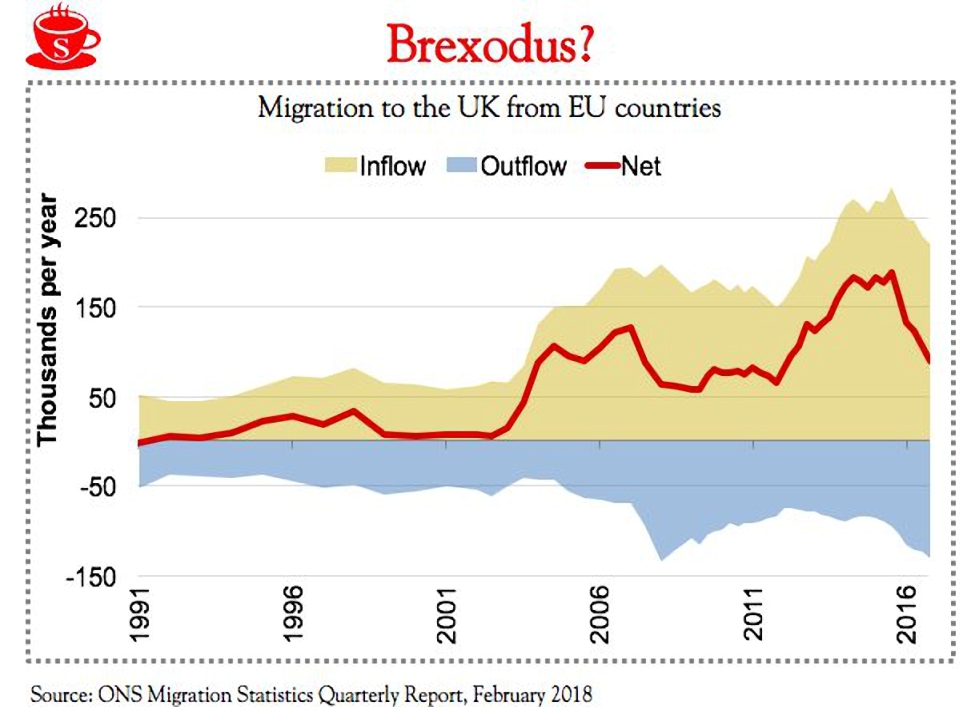
We end with a chart from the Brexit spin file.
- The BBC used the data from this chart (sourced from the ONS) to write a story headlined “record numbers of EU citizens leave the UK”.
- Yet many more have arrived, and the net inflow remains close to 100,000 per year (and well above historical averages).
Until next time.
Mike Rawson
Mike is the owner of 7 Circles, and a private investor living in London. He has been managing his own money for 40 years, with some success.