Annual Portfolio Review 2022

It’s that time of year again. Today we’ll be taking a look at how my overall portfolio performed last year. Stay tuned for the Annual Portfolio Review 2022.
Contents
Headlines
Let’s start with the usual scene setting:
- I run a large and well-diversified multi-asset portfolio.
- I’ve been in decumulation (retirement) for quite a few years and I have dependents – so I can’t take on a high level of risk.
- I have a decent amount of non-listed assets (48% of property and DB pensions) which limits my risk asset exposure (equities are usually at somewhat less than 40%).
- I’m more interested in steady long-term compounding than in shooting the lights out during a good year for global stocks.
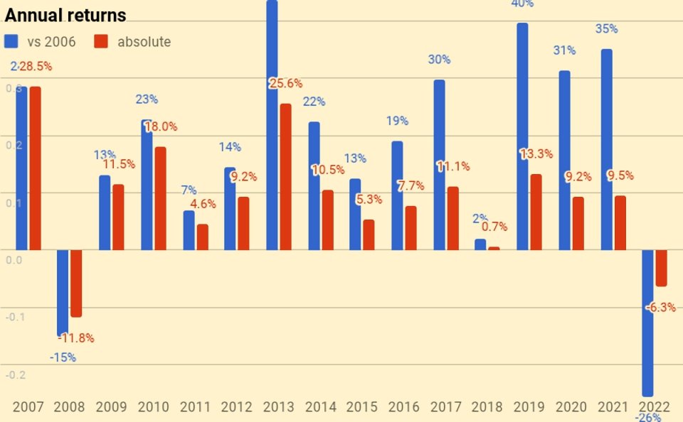
On to the scores – I lost 6.3% in 2023, making it the worst-ever year in my investing career.
- It was my worst-ever year in nominal terms (pounds sterling)
- After inflation, the numbers look even worse
- It was the second-worst year in percentage terms (despite being only my second down year in 39 years of investing)
- I lost more money than I managed to accumulate in my first 13 years of investing
- I trailed my benchmark by more than 5%
My listed portfolio was down by 8.9% whilst my unlisted portfolio did somewhat better.
- Nevertheless, the unlisted portion trailed the benchmark because (1) my property is concentrated in London, which did worse than the rest of England and (2) rising bond yields impacted my bonds and DB pensions (whereas the benchmark uses cash).
Since this is a down year generally, for once I have beaten some (though not all) of the UK stockpickers on Twitter.
- I still don’t ever expect to run out of money.
My blended benchmark was down 0.5%, so I underperformed by 5.8%.
- UK Inflation increased once again to 9.3% – adding on my target SWR of 3.3% gives a gross target of 12.6%, which we have missed by 18.9%!
In practice, my actual withdrawal rate is around 0.7%, so my personal target for 2022 would be 10% (missed by 16.3%).
- This has been a shocking year for my future purchasing power.
My net worth decreased by the equivalent of around nine and a half years of living expenses.
- I now have around a net worth equivalent to 141 years of living expenses.
With an average life expectancy for me and my partner of 25 years, this gives a “death ratio” of 5.6 times (down from 5.8 times last year).
Performance
We’re down 6.3%, and our average life expectancy has decreased by one year, so we’ve lost 5.6% on that basis (-6.3% plus 0.7% for one year’s withdrawals).
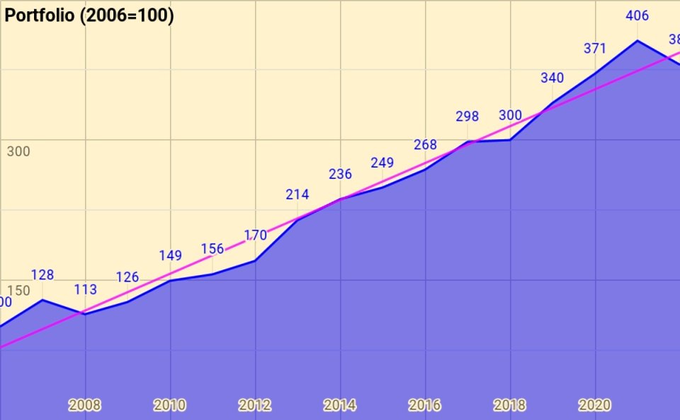
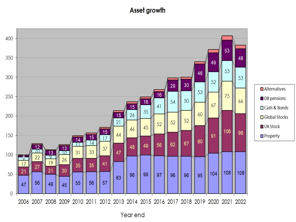
Rather than use UK currency, 2006 is baselined at 100, so the portfolio is now worth 381 (down from 406 last year).
- Total growth over 16 years is 280.6%, or 8.7% compound pa.
This remains acceptable given that it includes the 2007 financial crisis, thirteen years of low interest rates and the Covid crisis.
The chart below breaks the growth out into annual chunks:
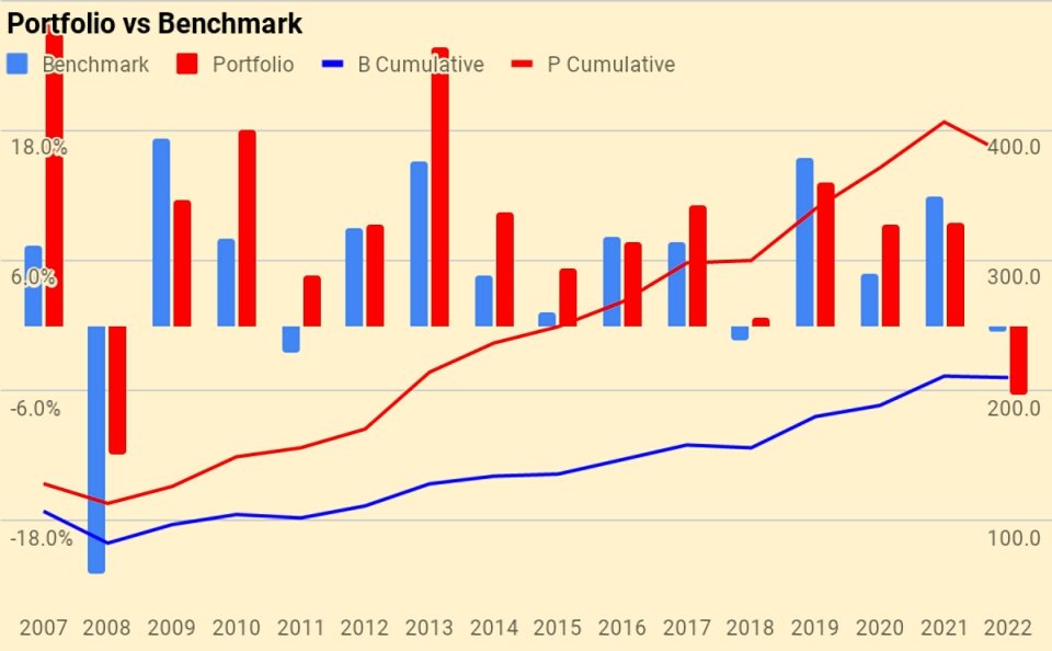
Benchmark
I use a composite benchmark made up of four items.
- It’s intended to be an average allocation for a UK private investor aiming to reach financial independence.
It has four components:
- UK stocks – 15%
- International stocks – 40%
- UK residential property – 25%, and
- Cash/bonds – 20%
The weights start from allocating a target percentage to property and cash.
- I then divide the remainder between UK stocks and international stocks.
Note that I use DB pensions and cash rather than bonds proper (which I have considered to be overvalued for some time, though they are getting closer to a buy).

Over 16 years the benchmark is up 110.0%, or 4.7% pa.
- My compound return over the same period is 8.7%, oo my portfolio has on average outperformed by 4.0% pa (in nominal terms – see also the more detailed analysis below).
Here’s a year-by-year breakdown of the performance of the portfolio and the benchmark:
Asset allocation
Unlike many bloggers and Twitterati, I use a “total wealth” approach to my portfolio.
- This is primarily so that I maintain a high enough allocation to equities as I get older.
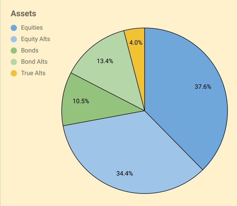
I use five high-level asset classes (last year in brackets):
- Equities 37.6% (40.9%)
- Equity Alts 34.4% (32.2%)
- Bonds/Cash 10.5% (7.4%)
- Bond Alts 13.4% (13.7%)
- True Alts 4.0% (5.7%).
The second chart shows how these assets have grown over fourteen years. (( The split between the UK and international stocks is now obsolete, but the numbers are otherwise pretty accurate ))
The third chart shows the same data in percentage terms rather than absolute numbers:

Portfolios
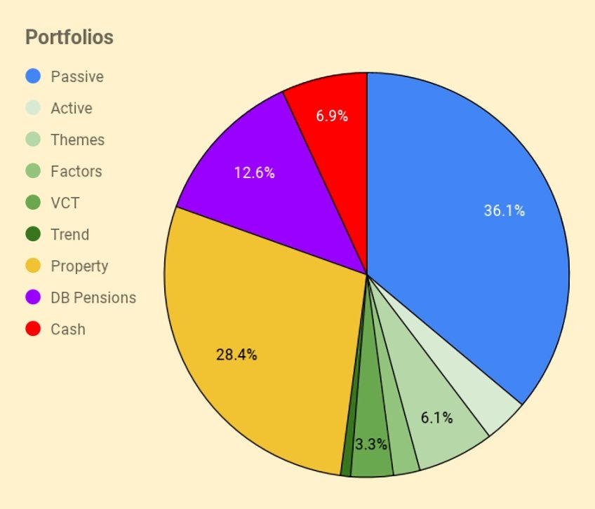
I have six listed portfolios:
- The core passive portfolio
- An active UK stock portfolio, split between AIM and the main market
- A theme portfolio (ESG, tech and biotech)
- A factor fund (smart beta) portfolio
- A VCT portfolio,
- And a trend-following (momentum) portfolio
I also have three non-listed “portfolios”:
- Property, including the house I live in
- DB pensions
- Cash
The table below maps the portfolios onto the high-level asset allocation that we’ve seen previously:
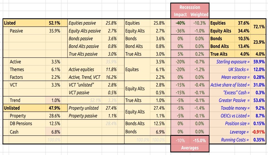
The red section is a stress test showing the impact of a 40% crash in global stock markets.
- The running costs of the portfolio remain at 0.35% pa.
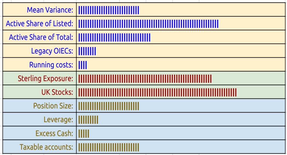
I use a few bar chart indicators, but I’m not sure they make things much clearer.
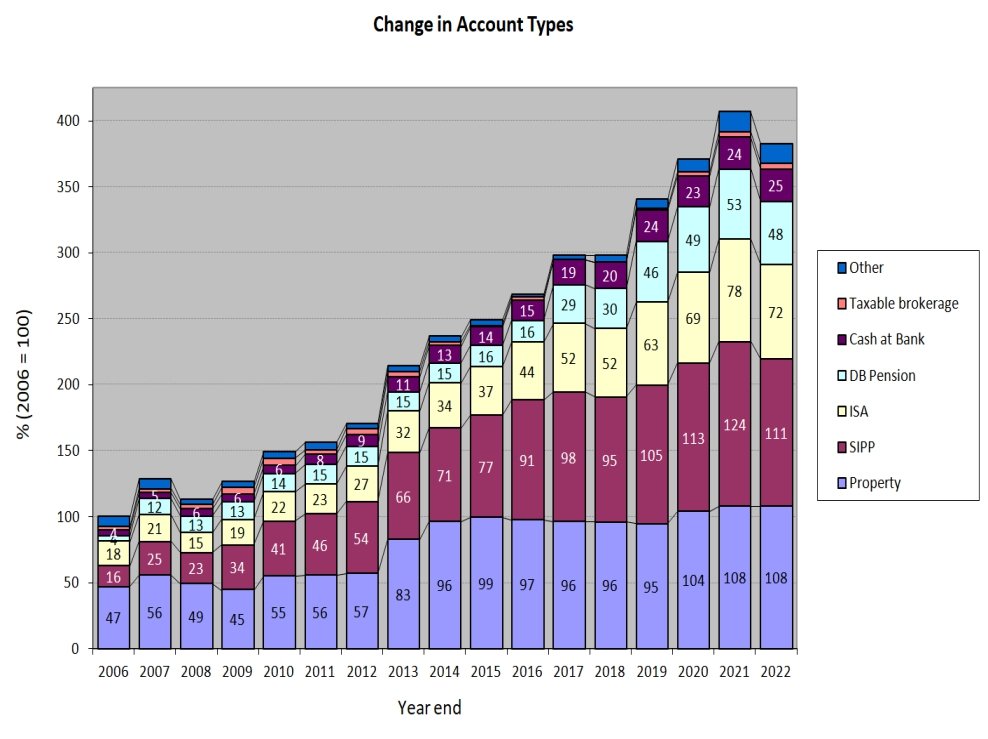
Accounts
Apart from the 28% in property, another 50% is in SIPPs and ISAs – that’s close to 80% of the total accounted for.
- The remainder is split between DB pensions, cash, VCTs and taxable accounts.
The two charts below show how these account types have varied over the years, in absolute and relative terms:

New money
The long-term annual returns of 8.7% pa are flattered by three (overlapping) things:
- new money
- inflation
- the positive performance of the benchmark portfolio
Let’s look at new money first.
The chart below shows the net extra contributions to the portfolio (from income and inheritance) or withdrawals (from pensions) by year:
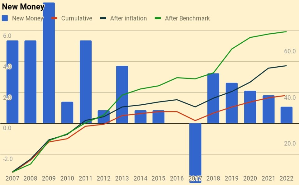
The chart also shows a cumulative total for the entire period (the red line), and then increases this to reflect inflation (blue line) and benchmark growth (green line).
- New money totals 38.8 of the total portfolio’s value of 381.
- After inflation, this rises to 51.6
- After benchmark growth, it rises to 73.8
Alpha vs inflation
The chart below shows inflation over the last fifteen years:
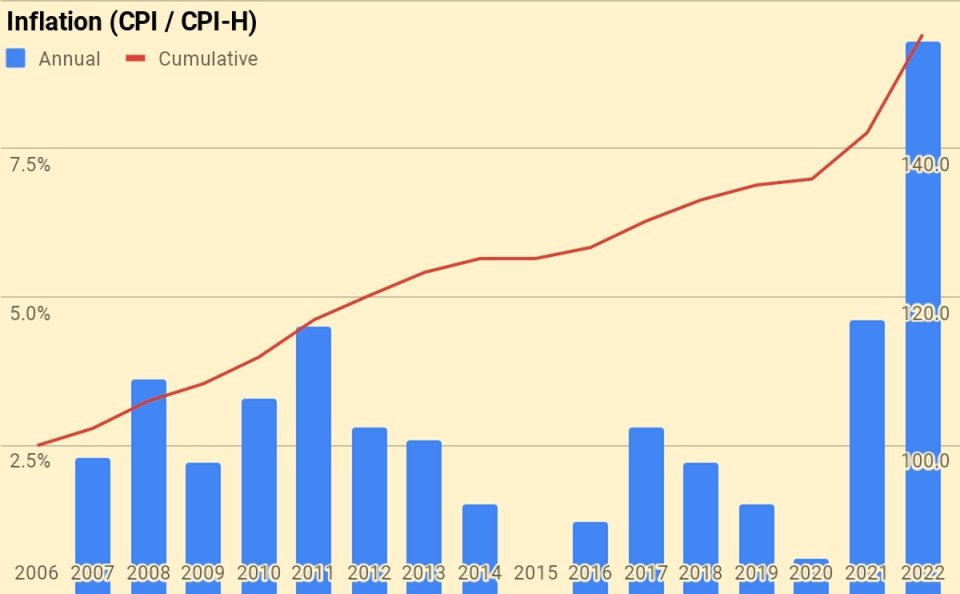
- Total inflation has been 55.4%, or 2.8% pa.
The second chart shows the portfolio against new money and inflation:
- the green area is the initial portfolio plus inflation
- the blue area is the new money added plus inflation
- the red area is the value-added (alpha) from investment choices
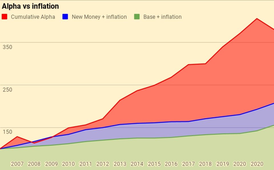
Of the current portfolio value of 381:
- 155 is the base portfolio plus inflation
- 52 is new money and inflation
- 174 is alpha
Alpha vs benchmark
The next chart shows the growth of the benchmark over the years:

The benchmark is up 110%, or 4.7% pa.
The next chart is the portfolio against new money and the benchmark:
- the green area is the initial portfolio plus benchmark growth
- the blue area is the new money added plus benchmark growth
- the red area is the value-added (alpha) from investment choices away from the benchmark portfolio
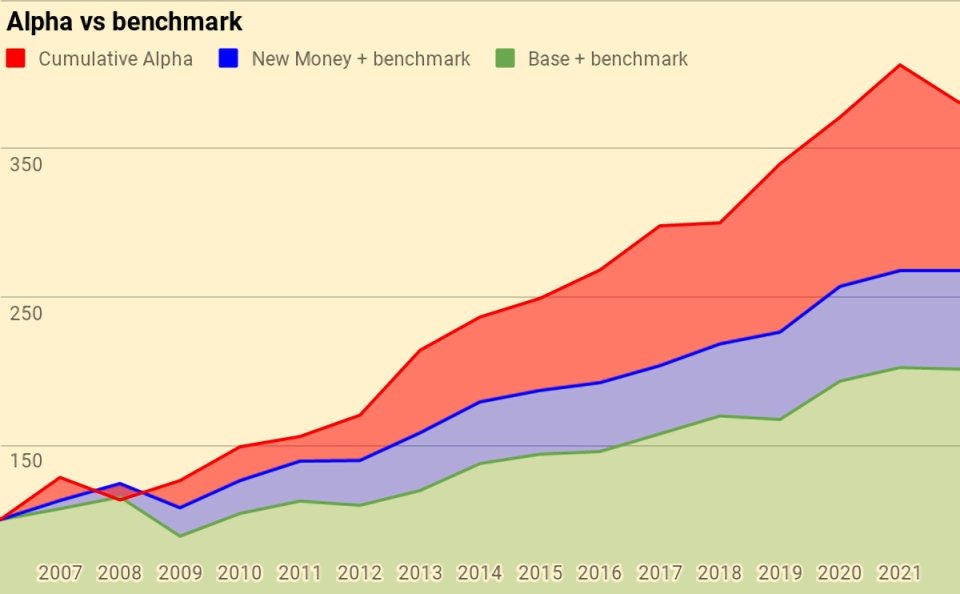
Of the current portfolio value of 381:
- 210 is the base portfolio plus benchmark growth
- 74 is new money and benchmark growth
- 97 is alpha
Counterparties
Here’s the complete pie of counterparties.
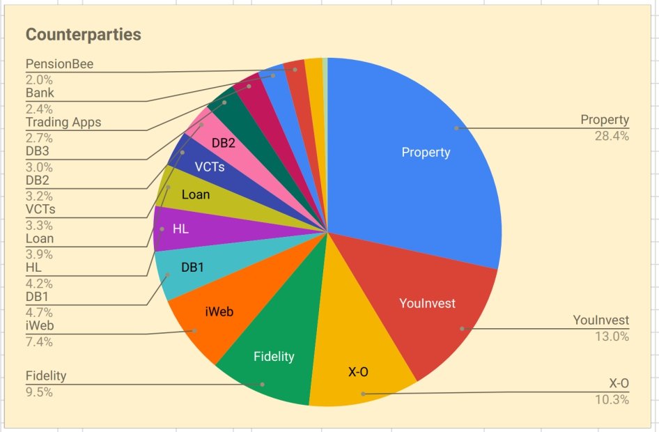
Counterparties to whom I expect to increase my exposure in 2022 are:
- “Trading Apps” (most likely TastyTrade and IBKR)
Turnover
I still haven’t got around to adding turnover analysis.
I’ll stick with last year’s guesstimate that I trade around 25% to 30% of my listed portfolio (12% to 15% of my total net worth) each year.
- That translates to an average holding period of somewhere between 3 and 8 years, depending on how you look at things.
This is, of course, an average, and includes positions that I have held for 30 years as well as others that are only open for a few days or weeks.
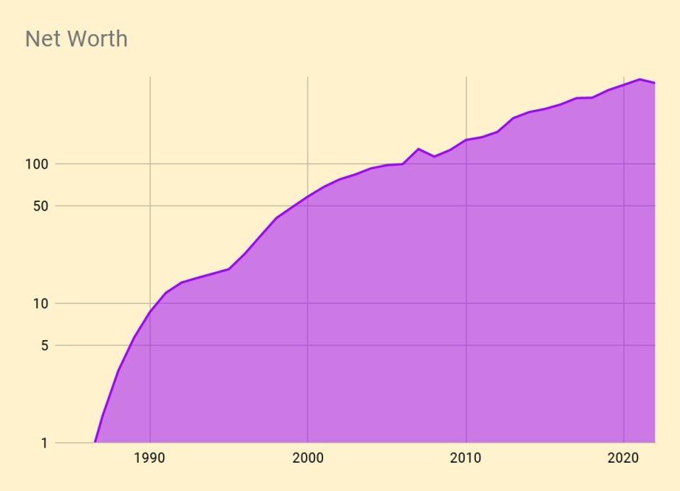
Snowball
I’ve updated the snowball charts from the post I wrote in February 2020.
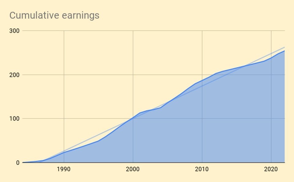
Here are our cumulative earnings.

And here is the chart of the rolling 10-year average.

Here is the net worth snowball.
Here is the exponential version.

And here’s the breakdown by assets.

Here’s a chart of net worth compared to cumulative career earnings.
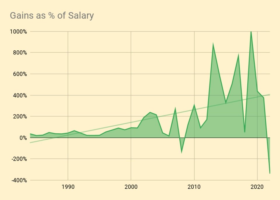
And here are the annual portfolio fluctuations as a percentage of salary.
Daily returns
During 2021, I tracked daily changes in valuation for the first time.
- I kept this up in 2022.
I’m more interested in volatility than actual returns.
- I also want to see how much my listed portfolio varies against my overall net worth and against my tailored benchmark.

Here are the daily and cumulative movements.
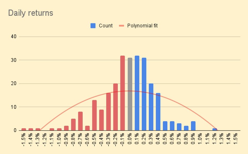
And here is a distribution of daily returns, to which I have fitted a polynomial curve.
- The daily movements appear very small – the best day was +1.2% and the worst was -1.5%.
Most days are in the -0.3% to +0.4% range.
- It should be noted that since my annual living expenses (my withdrawal rate) are just 0.7%, the daily movements still feel pretty lively to me.
I also calculated a Sharpe Ratio from the daily movements, which was -1.1 (pretty bad).
Conclusions and outlook
That’s it for today.
- This has been a horrendous year in financial terms, and a not much better one in life terms. (( My mother-in-law died in August, and both my cats died suddenly just before Xmas ))
Here’s hoping that 2023 is better than last year.
- Until next time.
Mike Rawson
Mike is the owner of 7 Circles, and a private investor living in London. He has been managing his own money for 40 years, with some success.


Re:
“3. It was the second-worst year in percentage terms (despite being only my second down year in 39 years of investing)
4. I lost more money than I managed to accumulate in my first 13 years of investing”
That is eye catching.
However, is it not the case that the impact of this is best illustrated by the exponential net worth snowball chart, where 2022’s fall (IIRC c. 25 units) barely registers?
I guess – if I were in “compounding investor” mode. I was trying to imagine how 1997 me would have felt about this size of a down move.
How I really feel is what the headline numbers say – I lost 6.3% in a year when inflation was 9.3%. So I am a LOT poorer than I was at this time last year. And given what I spend on, I think my personal inflation rate was much higher than 9%.
The personal inflation rate is an interesting one.
I have been tracking this for a number of years using my own method which is very similar to that [again] being used by the ONS, see:
https://www.ons.gov.uk/economy/inflationandpriceindices/articles/howisinflationaffectingyourhouseholdcosts/2022-03-23
Interestingly, our divergence across 2022 [to Nov] vs the official values was much bigger for CPI than CPIH. This has not happened before. And, both ‘our CPI’ and ‘our CPIH’ are somewhat overstated as we got lucky and secured a two-year fixed price deal for gas & electric that runs until August this year.
That calculator puts me at 12.7%, which still feels way too low. They have eating and drinking out at 10% inflation, but it’s more like 30% for the places I use.
Notwithstanding the major caveat I described above (re gas & electricity), my method gave the following values for us for Nov 2022: CPIH 10.2% and CPI 15.4%.
Hi Mike, in putting a value to your DB schemes do you apply a factor such as 30x the annual entitlement?
I use the geometric mean of seven valuation methods based on bond and stock yields, annuity levels and the PV of the likely future cash flows, as well as the 20x rule used by the government and my own target SWR of 3.33%.
It has never worked out as high as a multiplier of 30. Right now it’s at 22.6 but before interest rates went up it was as high as 26.