Annual Portfolio Review 2023

It’s that time of year again. Today we’ll be taking a look at how my overall portfolio performed last year. Stay tuned for the Annual Portfolio Review 2023.
Contents
Headlines
Let’s start with the usual scene setting:
- I run a large and well-diversified multi-asset portfolio.
- I’ve been in decumulation (retirement) for quite a few years and I have dependents – so I can’t take on a high level of risk.
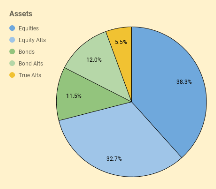
- I have a decent amount of non-listed assets (39% of property and DB pensions) which limits my risk asset exposure (equities are usually at somewhat less than 40%).
- I’m more interested in steady long-term compounding (and low volatility) than in shooting the lights out during a good year for global stocks (beating stock returns is extremely difficult)
On to the scores – I made 10% in 2023.
- It was my third-best year in nominal terms (pounds sterling)
- In percentage terms, it’s probably just above average over 40 years of investing
- I finished the year close to an all-time high (down 0.1% from the peak on 29th December)
- I still only have two down years in 40
- I beat inflation by a decent margin
- I beat my benchmark by a smaller margin
- That outperformance is almost entirely down to a small inheritance and an even smaller increase in our earnings
After the rally in November and December, my listed portfolio was up by 10.4% whilst my unlisted portfolio did slightly worse.
- Bond yields (which drive DB pension valuations) went up and then came down.
- My properties (concentrated in London) for once outperformed the average return for England.
I still don’t ever expect to run out of money.
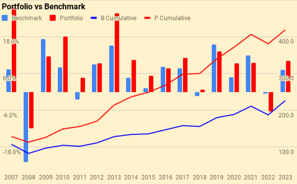
My blended benchmark was up 7.2%, so I outperformed by 2.8%.
- UK Inflation fell back to 4.2% – adding on my target SWR of 3.3% gives a gross target of 7.5%, which we have beaten by 2.5%
In practice, my actual withdrawal rate is around 0.7%, so my personal target for 2023 would be 4.9% (beaten by 5.1%).
- So this has been a good year for my future purchasing power.
My net worth increased by the equivalent of around 14 years of living expenses, such that I now have around a net worth equivalent to 155 years of living expenses.
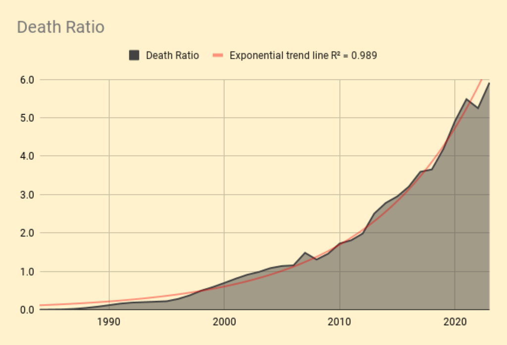
I use a slightly more complicated indexed cost of living to calculate a “death ratio” of net worth to future living expenses.
- With an average life expectancy for me and my partner of 24 years, the current death ratio is 5.9 times (up from 5.2 times last year, and a new high).
Performance
We’re up 10.0%, and our average life expectancy has decreased by one year, so we’re up 10.7%on that basis (10.0 plus 0.7%).
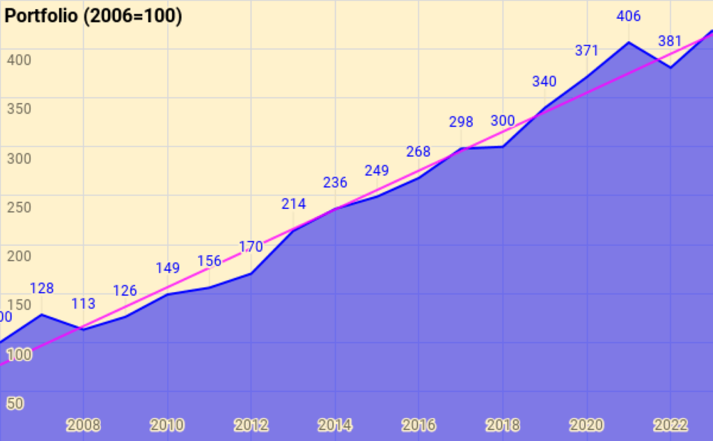
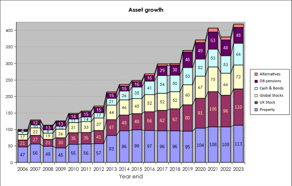
Rather than use UK currency, 2006 is baselined at 100, so the portfolio is now worth 419 (up from 381 last year).
- Total growth over 17 years is 318.7%, or 8.8% compound pa.
This remains acceptable given that it includes the 2007 financial crisis, thirteen years of low interest rates and the Covid crisis.
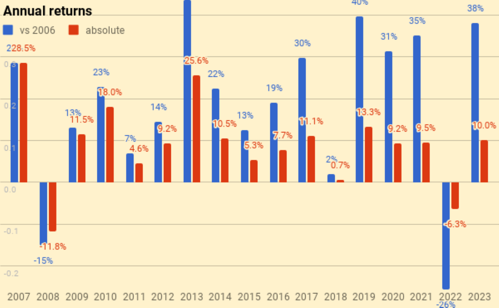
The chart below breaks the growth out into annual chunks:
Benchmark
I use a composite benchmark made up of four items, intended to be an average allocation for a UK private investor aiming to reach financial independence:
- UK stocks – 15%
- International stocks – 40%
- UK residential property – 25%, and
- Cash/bonds – 20%
The weights start from allocating a target percentage to property and cash.
- I then divide the remainder between UK stocks and international stocks.
Last year the benchmark was up 7.2%.
- Over 16 years the benchmark is up 125.2%, or 4.9% pa.
My compound return over the same period is 8.8%, so my portfolio has on average outperformed by 3.9% pa (in nominal terms).
Here’s a year-by-year breakdown:
Asset allocation
Unlike many bloggers and Twitterati, I use a “total wealth” approach to my portfolio.
- This is primarily so that I maintain a high enough allocation to equities as I get older.
I use five high-level asset classes.
The second chart shows how these assets have grown over fourteen years. (( The split between the UK and international stocks is now obsolete, but the numbers are otherwise pretty accurate ))
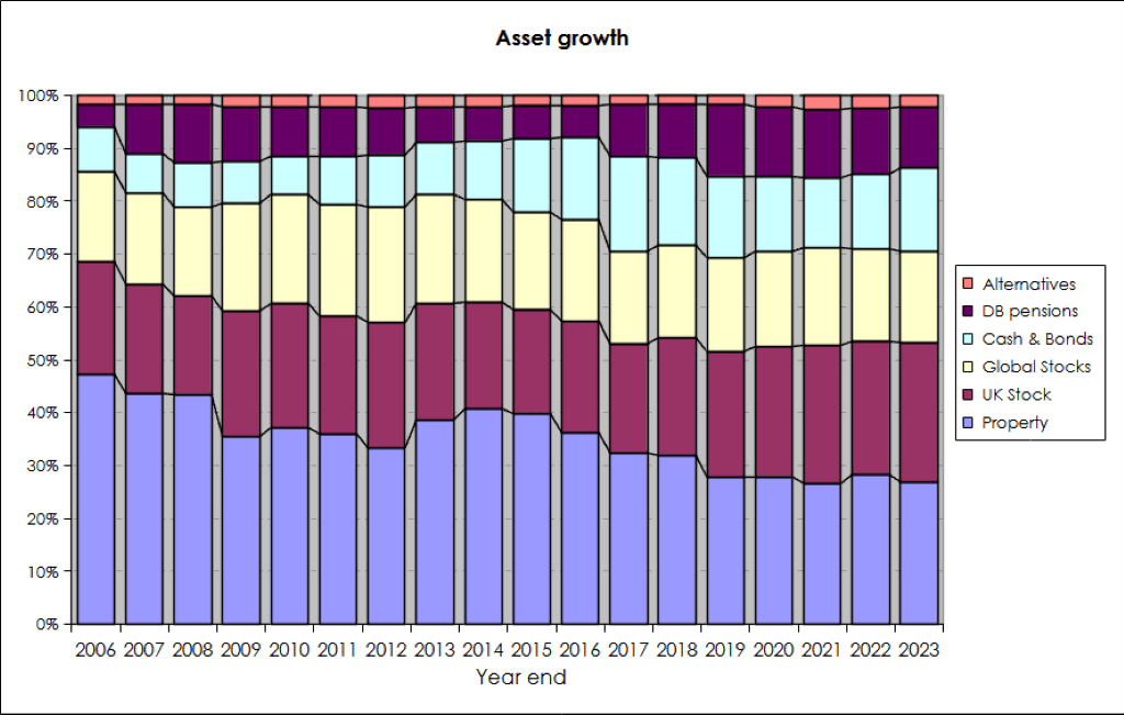
The third chart shows the same data in percentage terms rather than absolute numbers:
Portfolios
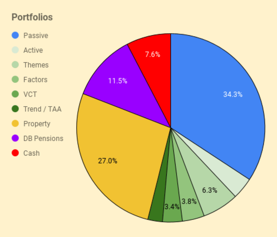
I have six listed portfolios:
- The core passive portfolio
- An active UK stock portfolio, split between AIM and the main market
- A theme portfolio (ESG, tech and biotech)
- A factor fund (smart beta) portfolio
- A VCT portfolio,
- And a trend-following (momentum) portfolio
I also have three non-listed “portfolios”:
- Property, including the house I live in
- DB pensions
- Cash
The table below maps the portfolios onto the high-level asset allocation that we’ve seen previously:
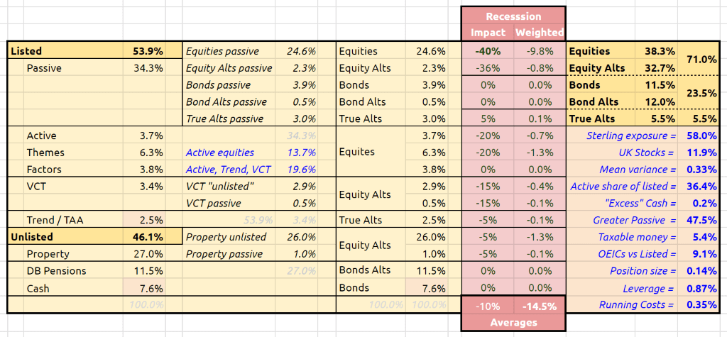
The red section is a stress test showing the impact of a 40% crash in global stock markets.
- The running costs of the portfolio remain at 0.35% pa.
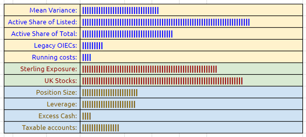
I use a few bar chart indicators, but I’m not sure they make things much clearer.
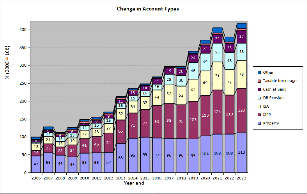
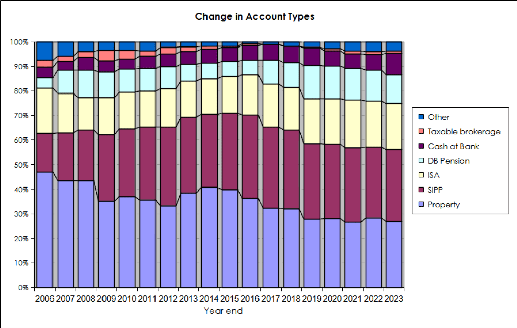
Accounts
Apart from the 27% in property, another 48% is in SIPPs and ISAs – that’s 75% of the total accounted for.
- The remainder is split between DB pensions, cash, VCTs and taxable accounts.
The two charts below show how these account types have varied over the years, in absolute and relative terms:
New money
The long-term annual returns of 8.8% pa are flattered by three (overlapping) things:
- new money
- inflation
- the positive performance of the benchmark portfolio
Let’s look at new money first.
The chart below shows the net extra contributions to the portfolio (from income and inheritance) or withdrawals (from pensions) by year:
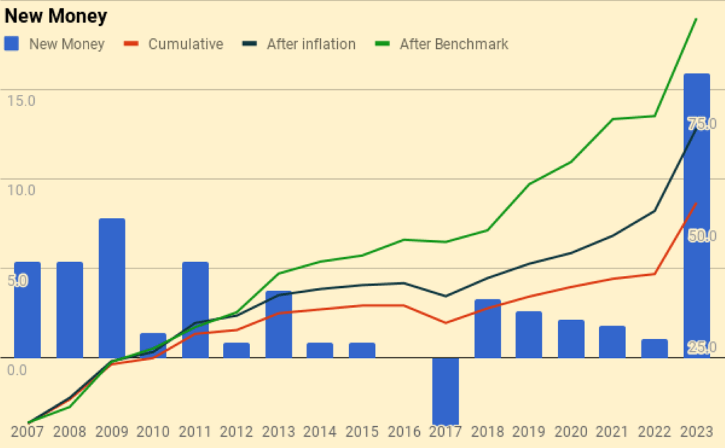
The chart also shows a cumulative total for the entire period (the red line), and then increases this to reflect inflation (blue line) and benchmark growth (green line).
- New money totals 54.7 of the total portfolio value of 419
- After inflation, this rises to 71.3
- After benchmark growth, it rises to 95.9
Alpha vs inflation
The chart below shows inflation over the last fifteen years:
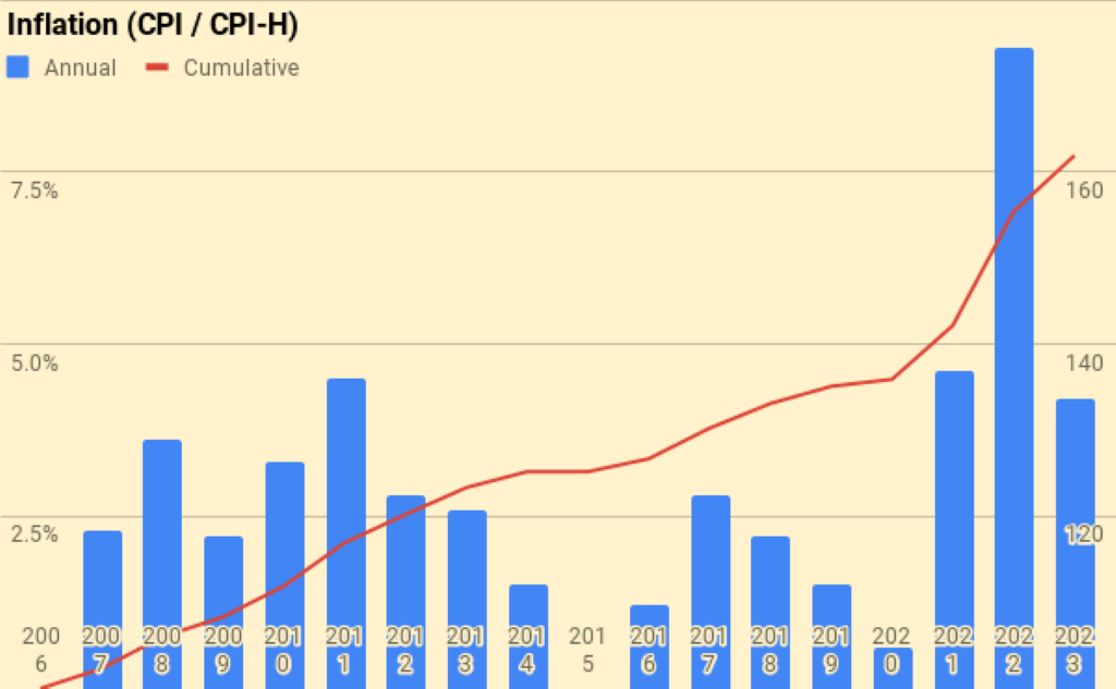
- Total inflation has been 61.9% or 2.9% pa.
The second chart shows the portfolio against new money and inflation:
- the green area is the initial portfolio plus inflation
- the blue area is the new money added plus inflation
- the red area is the value-added (alpha) from investment choices
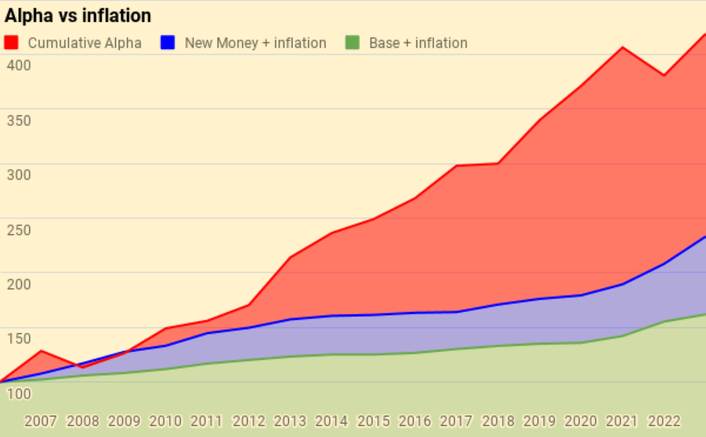
Of the current portfolio value of 419:
- 162 is the base portfolio plus inflation
- 71 is new money and inflation
- 186 is alpha
Alpha vs benchmark
The next chart shows the growth of the benchmark over the years:
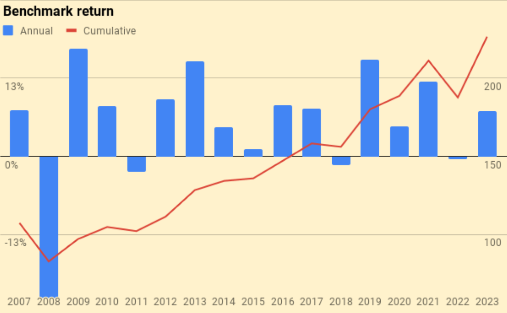
The benchmark is up 125%, or 4.9% pa.
The next chart is the portfolio against new money and the benchmark:
- the green area is the initial portfolio plus benchmark growth
- the blue area is the new money added plus benchmark growth
- the red area is the value-added (alpha) from investment choices away from the benchmark portfolio
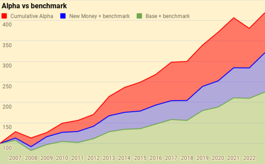
Of the current portfolio value of 381:
- 225 is the base portfolio plus benchmark growth
- 96 is new money and benchmark growth
- 98 is alpha
Counterparties
Here’s the pie of counterparties.
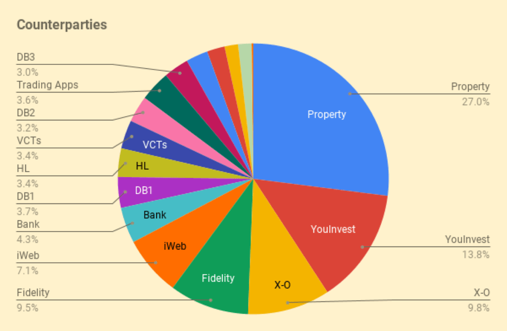
Counterparties to whom I expect to increase my exposure in 2022 are:
- “Trading Apps” (IBKR, TastyTrade and Stake)
- AJ Bell YouInvest (since the LTA has been abolished)
Turnover
I still haven’t got around to adding turnover analysis.
- I’ll stick with last year’s guesstimate that I trade around 25% to 30% of my listed portfolio (12% to 15% of my total net worth) each year.
- That translates to an average holding period of somewhere between 3 and 8 years, depending on how you look at things.
This is, of course, an average, and includes positions that I have held for 30 years as well as others that are only open for a few days or weeks.
Snowball
I’ve updated the snowball charts from the post I wrote in February 2020.
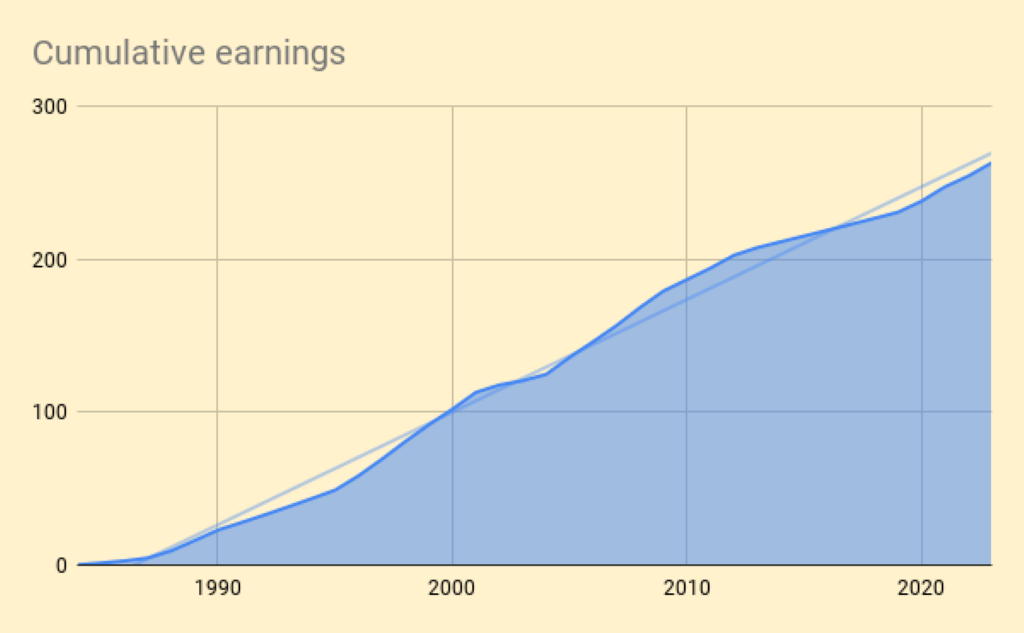
Here are our cumulative earnings.
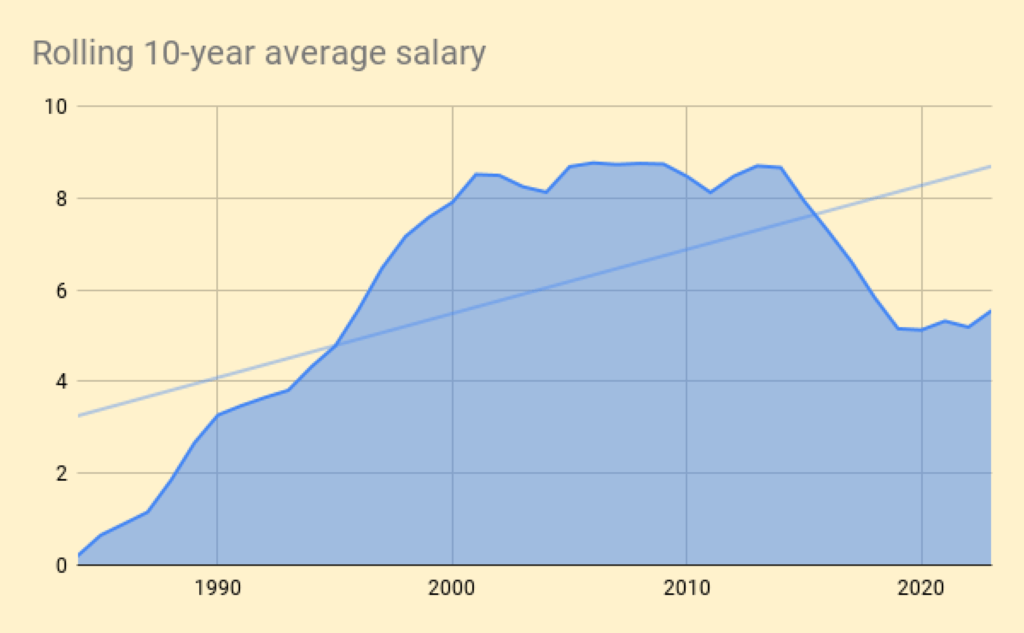
And here is the chart of the rolling 10-year average.
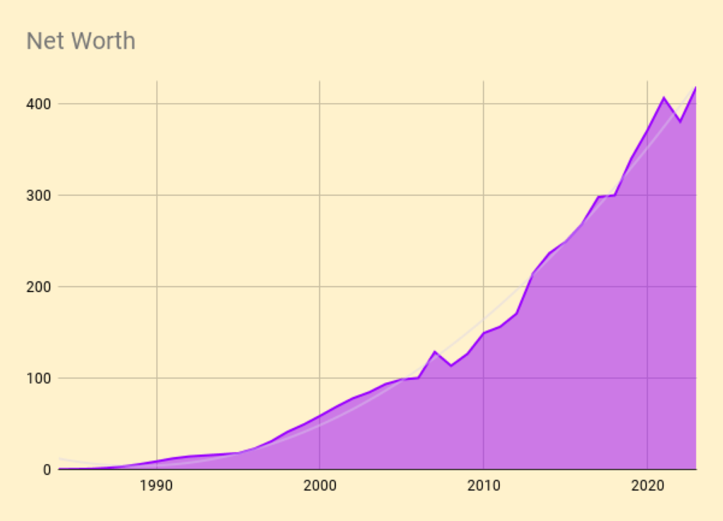
Here is the net worth snowball.
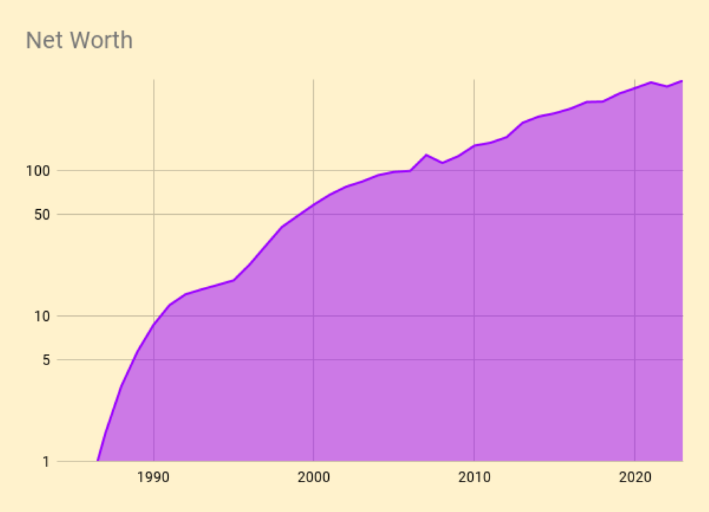
Here is the exponential version.
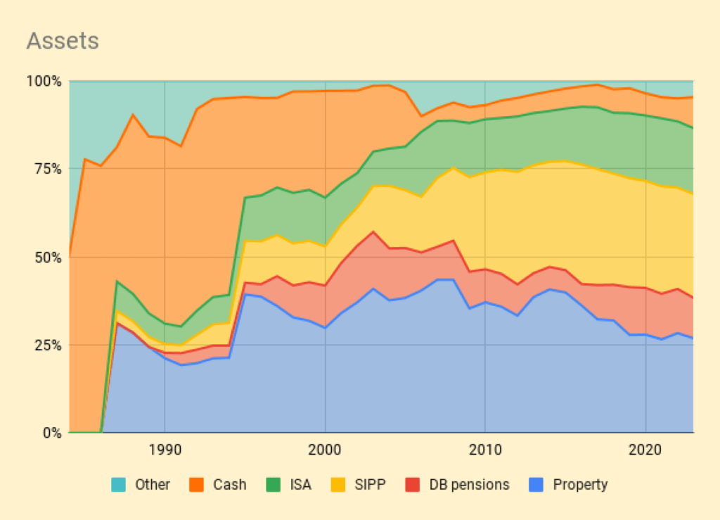
And here’s the breakdown by assets.
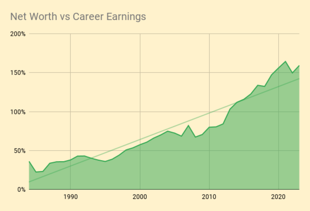
Here’s a chart of net worth compared to cumulative career earnings.
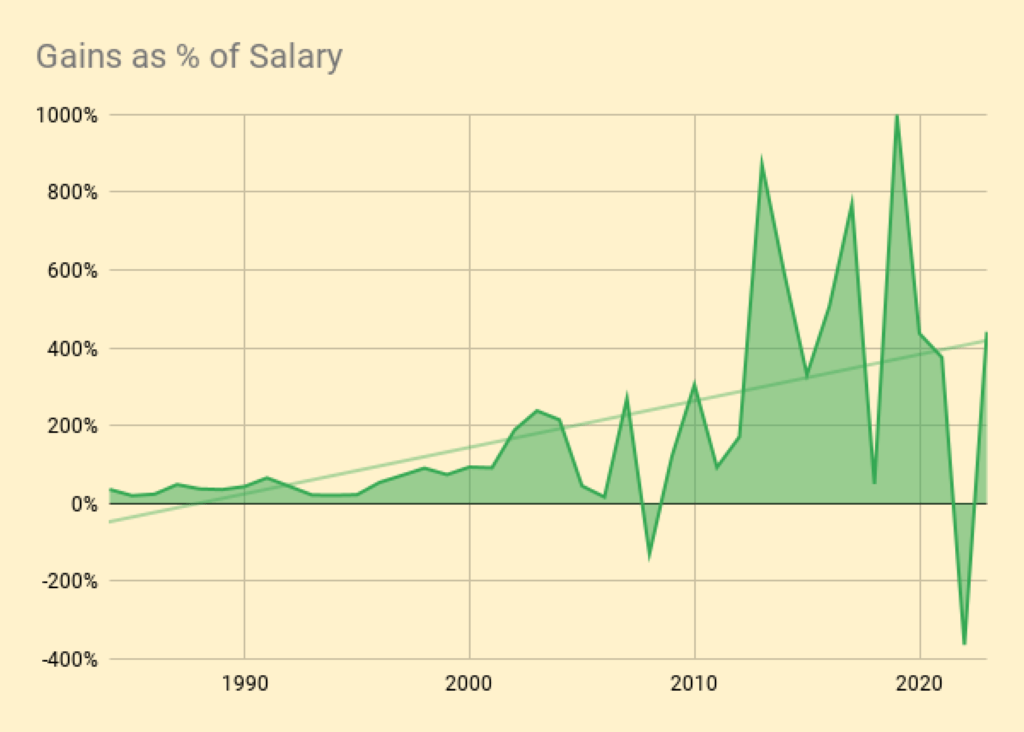
And here are the annual portfolio fluctuations as a percentage of salary.
Daily returns
For the past three years, I have been tracking daily changes in valuation.
- I’m more interested in volatility than actual returns.
I also want to see how much my listed portfolio varies against my overall net worth and against my tailored benchmark.
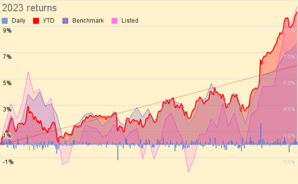
Here are the daily and cumulative movements.
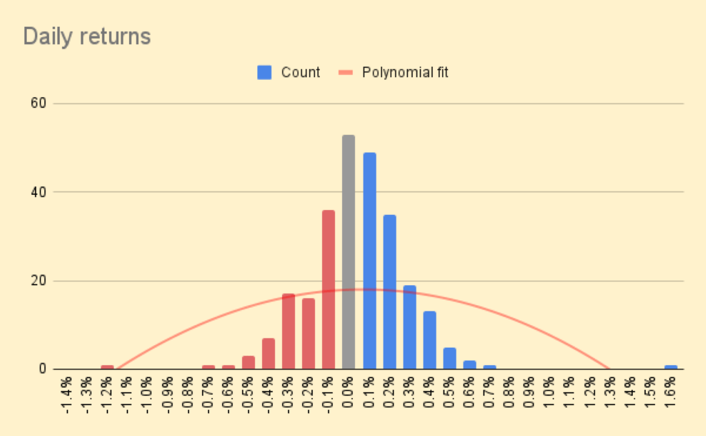
And here is a distribution of daily returns, to which I have fitted a polynomial curve.
- The daily movements appear very small – the best day was +1.6% and the worst was -1.2%.
Most days are in the -0.3% to +0.4% range.
- It should be noted that since my annual living expenses (my withdrawal rate) are just 0.7%, the daily movements still feel pretty lively to me.
My Sharpe Ratio for 2023 was extremely good, at 2.3.
Conclusions and outlook
That’s it for today.
- 2023 was a decent year, but given the political pressure from elections on both sides of the Atlantic, it’s possible that 2024 could be even better.
Until next time.
Mike Rawson
Mike is the owner of 7 Circles, and a private investor living in London. He has been managing his own money for 40 years, with some success.