IPO Survival Guide – Stockopedia
Today’s post looks at a report from Stockopedia called the IPO Survival Guide.
Stockopedia
Stockopedia started out as a stock screening tool based on the traditional outperformance factors of momentum, value and quality.
- Over the years it morphed into an upmarket bulletin board based around the daily “Small Cap Value Report”.
The Covid lockdowns seem to have triggered a wave of interest in stock investing, and there was an influx of new subscribers.
- This was good for Stockopedia but has not been positive for the quality of debate on the site.
I had high hopes that the site would develop into the UK home for systematic investing but it seems that is not to be.
- But it’s still a useful tool for screening and portfolio management, and I would still recommend it (though it’s expensive if that’s all you use it for).
IPOs

Small-cap stock-pickers are interested in IPOs (initial public offerings) – the US term for new issues that now appears to have been adopted in the UK.
- Many believe investing in IPOs is easy money, but the truth is more complicated.
Stockopedia have done the research and a report has been written by Keelan Cooper, a new Stockopedia face to me.
- It looks at 258 UK IPOs from January 2016 to May 2021, with price data up to 15th June 2021.
Excepting the Covid crash of 2020, this was a bull market.
- So decent performance is to be expected, but at the same time, IPOs are more likely during a bull market.
The report is 59 pages long, so I thought that it might be worth summarising the key findings.
Performance
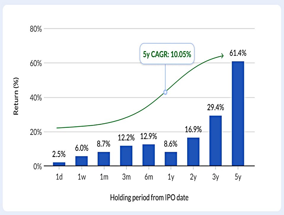
The average IPO is up 61% after five years, a CAGR of 10%.
- Performance over the first six months is particularly strong, but 1-year performance is weak.
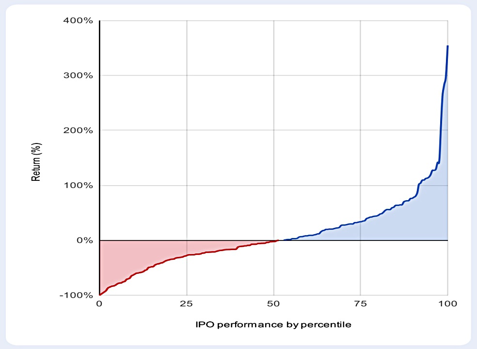
The decent average CAGR is propped up by a handful of multi-baggers.
- The chart shows the spread of returns over one year, but Keelan implies that something similar is happening over five years.
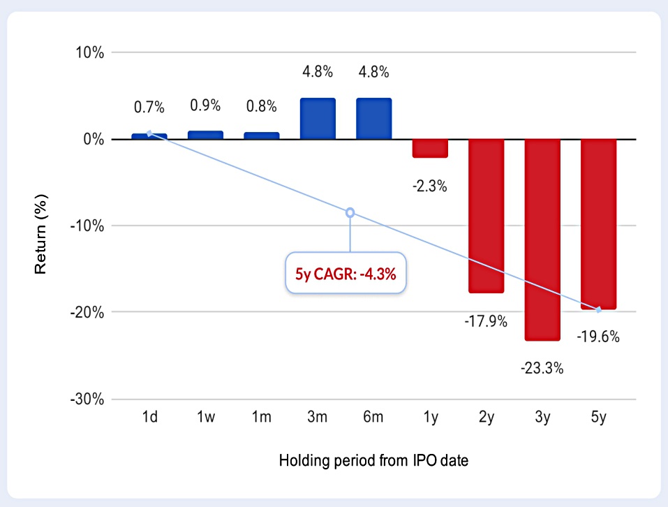
When we look at the median performance, this is negative from 6 months onwards, despite the bull market.
- The median 5-year CAGR is -4.3%
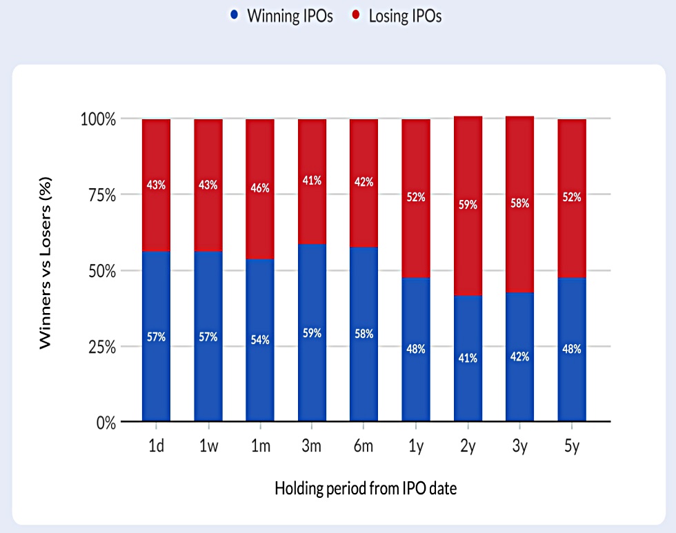
The chances of holding a winning IPO peak in the 3 to 6-month period, and fall below 50% after that.
Size
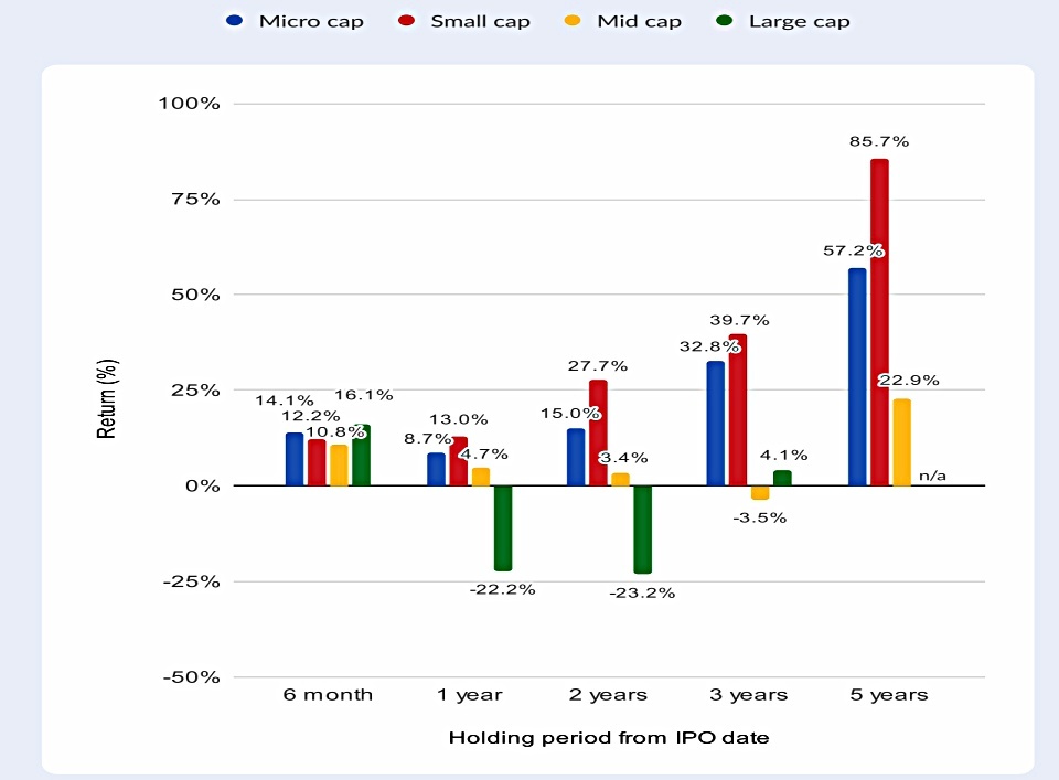
Keelan breaks IPOs into four groups by size:
- Micro-cap, below £50M
- Small-cap, up to £350M
- Mid-cap, up to £2.5 bn
- Large-cap, above £2.5 bn
Small-caps start behind micro-caps but lead from 1-year out.
- They average 85% over five years.
Large caps average -20% after two years but then recover somewhat.
- Note that the large-cap sample size is small.
Keelan thinks that large- and mid-cap performance is hampered by aggressively-priced PE and VC exits.
Markets
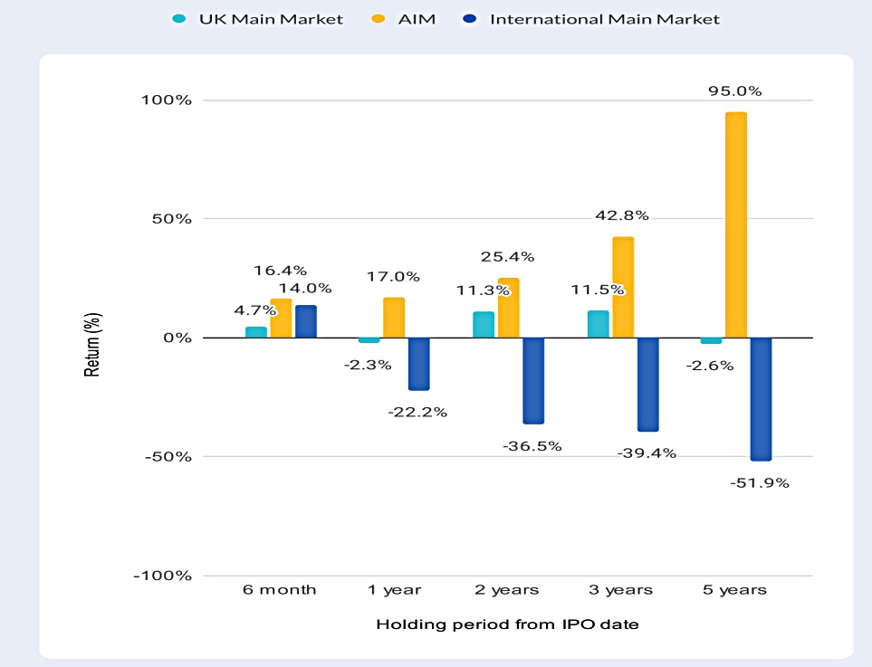
AIM IPOs outperform over all time periods.
- The average AIM IPO nearly doubled over five years, whilst the Main Market average return was negative.
- More than 58% of AIM IPOs showed positive returns.
Returns from International Main Market IPOs were horrible.
Sectors
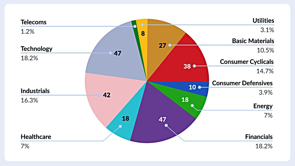
On the whole, the number of IPOs by sector followed the overall UK market structure.
- The exception was tech, which produced a lot of IPOs for a small sector.
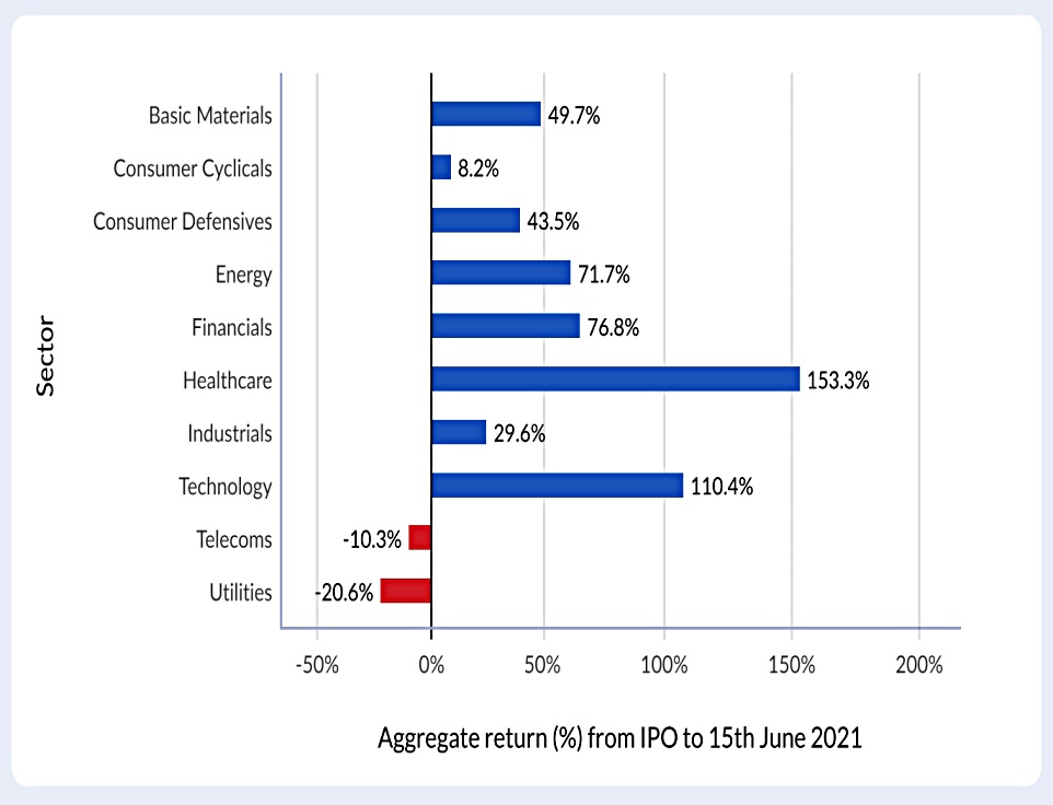
Tech was also the second-best performing sector, beaten only by healthcare.
- Covid is a factor here, but we should also note that the numbers in both sectors are flattered by a small number of very big winners.
Telecoms and utilities were the worst performers.
Stockranks
![]()
Since new listings have no price history, the Momentum factor can’t be used, to begin with.
- Instead, Keelan looked at the combined QV factor.
IPOs with a QV score of more than 60 (which should be high-quality and cheap) massively outperformed those with lower QV scores.
Conclusions
Keelan has 8 main points:
- IPOs do badly over the long-term
- Most IPOs do well initially, with a high point at around six months, before tailing off.
- A few big winners maintain the average outperformance at the one-year mark.
- The optimum holding period is in the 3 to 6 months range.
- Large and mid-cap IPOs are more likely to underperform
- Keelan thinks this might be because of PE and VC exits.
- Small- and micro-cap IPOs outperformed over most timeframes.
- AIM IPOs outperform relative to those on the main market.
- Health and Tech have been the best-performing sectors, driven by a minority of multi-baggers.
- Using the QV combined factor score can help to pick a winning IPO.
- Underpriced IPOs shoot up immediately after the market opens, which benefits institutions rather than private investors (PIs), who are often unable to participate.
- 89% of IPOs open higher than their issue price, with an average first-day trading pop of close to 10%
- Keelan found that IPOs open to PIs didn’t perform as well on the first day as those which were inaccessible.
These are interesting findings, and to a certain extent, easily actionable.
- Whether there are enough high-QV, small-cap AIM IPOs in the Tech and Healthcare sectors for this to be a significant theme in your overall asset allocation is another question.
That’s it for today.
- Until next time.
Mike Rawson
Mike is the owner of 7 Circles, and a private investor living in London. He has been managing his own money for 40 years, with some success.