Weekly Roundup, 30th January 2018

We begin today’s Weekly Roundup in the FT, where John Authers was looking at the history of bubbles and crashes.
Contents
Where are we now?

This weeks installment in our series tracking the progress of the current bubble begins with John’s article on the rhyme and reason in bubbles and crashes.
- Today, US stock markets have high valuations with low volatility.
- And the dollar is sliding even as the bull market in US Treasuries appears to be ending.
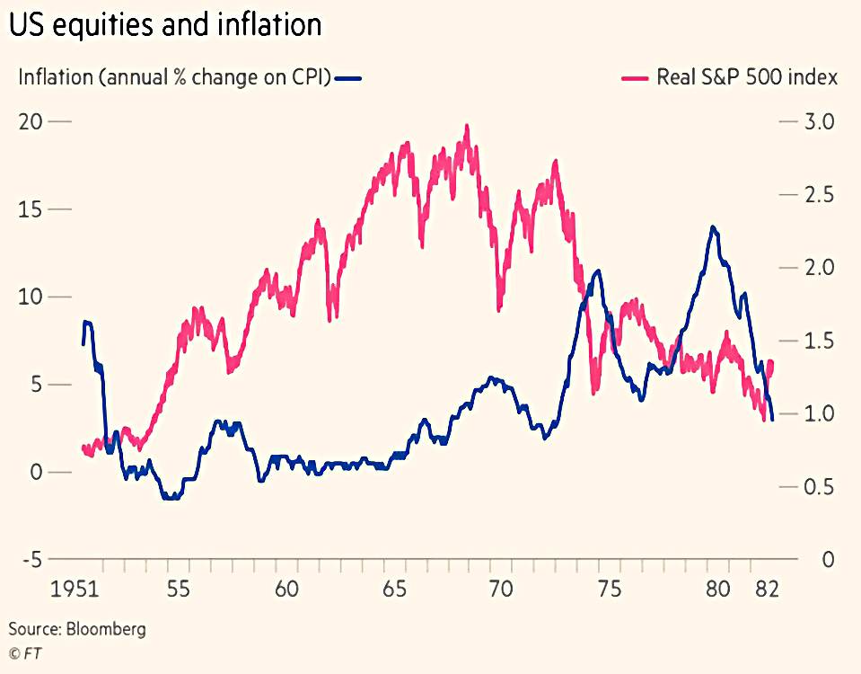
A comparison with 1951 (the start of a post-war boom) suggests that good times are ahead.
- 1966 (when inflation returned) would suggest that stocks are about to slump for more than a decade.
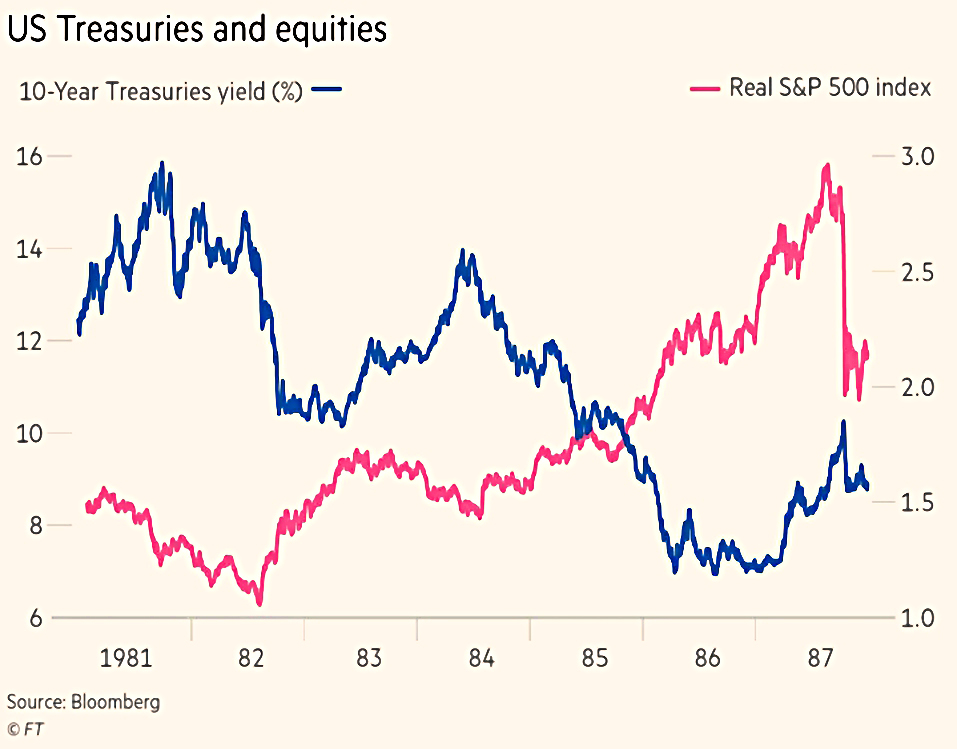
- 1987 suggests a crash, if there is a scare in the bond markets.
- 1998 suggests that we might have two or even three years to go to the top.
John is looking for rising inflation and rising bond yields.
- These would signal that it is a good time to start selling stocks.

The Economist blamed recurring crises on deregulation.
The article starts by explaining cycles:
- Good times lead to bigger profits and higher asset values.
- More valuable assets increase borrowers’ ability to borrow.
- Spending (investment) goes up, intensifying the boom.
- The mood turns and assets starts to fall in price.
- Banks become stingier.
- Falling sales make firms default on debts.
- They cut costs by sacking workers, who then default on their debts.
- Asset prices crash as panic sets in.
What regulators should do during a boom is to raise banks’ equities to asset ratios and tighten their lending standards.
- This would be countercyclical.
Instead they are often procyclical.
- Before the 2008 crisis, the US removed bank regulations dating back to the depression, allowed banking consolidation and lowered mortgage lending standards.
- After the crisis, rules were tightened, but now they are being weakened again.
The Economist thinks that the explanation is political:
Opening credit taps often brings short-run political rewards … That makes recklessness an attractive political strategy.
And often politicians are big beneficiaries of booms.
Low volatility
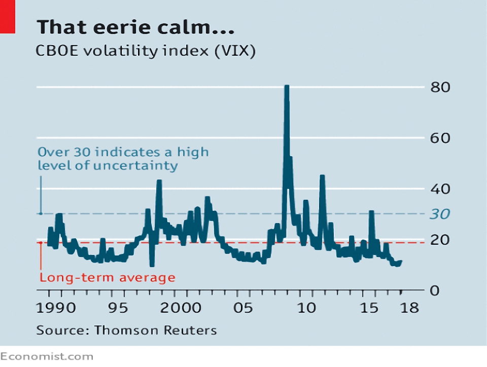
Coming back to the present day, Buttonwood wrote about the current low volatility.
- The S&P has just recorded its longest run without a 5% fall, and only 1964 had lower volatility than 2017.
It’s largely down to the central banks – to low interest rates and QE.
- Steady interest rates mean steady discount rates for future cash flows, and hence steady valuations.
Minsky warns that stability leads to more risk (debt) and hence to crashes when a shock (a rise in interest rates, for example) arrives.
- But in fact, low volatility is the default condition, and usually predicts more low volatility.
So we may not be near a crash.
Buttonwood worries about those speculating in volatility itself, by writing options on the VIX.
- And Value At Risk (VAR) shrinks in periods of low volatility, allowing investment banks to play larger positions.
The standard VIX looks at one-month volatility, but there is also a volatility curve (like the bond yield curve).
- In 2007 this was flat, so investors were caught out by the sub-prime crash.
This time the volatility curve is steep.
- Investors expect the unwinding of QE and raising of interest rates to reach a tipping point.
But we don’t know what form that will take – or which institution has taken on too much risk.
Tax rises
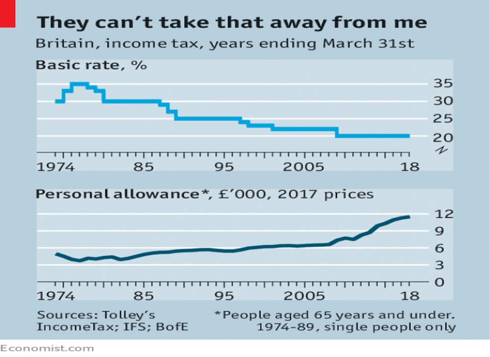
Elsewhere in The Economist was an article suggesting that UK opposition to tax rises is softening.
After the 2017 Election result, I’m prepared to believe anything about the British public.
- But the real question is whether anything can change as a result.
- Even Labour is only proposing tax increases on corporations, and those earning more than £80K pa.
There’s no doubt that basic rate tax is trending down, and the tax-free allowance is trending up.
- So those at the bottom end of the earnings scale are paying a lot less tax than they used to.
But tax revenues as a proportion of GDP remain close to the highest ever recorded.
- And previous experience suggests that increasing rates will lead to less revenue, not more.
So the public can think what they like.
- The only way to fix our deficit is to cut our spending.
Dividends
The collapse of Carillion has thrown the spotlight on dividend policy in declining and failing companies (and those with significant pension deficits).
- It seems that the firm sold assets and increased debt in orders to maintain dividend payments, even as a large pension deficit went unaddressed.
There’s obviously an issue here, but not necessarily an easy solution.
- It may be that in the case of Carillion there is an accounting issue, so let’s look at the wider problem.
Companies want to smooth dividend payment, so as to not spook their shareholders.
- The obvious way to approach this is through a dividend reserve.
A firm’s dividend policy would be made up of two elements:
- a target payout ratio (say 50% of after-tax profits)
- a commitment to (say) inflation link the dividend payment and never cut it
So to begin with, any surplus within the 50% of profits that was above the previous year’s dividend (plus inflation) would be added to the dividend reserve.
- When profits fall, the reserve can come to the rescue.
- If profits rise, the surplus from the reserve could be paid out as a special dividend.
Investment trusts operate a similar system, and many have managed to maintain or increase dividends for several decades.
The pension problem is more dificult.
- It depends on how real you see the deficit as being.
At the moment, pension funds use a lot of bonds, and their future liabilities are discounted using record low interest rates.
- Multi-asset portfolios and historical average interest rates would make most of the deficits go away.
And if you think the deficit is illusory, then diverting investment to address it is not the best use of a company’s capital.
London Housing
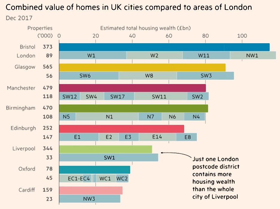
The FT had an article comparing the value of property in various London boroughs with other cities around the UK.
- I think the charts speak for themselves.

Oxfam
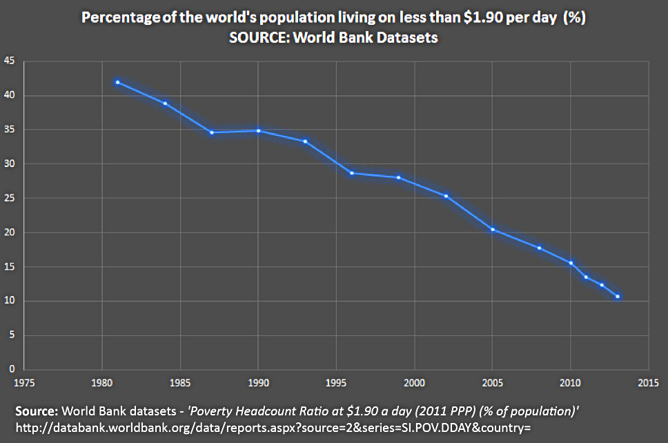
In the latest of their regular reports on global inequality, Oxfam once again painted a ludicrously distorted picture.
- They seem dead set against global capitalism, which has lifted more and more people out of poverty.
- Extreme poverty has fallen from 42% in 1981 to 10% in 2013, despite a massive increase in the global population.
Oxfam’s chosen solutions – higher taxes and higher minimum wages – will only get in the way of this process.
- If we want more people to get rich, we need to find ways of them owning something that will increase in value.

Rob Wilson, the former charities minister, said:
Oxfam, like a number of large international charities, has been so blinded by the political correctness of the chattering classes, it has disappeared up its own, morally righteous, posterior.
It gives every impression of being incapable of evidence-based rational argument about the ongoing success of western economies or capitalism in general.
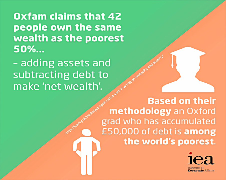
The IEA pointed out that Oxfam seem obsessed with rich people rather than the developing poor that they claim to be helping.
Their most dubious claims concern net worth.
- It’s hardly a shock that old people in the developed world own more stuff than younger populations in developing nations.
The IEA objects to their use of “net” worth, subtracting the serious debts that only rich people can obtain to produce net figures that exacerbate inequality.
- This approach seems fine to me in terms of analysing the progress of an individual towards financial independence, but misleading in the context of global populations.
There are two other caveats when using GDP and net worth to examine inequality.
- GDP measures the wrong things.
- And in particular, human capital – the ability for those with their working life ahead of them to become richer – is ignored.
Corbyn watch
On the Andrew Marr show over the weekend, Jeremy Corbyn promised to buy every homeless person in the UK a house.
- Where will Labour’s “generosity” (( It’s not their money they’re making plans to give away – it all belongs to taxpayers )) end?
He said he would buy 8,000 homes “immediately” and also let councils take over properties that have been left “deliberately” empty.
This last dig was aimed at developers drip feeding new flats on to the market to support high prices.
- He claims the developers are making money from rising prices, but really they are trying to avoid losses from falling prices.
- In my area, Corbyn’s policy would mean that gentlemen of the road would be handed million pound flats with river views across from Chelsea.
Councils would also be required to build more houses.
- And vacant Housing Association properties would also be given to the homeless, rather than to people on the waiting lists.
A Labour party spokesman later backtracked on the dottiest ideas, but Corbyn said it all, on live TV.
- He’s not too wedded to property rights, is he?
Ladies and gentlemen, our next prime minister.
- Unless you do something about it.
Twitter pics
I have eight for you this week.
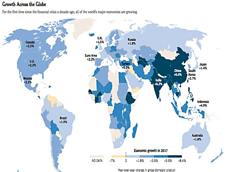
First up, some evidence that we’re living through a global economic boom time (even if it doesn’t feel like it).
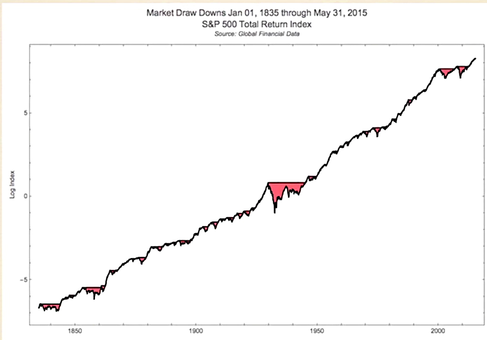
Next, a look at drawdowns, and how short and (for the most part) shallow they are.
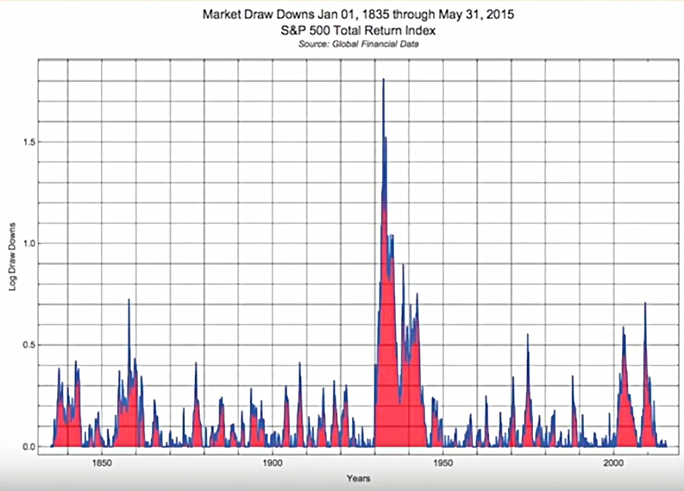
Here’s the same chart flattened out and turned upside down.
- The takeaway is that we are nearly always in drawdown, but a new high is usually not far away.
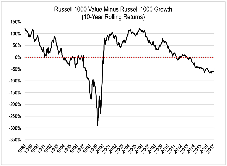
This one shows how badly value investing has been doing recently.
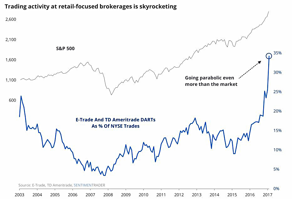
And this one shows how the increase in US retail trading far exceeds even the market’s gains.
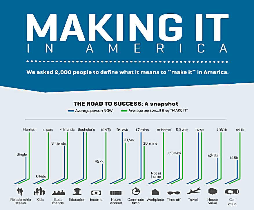
This one shows what making it means to Americans:
- Married with two kids rather than single with none
- Four friends rather than three
- $147K pa for a 31 hr week and a 10 minute commute (or working from home)
- 5.3 weeks of holiday and three trips a year
- A house worth $461K and a car worth $41K.
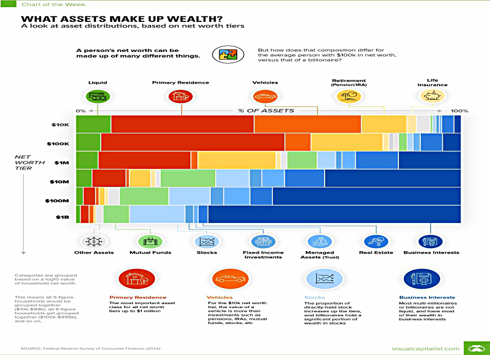
And here’s how people do make it – it’s a look at asset distributions by net worth.
- Poor people have more cash, cars, and a house and a pension.
- The rich have more investments.
- The very rich have most of their money in their businesses.
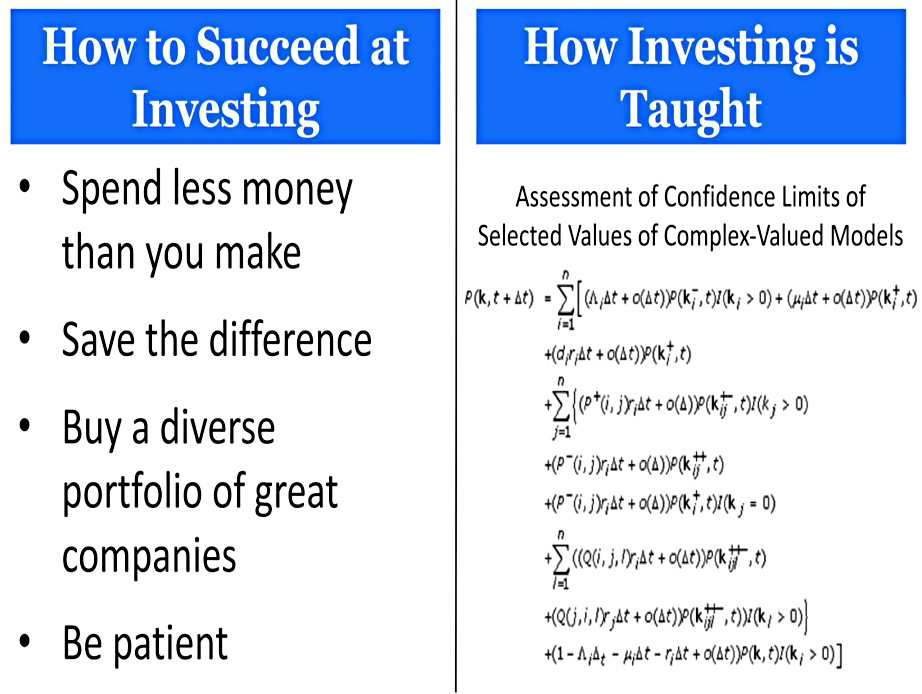
The final chart compares what you need to do to invest successfully with how investing is taught in college.
- I try to stay mostly on the left hand side, but let me know when I don’t.
Inteview
And finally, I gave an interview last week.
- You can read it here on the DayTradingz website.
Until next time.
Mike Rawson
Mike is the owner of 7 Circles, and a private investor living in London. He has been managing his own money for 40 years, with some success.