Weekly Roundup, 28th June 2016

We begin today’s Weekly Roundup in the FT, with the Chart That Tells A Story. This week there were several charts, all about hedge funds.
Contents
Hedge Funds
The papers are largely still full of Brexit, which I’m getting pretty bored with myself.
- I’ll keep away from the topic as much as possible – though I do have one graph to share later on – so this week’s roundup will probably be a bit shorter than usual. (( No doubt many of you will be relieved to hear that ))
And so to the hedge fund charts.
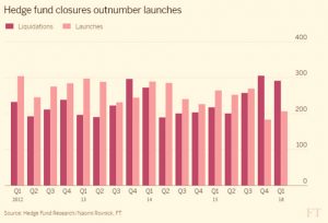
Naomi Rovnick in the FT reported that the number of hedge funds is falling, as closures over the past couple of quarters have exceeded new openings.
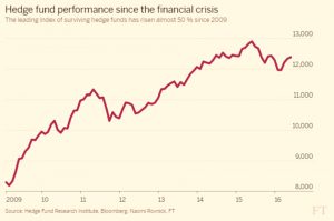
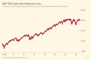
The industry has two problems – high fees (2% pa, plus a performance fee), which stand out in these times of lower returns – and underperformance relative to equities.
The comparison to the S&P 500 is not entirely fair, since hedge funds are multi-asset vehicles, but it’s a tempting one, and something that most investors would do instinctively. ((Note to the FT – the hedge fund performance and S&P performance might have been better squeezed on to a single chart ))
They are still making money, though the apparent returns are flattered by survivorship bias – the hedge funds that went spectacularly bust are no longer included in the index.
But industry estimates show that 80% of the “alpha” ends up with the funds themselves, rather than their investors.
I’m not one of the biggest bashers of hedge funds.
- Twenty years ago they were an attractive diversification from stocks, and I still have a bit of money in them.
- But their time looks to have passed, and I have no plans to add to my holdings.
Cash vs stocks
The work by Paul Lewis on the apparently competitive returns from cash has provoked a response.
- I want to focus on a piece by Abraham Okusanya from Finalytiq.
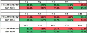
Paul very kindly sent Abraham his data, and Abraham duly replicated his results, though rather than compare cash to a specific tracker, he looked at FTSE-100 returns minus a 0.5% annual fee.
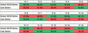
- His results were similar, with cash appearing to generally beat stocks.
But Abraham has a few explanations, starting with diversification.
- When he switched to a global 50/50 portfolio ((I’m assuming this is 50% global bonds, though Abraham doesn’t explicitly state this )) for comparison, cash did worse.
Which comes back to the point we made last week that Paul is comparing a savvy, shop-around cash investor with a lazy, can’t be bothered to diversify equity investor.
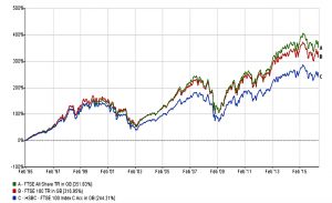
The second point is that over the 21 years of Paul’s research, the HSBC FTSE-100 tracker (which I own, amongst other trackers, though I haven’t had it for the entire 21 years!) has been pretty awful.
- It’s underperfomed the FTSE-100 by 3.4% pa, or 72% (244% vs 316%) over the 21 years.
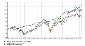
Abraham’s third point is that the “chosen” 21 year period ((I think in practice it was chosen because that was when a FTSE-100 tracker became available )) includes two of the worst UK market declines of all time – 2001 and 2008.
- So without diversifying away from UK stocks, those two crashes – unusually close to one another in historical terms – have a big effect.
- Not only did cash beat stocks over this period, so did bonds.
But that is unlikely to continue, and few people would advise a 100% bonds portfolio at the moment.
As Abraham says, Paul is probably correct to encourage people to take cash more seriously – I’m 15% in cash myself at the moment.
- But that’s a different thing from saying that cash will outperform over the long-term.
- That’s extremely unlikely, and low-cost multi-asset diversification (in tax-sheltered accounts) is the way to go.
Helicopter money
In the Economist, Buttonwood looked at helicopter money, the creation of money to finance government spending or tax cuts.
- It was originally conceived jokingly as bundles of notes tossed out of helicopters, but might nowadays be distributed as a £1000 time-limited credit card to each household.
The article looked at a paper from Toby Nangle of Columbia Threadneedle.
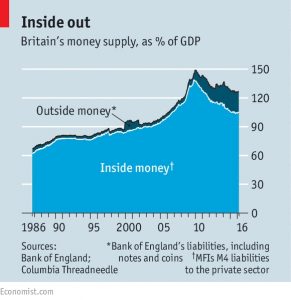
- He contrasts the “inside money” created when banks make a loan – the “deposit” in the bank that the customer can spend – and outside money created by the government / central bank (typically notes and coins).
The government collects taxes to pay its bills, borrowing any deficit in the bond markets.
Mr Nangle looks at this another way:
- the government creates money to pay bills, but doesn’t want too much sloshing around, in case this dents confidence in the currency
- so it “parks” money, taking it out of the system through taxes and issuing debt
- Mr Nangle calls this “sterilisation”
This makes QE (creating money to buy bonds) the opposite of sterilisation.
This sounds like a bad thing, but the stats show that QE (outside money) didn’t even offset the shrinkage in inside money after the financial crisis, it merely reduced its impact
- and QE moves bonds from the private sector to central banks
- with one part of the government owing another, net government debt to GDP will fall
So the only difference between QE and helicopter money (HM) is that QE eventually “expires” – in theory at least, it hasn’t happened yet – when the bond matures (or earlier if the central bank sells the bond).
This sounds reassuring, but also suggests that HM might be as ineffective in stimulating growth as QE.
- HM is a permanent expansion in the money supply, but how would that feel different over a, say, five-year period?
In fact, Mr Nangle is not in favour of HM, simply because it is permanent, and might force central banks to raise interest rates sharply at some point in the future.
But then again, are there any alternatives?
Death of banking
Over at MoneyWeek, Dan Denning took a typically more doomy look at what’s going on with central banks.
- According to Dan, their attempts to boost growth will only devalue their currencies, which will in turn lead to disaster.
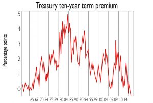
He starts by looking at record low bond yields, and in particular the “term premium” for US Treasuries.
- Bonds that return your money in ten years should be riskier than those that give you your money in one year – for example, inflation might rise – so they should yield more
- But this term premium has now gone negative
This means four things:
- interest rates are expected to stay low
- deflation is more of a risk than inflation
- investors prefer “safe” assets, even if their returns are low or slightly negative
- those investors requiring yield must take greater risks with their capital
To see what might happen next, Dan looks first to Japan.
There’s a three-pronged strategy from the government in place here:
- buy government bonds (the central bank now owns one in three)
- buy equities (via ETFs)
- make deposit rates negative (for banks) to encourage lending
But it still isn’t working, so what comes next?
Dan sees three options:
- helicopter money (HM)
- negative rates for retail deposits
- cash that expires (“stamped money”, SM)
HM could be either printing money to buy new (interest-free?) government bonds, or it could be “shopping coupons” to households.
- The latter would be time expired to encourage consumers to use them, in the same way that negative rates for retail deposits would encourage spending.
Of course what has happened in Japan is that people are buying safes to hold physical cash at home.
To deal with this, governments would need “stamped money” – cash that isn’t legal tender until a government stamp has been applied.
- This was tried briefly in Austria in the 1930s
- You pay for the stamp, so there is a tax to the government
- The tax might vary according to the note denomination, or the amount of money you got stamped, or how long you’d held the money.
This is a half-way house towards the replacement of physical cash with a parallel digital currency, which would allow negative interest rates to be employed without side-effects.
Dan doesn’t see any of this working.
- He expects sound currencies to be destroyed, leading to hyper inflation.
- And the only defence he sees is holding gold.
I think that most of these scenarios (HM, SM, negative rates, electronic money) are plausible, but we’re a long way from them at the moment – apart from maybe HM.
- And I can’t quite make the leap from negative rates and digital money to hyperinflation.
- The amount of money in private hands would then be shrinking, not increasing.
Things would be very different, and it’s hard to predict what might be a good store of value in those circumstances, but it’s likely that something would emerge.
UK labour market, part 1
The Economist looked at the rising numbers of the working poor.
- The minimum wage (for over-25s) is £7.20 per hour, or around £12K pa.
- With the personal tax allowance now up to £11K pa, most of that cash is tax free.
This compares with unemployment benefit of £73 per week, or less than £4K pa, though of course the unemployed are usually eligible for lots of other benefits (housing, children etc).
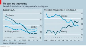
But poverty is rising again.
The UK uses a measure of “absolute poverty” ((It’s relative poverty, in fact )) of 60% of the national median income.
- This is around £14.6K for a couple with no children, or £12.5K pa after housing costs are deducted.
Despite record employment, more people are falling below this level, and more of them are in work.
- This means that more children are being caught up, too.
In contrast, only 15% of pensioners live in absolute poverty, compared with 70% in 1980.
- This is despite a pension which increased from only £6.2K pa to £8.1K in April 2016
And as the proportion of pensioners in poverty falls, this makes the contribution of working poor to those in poverty look much worse in relative terms.
Yet a real problem remains:
- the cost of housing continues to increase
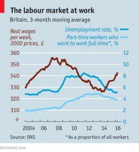
- though there are plenty of jobs, lots of them are part-time (some – though not that many – people would like to work more hours)
- real wages are still lower than in 2008, mostly because of a lack of growth in productivity
The new minimum wage (“National Living Wage” or NLW) will hit £15K by 2020.
- With an appropriate tax treatment, this might take all workers out of relative poverty.
- In practice it may well increase unemployment, with low-skill jobs not viable at that rate of pay, and increasingly vulnerable to replacement by automation.
UK labour market, part 2
And finally we come to Brexit, or one of the causes of Brexit.
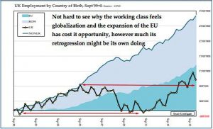
The chart below ((Grabbed from my Twitter feed, so apologies for the quality )) comes from HindeSight Capital, though it’s based on ONS data.
- It shows the number of jobs gained or lost by birth country of worker, using September 1999 as a baseline.
From 2000 to 2005, new jobs were spit equally between UK workers and foreigners, with most of the foreign jobs going to non-EU nationals.
From there to the financial crisis, all the new jobs for UK workers were lost again, whilst jobs for foreigners continued to grow.
- EU workers start to show up at this point, though non-EU workers are still doing better.
The 2005 peak for new native jobs wasn’t reached again until 2014.
- There are now 161K more UK workers than in 2005
- Meanwhile 2.3 million jobs have gone to foreigners – 14 times as many
- EU workers have taken 1.3 million of these jobs, with 1 million of these going to workers from Eastern Europe
As HindeSight stress, these are workers, and not a burden on UK society in any way.
- It’s also the case that the same jobs are available to UK workers
- There must be good reasons why they aren’t winning them (though unwillingness to work for low wages is probably involved)
But the split in allocation of new jobs between UK and foreign workers over the past 10 years must explain some of the votes for Leave amongst the UK’s (increasingly non-) working classes.
Until next time.


