Weekly Roundup, 14th June 2016

We begin today’s Weekly Roundup in the FT, with the Chart That Tells A Story. This week’s topic was NHS spending.
Contents
NHS Spending
Because I was away on holiday last week, there’s twice as much to get through as usual. Because of that, I will:
- Hold over all the Brexit articles for a Brexit Special next week (just before the referendum), and
- Go a bit faster than usual – hold tight.
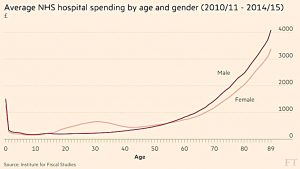
Gemma Tetlow in the FT looked at NHS hospital spending by age and gender.
As you might expect, it’s much higher for the elderly.
- It’s also slightly higher for men than for women of the same age, as men have a lower life expectancy.
- There’s also a “pregnancy bump” in spending on women in their twenties and thirties.
One thing the graph doesn’t show is the concentration of spending.
- Amongst the over 65s, 1% of people account for more than 20% of spending.
The big takeaway is that as the population ages, NHS spending will need to increase, though rising life expectancy will push the spending curve slightly to the right.
- The percentage of over 75s is expected to double (from 8% to 16%) over the next 50 years.
So either the proportion of GDP spent on the NHS will increase (it’s already gone up from 3% in the 1950s to more than 7% now), or we will have to reduce the quantity or the quality of the services it offers.
Or we could do the smart thing and charge at the point of consumption.
- That should both raise funds and choke off frivolous demand (such as the minority who clog up A&E every day).
Queuing
Tim Harford looked at queueing.
Queues are unpleasant not when they are long, but when they carry risk (for example, of missing your flight), require constant monitoring (for queue jumpers or new lines), or are confrontational or unfair.
- In a single long queue that is properly policed, you can just read a book.
- A ticket system where you wait until your number is called is also good.
But in an emergency (a natural disaster, or a transport system breakdown), even these queues will be too long (say more than 6 hours) to be useful.
Unless a queue system is engineered to cope with peak demand, the queue will lengthen during the peak, and then never recover (since there is no excess capacity once the peak has subsided).
From an economic perspective, the existence of a queue suggests that the resource being queued for is under-priced.
- You could increase the price of the resource, or add an entry fee to join the queue.
- This should make the queue significantly shorter.
For unavoidable queues like airport security, the solution is to add more capacity, perhaps funded by a fee to skip the normal queue (this is the fast track solution used by many airline check-in and boarding systems).
- Where there are alternatives (eg. more than one airport in a city, or interchange between cities), passengers should eventually figure out which has the worst queue, and traffic should equalise between them.
Squeezed upper middle
Janan Ganesh commented on an article in the previous week’s FT about a family struggling to “get by” in London on £200K pa.
His point that was that these people are seriously rich, not part of the squeezed middle classes.
- Only 17% of the adult population pay 40% income tax, which cuts in at around £43K.
- And only 7% of schoolchildren go to private schools (school fees are one of the major expenses for this type of “squeezed rich” couple).
The average wage is around £27.5K, and that is a mean distorted by the highest earners.
- So the real middle classes are the ones that earn around that figure.
- Janesh doesn’t define a range, but let’s go for something like £20K to £40K.
Of course that’s a national average.
- The average for central London is more like £40K pa, so we might define the middle class in London as those earning £30K to £60K pa.
And none of this takes into account net worth.
The real problem is that a few of the things that rich people see as defining middle class status (private school, a house in London) have risen by many times the inflation rate over the past 20 years.
- No truly middle class people can afford them any more, and neither can some of the “squeezed rich”.
- The tax and pensions system has also been rearranged in the last few years to penalise those on more than about £85K pa, and to be much kinder to those earning less than £12K pa.
And the second point (which Janesh makes) is that the people on £85K pa and more are looking upwards, not down.
- They know a lot of people earning more than them – sometimes a lot more – and not so many who are truly middle class.
Houses in retirement
Don Ezra took a look at four ways in which your home can be part of your retirement plan.
Britons are addicted to owning their own house.
- It’s great for a sense of security, and it’s been a good investment in recent years.
- This is in contrast to the US, where houses are seen as a liability incurring lots of repair costs with no real long-term gains above inflation.
Houses are typically bought (via a mortgage) when you are asset poor but cash rich.
- When you reach retirement, you are often asset rich and cash poor, and your home may well be your largest investment.
If you have a large enough pension pot, you can ignore your home, but if not, you will have to “monetise” it. There are four options:
- downsize to a smaller property
- this can be quite an emotional wrench
- sell the house and rent
- just as emotional
- rent out a room
- the tax-free allowance for having a lodger was increased to £7.5K pa in April
- but a lot of people won’t fancy sharing a space they have enjoyed alone for perhaps 20 or 30 years
- equity release
- this is effectively a loan against your house while you still live in it
- it’s like a mortgage in reverse, but you don’t pay any interest – instead it rolls up and is added to the loan continuously
- you can borrow a lump sum, or even a monthly payment
- the loan is repaid when you sell the house, or when you die
The problem with equity release is that it can spiral out of control, since it uses compound and the snowball effect to your disadvantage.
- Income / borrowing is usually capped at 60% of your home’s value, to leave the rest as headroom for the accumulating interest.
- And you can usually only borrow once you are past retirement age.
Even so, I’m not a fan.
- It’s much better to save a bigger pension pot so that you can stay in your home unmolested, or at least enough that you can manage if you downsize.
One fund portfolios
Jonathan Eley, ex-editor of the Weekend FT’s Money section, provided an update on his minimum-effort investing strategy.
- Jonathan invests largely in a single fund, and this strategy has apparently proved popular with readers.
- He uses the iShares Core MSCI World ETF, which has an annual cost of 0.2%.
- He also has smaller holdings in investment trusts (emerging markets and European small caps).
I’m not a great fan of one-fund portfolios.
- Probably the best thing that you can say about them is that they are much better than doing nothing, or saving all your money as cash.
Though at least this one is reasonably cheap and moderately well diversified.
- Not though that as we saw when we looked at Fidelity’s platform, a tailored portfolio of nine iShares ETFs with better diversification would only cost 0.14%.
It’s disappointing to hear that Jonathan’s strategy is popular with FT readers, and even more disappointing that the editor (for three years) of one of the most popular private investor journals would use such a strategy.
- This is not picking on Jonathan – it seems that many UK financial journalists are much less adventurous with their own portfolios than with the articles they write.
I guess I’ll never understand why so few people are interested in such an important part of life – their retirement savings.
Buying versus renting
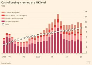
James Pickford reported that buying a house is now more expensive than renting.
- Research by Savills found that buying was 20% more expensive, a surprising result in these times of record low interest rates.
- Monthly mortgage payments were 25% less than rent, but adding in the capital repayments made buying more expensive.
Unfortunately this analysis is so superficial as to be useless.
As with everything property related, location is key.
- These figures are national averages, and you would need to look at the numbers for the place that you live in.
- You’d also need to double-check the Savills estimates for repairs and insurance and the “opportunity cost” of equity – the alternative return that you could get on your money (Savills used the “prevailing savings rate”).
The average used a 20% deposit, but there’s no detail on how other levels of deposit might affect the result, or on how the repayment schedule might affect the amount of interest paid overall.
- And of course the calculation doesn’t include the capital gains made on the value of your house, which have been very good over the last 20 years.
Gold in SIPPs
Josephine Cumbo reported that the Royal Mint is now offering 100g and 1kg gold bars for people to put into their SIPPs.
- The 1kg bar currently costs £28K.
- Royal Mint bullion coins have not been authorised by HMRC for use in SIPPs.
The other problem is that the Mint will charge 1% pa plus VAT (ie. 1.2% pa) to hold the bars.
- “Signature gold” – a share of a large bar, in 0.001 ounce units – can also be held, with an annual charge of 0.6% pa.
- It’s down to your SIPP provider as to whether they want to offer you the Royal Mint option.
ETFs still look like the best way to include gold in your SIPP.
Millenials prefer ETFs
Aime Williams covered the preference of Milennials for ETFs over active funds.
- People aged between 18 and 35 allocated more than 90% of their equity portfolios to ETFs.
- The figure for investors over 40 was 75%, which seems extremely high to me.
- This was a global survey, and the figures for Europe were 86% for Millenials and 60% for the over-40s.
This is still a bit high – most people I know have less than 50% allocated to ETFs.
- Passive ETFs are of course generally cheaper than active funds, so this could just reflect the cost-consciousness of the next generation of investors.
Taxes and Benefits
Using fresh ONS data, The Economist tackled what it called “two persistent myths about the welfare state“.
The first is that half of households get more in benefits than they pay in taxes.
- This is true, but only because pensioners are included.
- Ninety percent of retired households receive more in benefits, compared to 37% of working households.
This would still be pretty shocking (assuming that working households excludes those where no-one works) but for the ONS benefits include “benefits in kind” such as the NHS, education and public transport.
- Looked at this way, it’s not that surprising that half of us are supporting the other half.
Without benefits in kind, 25% of working households are net beneficiaries.
- Still far too many in my book.
The second myth is that the welfare state is too hard on the poor.
- The average household in the bottom 20% of incomes paid 37% (£5.2K) in tax, whereas the average household in the top 20% paid 34% (£29.8K).
But without adding back benefits this figure means nothing.
- Benefits made up £7.7K of the £13.8K average income for the bottom fifth.
- The top 20% received an average £2.9K in cash benefits – only 3% of their income.
So the system isn’t as bad as it looks after all.
Productivity
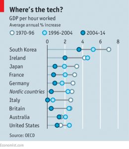
Buttonwood looked at productivity.
- Productivity is one of the two drivers of growth, along with the number of people in work.
As demographics mean that the workforce will shrink in many western countries over the next 20 years, productivity is increasingly important (unless you believe in the coming robot and AI revolution).
- The problem is that productivity is falling everywhere, with an average annual increase now down to around 1%.
A new paper from the OECD offers three explanations:
- “progress is over” – new tech advances aren’t as revolutionary as electricity or the car
- the shift to services, where productivity gains are harder to achieve
- mis-measurement – GDP ignores things like free internet searches
I think that it’s the last two.
We’ve looked at the problems with GDP before, and it’s obviously the case that services productivity has a ceiling (you can squeeze much more out of a busy waiter, or ask a string quartet or a hairdresser to go faster).
More on GDP in a future article.
But it remains the case than investment in technology has slowed since the dotcom boom.
- This suggests that there are few attractive projects available, even with interest rates (and therefore rate of return hurdles) at record lows.
The OECD disagrees, and had another few theories:
The first was that the productivity boom of 1996 to 2004 was caused not by tech, but by companies becoming leaner in order to join the “global value chains” – international alliances – that were forming at the time.
As international trade growth slows, so does the formation of new value chains.
There’s also been a slowdown in the rate of business formation (new businesses should eventually be more efficient than old ones).
Third, there’s a mis-match between skills and the jobs available.
- More than 30% of English workers think they are over-qualified for their job (though in some areas there are skill shortages).
- This would also persuade companies to hire more staff rather than make capital investments.
Whoever is right, the problem has been around for a long time, and doesn’t look like going away soon.
Academics and investing
Buttonwood’s previous column looked at academics and investing, and in particular, at risk.
- It may be that investor reactions to academic theory such as CAPM and the efficient market hypothesis have changed the markets so that risk and reward are not so strongly linked as before.
The article was based on two new papers, the first of which focuses on the long-known flaw with CAPM that more volatile stocks actually have worse returns than low volatility stocks.
- This is the reverse of what the theory predicts.
- Strangely the theory works between asset classes (stocks return more than bonds), but not within equities.
- The only time that high beta stocks out-perform is in a bubble, like the dot com boom.
The usual explanation for this is that institutional buying of high beta stocks in search of out-performance drives their prices too high.
- What they should do is buy low beta stocks and use leverage, but many institutional investors are not allowed to do this.
- Interestingly, this leveraged low-beta strategy is what private equity firms have used successfully in the past.
The second paper looked at tracker funds.
- Index funds were slow to take off after their invention in 1975, but in recent years sales of ETFs have soared, and passive funds now make up more than a third of the market.
- The attraction lies in their low costs, and the inability of active managers (in aggregate) to consistently beat the market.
The problem is that tracker funds don’t do what the stock market should – allocate capital efficiently (to the best companies).
- Instead, they blindly buy the firms in the index, usually in proportion to their size.
As trackers grow in popularity, this will lead to investor herding, and that’s what the paper found.
- So the risk-averse behaviour of index investors is increasing risk in the markets.
We’ll return to this subject in a future article.
[Tweet “The risk-averse behaviour of index investors is increasing risk in the markets.”]
Annuities
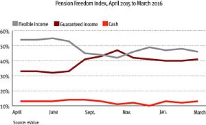
In FT Adviser, Ruth Gillbe reported that Annuities are staging a comeback.
- They now have 41% of the retirement market, compared to 33% when the pension freedoms were introduced last year.
- Drawdown remains the most popular choice, with 46% – down from 54% last year.
- There’s a gender split: men are 49% / 39% in favour of drawdown.
These numbers are dismaying to me.
- Annuities are not good value – don’t buy one (at least until you reach 75).
Payment by results
The Economist also looked at payment by results (PBR), the coalition government’s attempt to make public services more efficient.
- One in every three pounds spent on public services goes to private providers, so there’s a lot of room for improvement.
The main problem with the system is “creaming” – focusing on the easiest to help people. ((This is the first I’ve heard of this term – the practice used to be known as cherry-picking, or going for the low-hanging fruit ))
- A good example is the back to work programme, where those under 25 proved easiest to retrain into a new job.
The other problem with PBR is that it makes the suppliers to the incentivised firms wait until the government works out the final score, and hence the payment due.
The good news is that PBR seems to work.
- The back to work programme has similar results to the past, but cost 2% less (not a resounding success, to be sure).
- The “troubled families” programme has also been deemed a success, and have schemes for rehabilitting prisoners and getting councils to build new homes.
US stocks
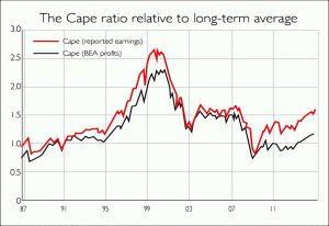
In MoneyWeek, Cris Sholto Heaton looked at the valuation of US stocks.
- The cyclically adjusted price/earnings ratio (CAPE) – invented by Robert Shiller – is the most popular metric for doing this.
- This uses a ten-year average of the markets earnings, adjusted for inflation.
- The current value is 26, compared with a long-term average of 16.
So things look expensive, but some observers argue that low interest rates and bond yields mean that stocks should be priced higher.
- Looking at the real return expectations across asset classes, Capital Economics have estimated that the market should be priced at around 23, meaning it’s only around 13% overvalued.
And as we’ve previously noted, Jeremy Siegel of the Wharton Business School thinks that the CAPE is not the same as it used to be, because accounting practices have depressed earnings during economic downturns.
- Using national statistics rather than company reports, he calculates the CAPE to be close to its long-run average.
- Add in the boost to earnings per share from increased share buy-backs and the gap gets even closer.
So US stocks may not be cheap, but they are not as expensive as people – and the CAPE – are telling you.
Quick Links
We’re running out of space for today, so here are a few more articles – mostly from the FT – that are worth reading.
Successful private investor and “ISA millionaire” John Lee is now answering questions at the FT – just send your question to johnlee@ft.com.
- This week’s question was: “How do I pass on your enthusiasm for investing to my daughters?”
- If that’s of interest to you, take a look.
John Redwood’s column was mostly about the implications of Brexit for investors, so I’ll cover that next week.
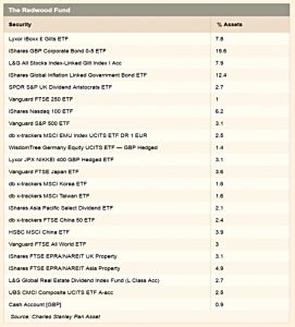
- But he also included an update on his ETF portfolio:
Another article from Aime Williams reported that Neil Woodford is thinking of launching a new high income equity fund, targeting a 4.5% yield.
- Woodford’s existing Equity Income Fund targets a 3.7% yield.
- The new fund would invest mostly in the UK, but potentially globally as well.
Aime’s third article was about AJ Bell using the Facebook Messenger services to trade stocks.
- The service – which uses a form of texting – should be operation in the next three months.
- The aim is to attract 18-30 year olds – it certainly doesn’t attract this 55-year-old.
Gill Plimmer reported that the government has revived plans to privatise the Land Registry.
- I’m a big fan of free markets, with two exceptions: externalities (eg. hidden costs of pollution) and monopoly power.
- The Land Registry is a natural monopoly if I ever saw one, and should be run by the government.
- Luckily the Competition and Markets Authority (CMA) seems to agree with me, so perhaps the sale will never happen.
For those of you inclined to bet on sports, in the Economist’s sister magazine 1843, mathematician David Sumpter explained how he beat the bookies.
- Most of the article is about premiership football, but he did offer one tip for the upcoming European Championships – bet on underdogs in close games (where the favourite’s odds are between 3/5 and 3/2).
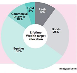
And finally, MoneyWeek have revealed the asset allocation within their Lifetime Wealth subscription product (I am not a member):
- 50% Equities
- 25% Bonds
- 10% Property
- 10% Cash
- 5% Gold
How does your portfolio compare?
Until next time.


