The Weird Portfolio
Today’s post looks at a long article/short book about another lazy portfolio – The Weird Portfolio.
Contents
The Weird Portfolio
I came across The Weird Portfolio on Risk Parity Radio (RPR), which I mentioned a few weeks ago.
- It’s described in a very long (72 pages) article on Medium, written by @ValueStockGeek (VSG) – who I already follow on Twitter.
He also has a blog, where he describes himself as:
A value investor. My outlook is inspired by the ideas of Benjamin Graham. This site is a real time chronicle of my portfolio and an outlet to share my ideas.
The sub-title of the article is “How To Avoid Bubbles, Limit Drawdowns, and Safely Grow Wealth”.
- So I am expecting a lazy portfolio in the style of the Permanent Portfolio – and since the article was referenced on RPR, there should be at least a nod towards Risk Parity (RP).
The reasons VSG gives for creating this portfolio are:
My results [from value stock-picking] made realize that I should develop an approach for most of my money that doesn’t try to predict the future because I get it wrong so often. I also wanted something much less stressful than owning 100% stocks. After all, the stock market has maddening levels of volatility and terrifying drawdowns.
Features I expect to see are:
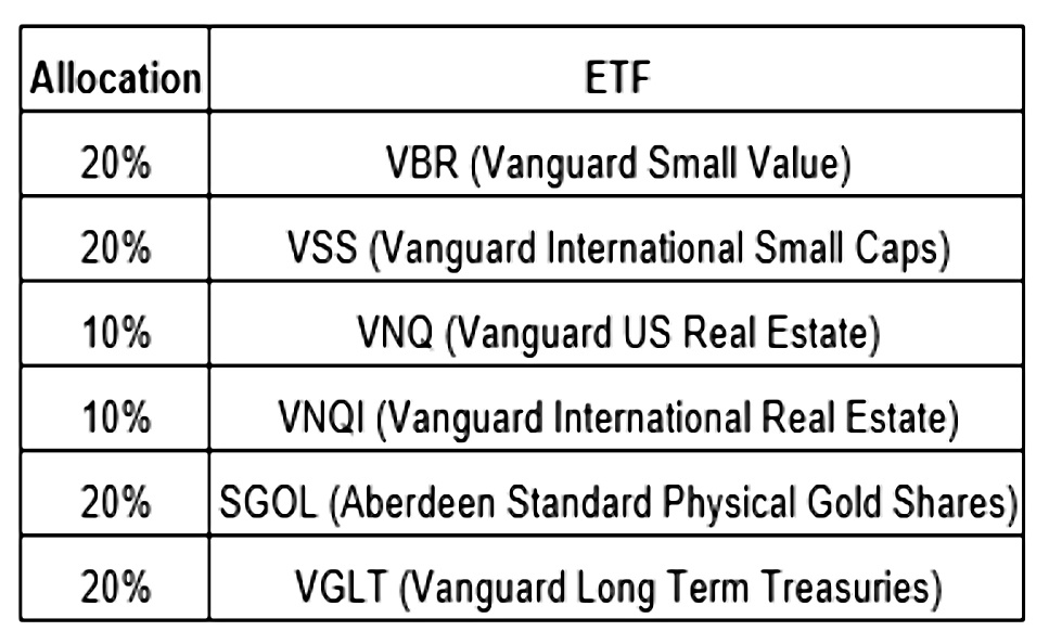
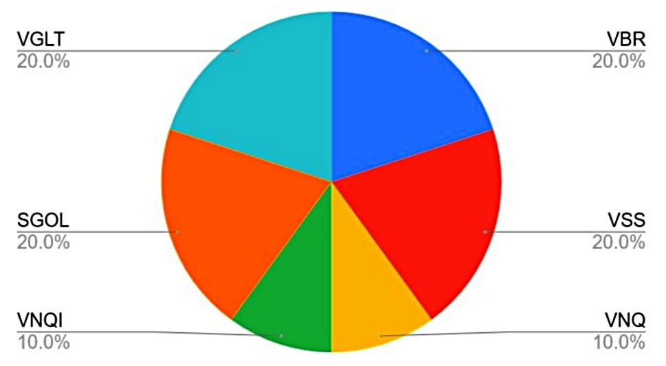
- A small number of ETFs (six)
- A small number of asset classes (five or six, depending on how you count)
- A selection of assets to deliver a return comparable to stock (but with lower volatility) across all economic environments (tick)
- A value bias (since VSG is a value investor)
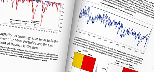
The backtesting for The Weird Portfolio was carried out on the Portfolio Charts website, so this article also serves as a mini-review of that service.
Economic scenarios
VSG lists four possible economic environments that the portfolio is designed to cope with:
- inflation
- deflation
- prosperity (growth)
- secular decline (high interest rates and a weak dollar)
Index funds
VSG also lists the reasons why he doesn’t simply invest in market cap index funds:
- He wants cheap stocks rather than popular stocks
- He wants to avoid massive drawdowns
- He wants to avoid long periods of losses (eg. Japan, the US post-1929)
60/40
The next section of the book/article is on asset allocation.
- VSG starts with a 60/40 stock/bond portfolio.
60/40 has done well in recent decades.
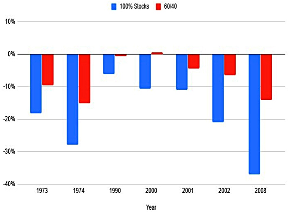
- From 1972 to 2019, this portfolio returns 9.6% pa, slightly below the 100% stock portfolio (10.4% pa).
But it does better in terms of drawdowns (size and duration) and outperforms in bad years.
- And it is better than the sum of its parts (9.1% pa).
This is because of rebalancing – selling what went up and buying what went down – which in turn depends on low correlations between the two assets.
The problems with the 60-40 looking forward are fourfold:
- Bond yields are low
- Stock valuations are high
- The stock/bond correlation could increase
- 60/40 ignores outperformance factors like small-cap and value
And also:
The 60/40 portfolio benefited tremendously from a 40-year bull market in bonds, which took interest rates from 20% to almost 0% from 1980 through 2020. That can’t happen again.
Which assets?
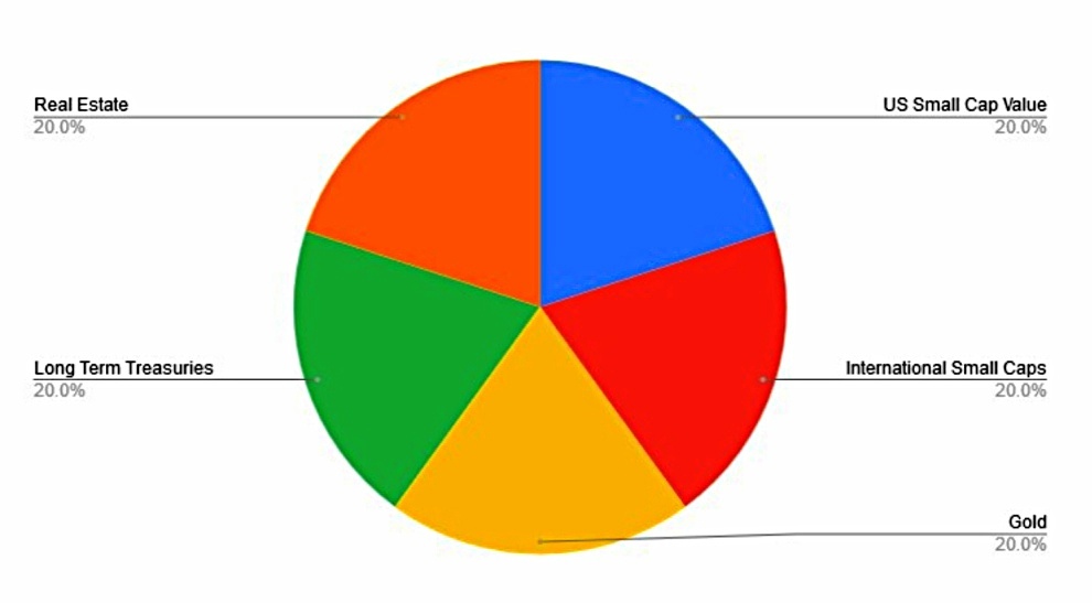
VSG decided on a six-asset portfolio:
- Small-cap value US stocks
- Small-cap international stocks
- US real estate
- Foreign real estate
- Long-term US Treasuries
- Gold
This doesn’t strike me as particularly weird – if anything it’s relatively simple and straightforward.
- Since 1975 this portfolio has delivered 7.4% pa, compared to 8.4% pa from 100% US stocks.
Max drawdown was 18% (vs 37%) and standard deviation was 11.5% (vs 16.6%).
These assets
The next section of the article walks through each of these assets in turn.
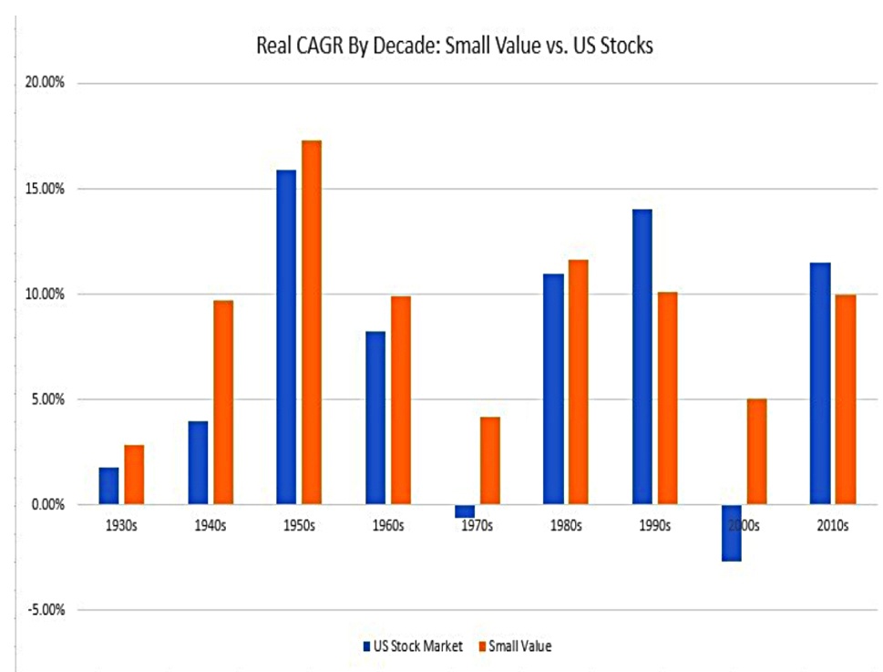
Small-cap value has outperformed (14% pa from 1972 through 2019, compared to 10% for US
stocks).
International small-caps have outperformed international stocks generally, and though the recent performance of international stocks has been below that of US stocks, there’s no reason to believe this will continue.
The US stock market is the most expensive in the world. Meanwhile, most of the stock markets around the world are reasonably priced or cheap.
REITs have outperformed US stocks since 1972 (11.6% pa vs 10.6%).
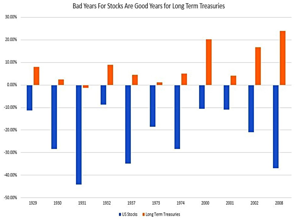
Long-term treasuries have done well in the bad years for stocks.
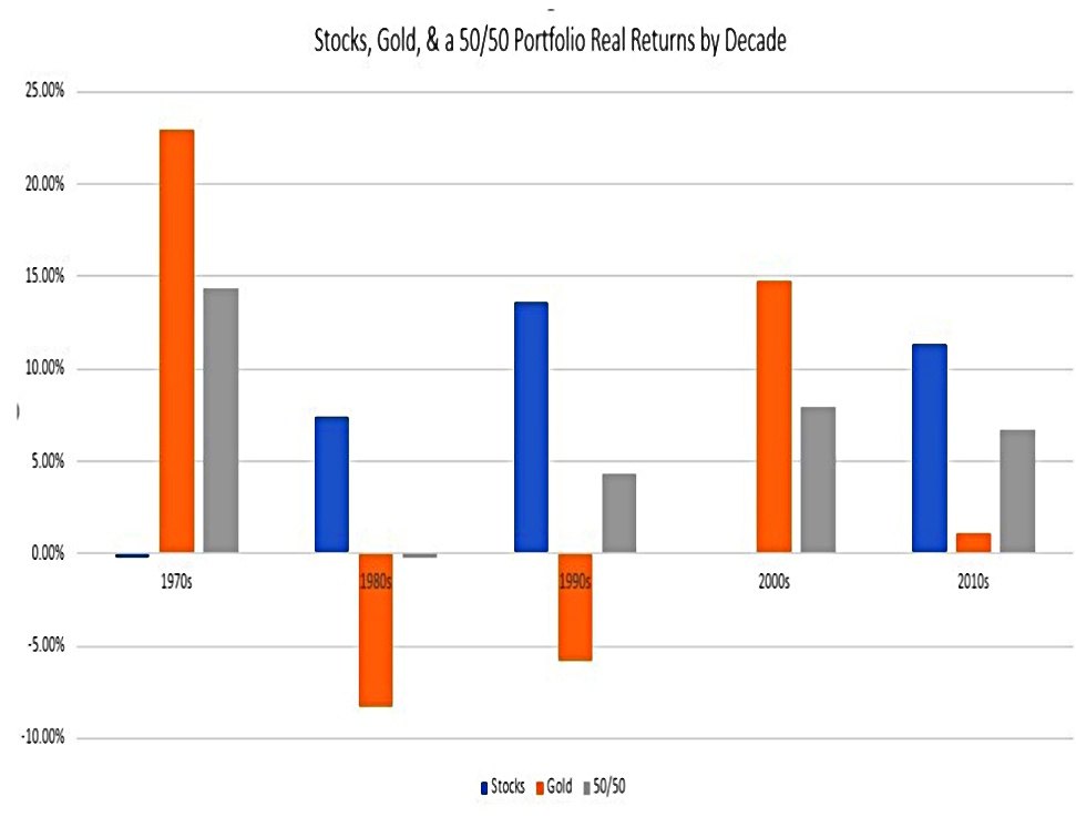
And gold is a great diversifier.
On its own, gold is an absolutely terrible investment. It has massive volatility. It also
endures extremely long drawdowns. Because it doesn’t generate any earnings or interest, it has little promise to ever outperform US stocks. However, it can work well in a portfolio with other assets.
Weird performance
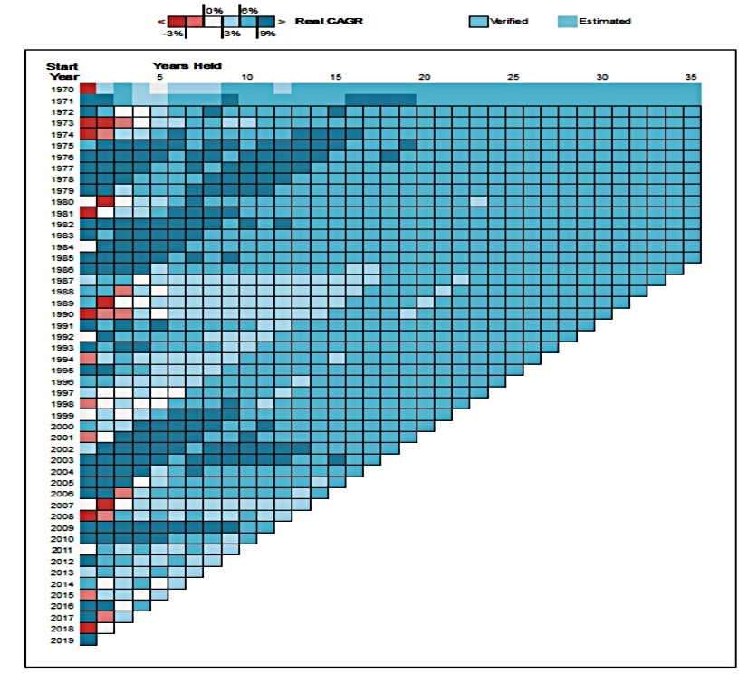
The chart above is the first we’ve seen from Portfolio Charts (PC), and it’s pretty impressive.
- It shows the compound return by year of investment (start year) and the number of years held – it’s a form of a heat map.
As you can see, the results for the Weird Portfolio are pretty good, and very consistent over the long term.
- Returns since 1970 are 7.7% pa, compared with 8% from the US stock market and 6.1% for the 60-40 portfolio.
The worst year was 2008 – down 19% compared with 37% for the US market.
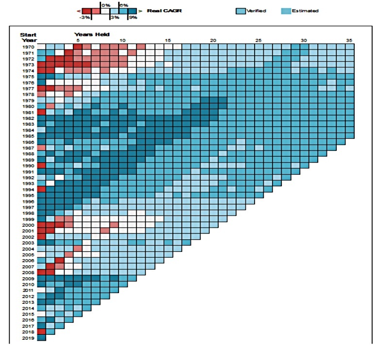
The heat map for the 60/40 portfolio is not quite as good, though most of the pain was in the 1970s.
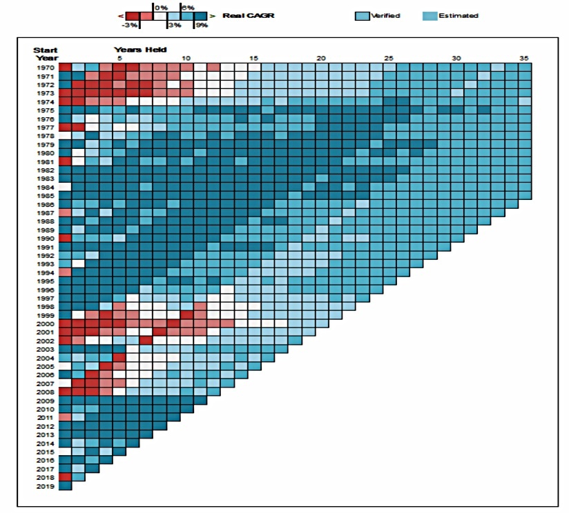
The 100% US stock portfolio has even more areas of pain, though it also has some good periods of high performance.
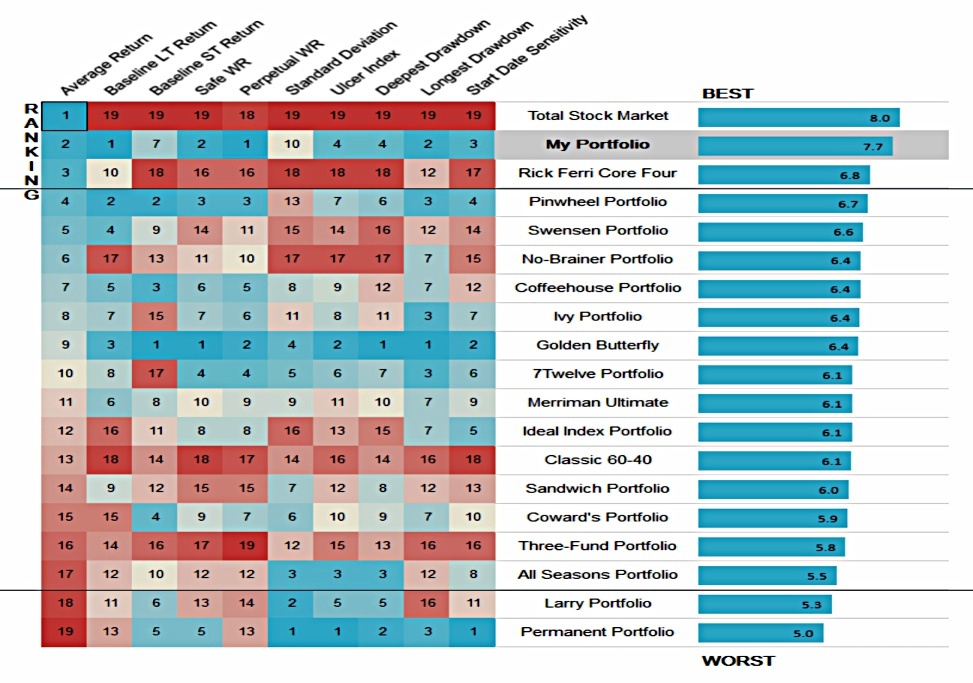
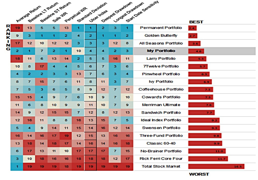
Here’s another great chart from PC, showing lots of stats about a variety of portfolios.
- This one is ranked by average return, and the Wierd Portfolio is at the top.
Perpetual withdrawal rate
VSG says:
I think the best measurement of a portfolio is its perpetual withdrawal rate. The perpetual withdrawal rate is the amount of money that can be withdrawn from a portfolio every year and maintain the principal balance while accounting for inflation.

The Weird Portfolio has a perpetual withdrawal rate (PWR) of 5.4% pa, compared to 3.5% for the US stock market.
- This is much higher than my own failsafe withdrawal rate (FWR) of 3.3% pa, which takes into account high starting valuations.
Drawdowns
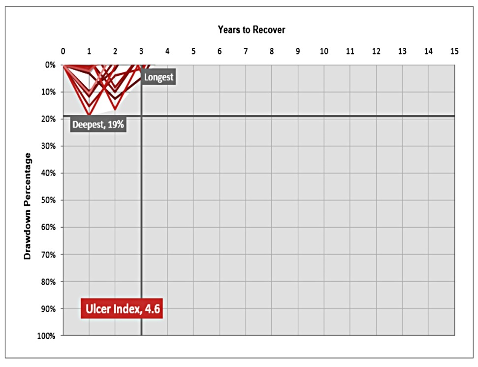
Here’s a third nice chart from PC, showing the severity and duration of drawdowns.
- The worst drawdown was 19% and the longest was 3 years.
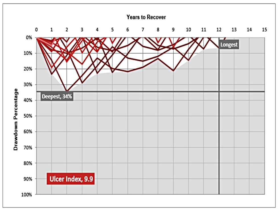
The 60/40 has a max drawdown of 34% and its longest drawdown was 12 years.

The US stock market had a 49% max drawdown, and its longest drawdown lasted 13 years.
Ulcer index
The Ulcer Index is like a Sharpe Ratio/standard deviation measure which focuses on downside volatility.
- Once again, the Weird Portfolio comes top.
Conclusions
I’ve enjoyed reading this very long article, though there’s nothing too earth-shattering within it.
- The Weird Portfolio is not that weird – it’s a fairly standard lazy portfolio constructed from six funds, this time with a small-cap value tilt.
- The portfolio has performed well since the 1970s, though the future could be different.
- It’s worth considering for smaller portfolios, alongside similar Lazy Portfolios with five or more funds.
- Investors with larger portfolios can do better with even more funds, though they may not be motivated to head in that direction.
- Portfolio Charts looks useful for backtesting.
- Be careful with backtesting – it’s easy to overfit your portfolio to historical returns.
Until next time.
Mike Rawson
Mike is the owner of 7 Circles, and a private investor living in London. He has been managing his own money for 40 years, with some success.